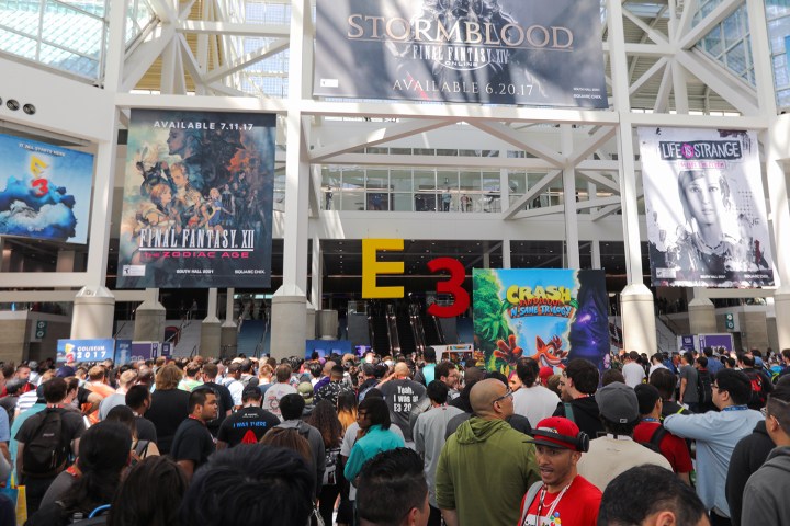
The new E3 logo takes its cues from modern design sensibilities; it uses a stark typeface and flat colors to produce a simple aesthetic that still retains something of its predecessor’s personality. Its yellow-and-red color scheme remains, but the three-dimensional lettering that was introduced back in the 1990s does not.

When E3 debuted in 1995, the video game industry was transitioning from the 2D era into the brave new world of three dimensions, thanks to hardware like the Sega Saturn, Sony PlayStation, and the Nintendo 64. As such, it made a lot of sense for 3D imagery to be used, reflecting what was cutting-edge in the world of interactive entertainment at that time.
The 3D revolution is old hat now and while 2D games have certainly had a resurgence, 3D environments are simply the norm. In a time when Nintendo can broadcast its own Direct live-streams as and when it sees fit to unveil new titles, E3 has to move with the times to stay relevant, and dragging its branding out of the 20th century is one component of a much broader effort.
There was a time when E3 was exclusively a press event, but due to various other competing trade shows, and the fact that many companies prefer to host their own showcases, this is no longer the case. E3 2017 marked the first time that the public could register for access to the show alongside industry insiders, heralding a change of tact that will see the expo compete more directly with the likes of PAX.
The new E3 logo is set to make its official debut when the 2018 edition of the event descends upon the Los Angeles Convention Center, according to Polygon. Next year’s show is scheduled to take place between June 12 and 14.
Editors' Recommendations
- E3 needed to end, but its demise is a net negative for the gaming industry
- The future of E3 is in question again as ESA reportedly seeks a 2025 reinvention
- With E3 2023 gone, other gaming events need to step up
- Ubisoft will not attend E3 2023, but it will still host a summer live stream
- Nintendo confirms that it won’t be part of E3 2023