Say what you will about Nothing, but this brand certainly has a taste for flashy design. After all, how many phones out there light up and sync to the beat of music? But the company’s latest smartphone endeavor could just be its best yet.
In March, Nothing introduced its Community Edition Project. The goal was to take ideas from its fans for hardware design, with the Nothing Phone 2a serving as the foundation. The company also has similar plans for wallpaper, packaging, and marketing shenanigans. Today, Nothing announced its winning entry for the phone design, and it’s a stunner.
We are very excited to announce Kenta and Astrid as our Stage 1: Hardware Design winners!
Last month, we announced the Community Edition Project. An industry-first co-creation project that invites our community to design the ultimate version of Phone (2a) alongside the team at… pic.twitter.com/8u89XxG9BG
— Nothing (@nothing) April 25, 2024
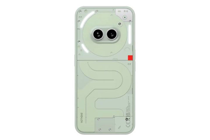
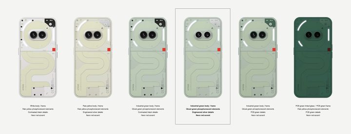
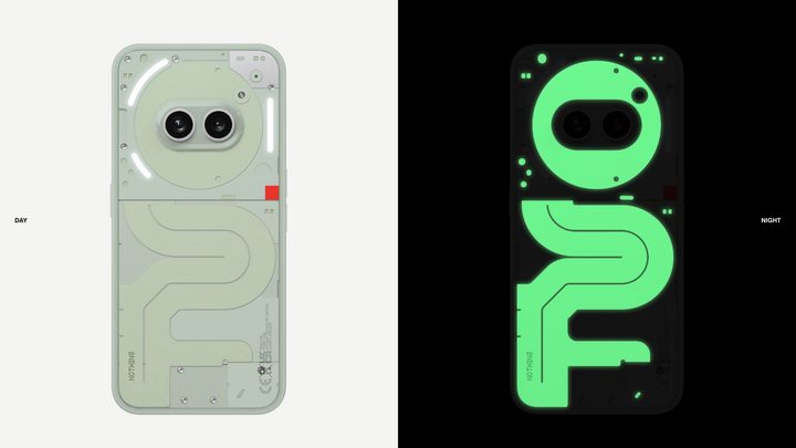
The concept is called Phosphorescence. If you’ve ever been enamored by glow-in-the-dark aesthetics — or, more recently, the “glow-in-the-dark” Analogue Pocket game console — this concept would be its loyal interpretation on a phone. The idea is the brainchild of Kenta and Astrid, who run an architecture firm.
“Using green-tinted phosphorescent material finishes, elements of the back of the phone emit a soft glow in the dark,” says the official description. And here is the best part. All that glow is passive. Or, as the company puts it, purely analog.
All those beautiful glowing strips you see at the back? Well, they don’t require any power source. Instead, they absorb sunlight to glow in the dark, just like on the Analogue Pocket handheld gaming device. As for the material, it is likely some kind of photoluminescent plastic sheet, which usually includes inorganic phosphors.
These particles get energized when light falls on them. Nothing notes that the glow could also serve a functional purpose by making it easier to find the phone in dark surroundings. What you see in the images above is not the final design, though.
Based on manufacturing complexities and other quality considerations, some changes could be made before it is widely launched later this year. Overall, the company received more than 400 entries before it picked Phosphorescence as the winning entry.
Stage 1 of the Community Edition is almost complete.
Thank you for all your entries so far. If you haven't got a chance yet, don't worry you can still submit your designs by 16 April 2024. https://t.co/miCrEAv5Yt pic.twitter.com/EmRz6OSmPG
— Nothing (@nothing) April 10, 2024
However, some of the submissions that didn’t make the cut were also quite a sight. Take a look at some of the submissions in the video above and let us know which one stirs your soul. Personally, I’d be thrilled if Nothing decided to make a Panda-themed version or that red-black tone befitting a Sith lord.