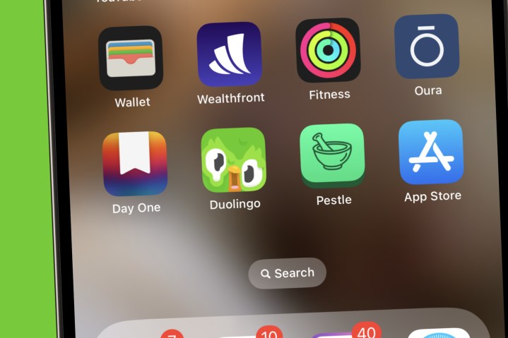
If you’re like me, Duolingo is one of the most-used apps on your smartphone. From extending my streak to getting higher up on the leaderboard, it’s an app I frequent quite often on any given day. As such, it took me by surprise this morning when I saw that my Duolingo app was melting. Where Duo’s cute, smiling face usually sits is now a melted version with his eyes and beak drooping down. It’s honestly kind of terrifying.
Is this a Halloween-themed trend? Is the app broken? Is Duo just going through a rough patch? Here’s what we know about Duo’s new, melted appearance.
Why Duolingo is melting
The real reason behind the melting Duolingo app is actually pretty simple. After numerous people started freaking out over Duo’s new, discombobulated look, a Duolingo spokesperson issued a statement to Distractify with the following explanation:
“The melting Duo you see is a new app icon that learners will see for a limited time. If learners have the latest version of the Duolingo app downloaded, they should see Melting Duo as the app icon. The purpose of the new app icon is to encourage learners to open the app.”
No, nothing is wrong with Duo. Everyone’s favorite internet owl is perfectly happy and healthy — he’s just trying to get your attention to open the app and catch up on your Spanish lessons.
How to get rid of the Duolingo melting icon

As ingenious of a stunt as the melting Duolingo icon is, there’s a chance not everyone will want to see a half-melted owl on their home screen. Luckily, there are a couple of ways to get rid of it.
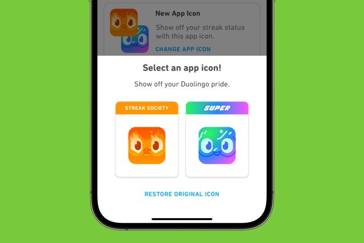
If you subscribe to Super Duolingo or Duoling Max, you can get rid of the melting Duolingo app and replace it with a Super or Max-themed one instead. From the Duolingo app home screen, tap the Duo icon at the top right of the screen, scroll down to Super App Icon or Max App Icon, and tap Turn On. This replaces the melting Duolingo app icon with the Super or Max one (depending on which membership you have).
Alternatively, if you’re a part of Duolingo’s Streak Society, you can change the app icon this way, too. From the Duolingo home screen, select the fire/streak icon near the top of your screen, scroll down to the Streak Society section, and choose Change App Icon. If you get rid of the melting Duolingo app but decide you want it back, tap the same Change App Icon button and then tap Restore Original Icon.
Editors' Recommendations
- Meta’s ChatGPT killer is taking over your favorite apps
- Can you take a picture of the solar eclipse with your phone? Here’s how to do it
- Are WhatsApp and Facebook down? Here’s what you need to know
- 8 iPhone browser apps you should use instead of Safari
- Apple just released iOS 17.4. Here’s how it’s going to change your iPhone


