We’ve never really been able to map our energy use in such a detailed way. That is, until Saul Griffith came along. He’s the brilliant mind working with other brilliant minds at Otherlab, self-described as “mischievous scientists, practical dreamers, working on making the world the way it needs to be,” and constantly asking the question, “Wouldn’t it be cool if … ?” And one of their latest inquiries delved into how all of the energy in America — yes, all of it — is used.
All the data — and believe us, there’s a lot of it — is presented in the form of an interactive, zoomable flowchart. “I think we may be the first three or four people to read every footnote in every energy agency document ever produced,” Griffith said when he debuted the team’s research at a recent talk. The painstaking work involved scouring information put forth from the Department of Energy, the census, and other institutions that deal with the complex workings of energy consumption in our country.
But this is much more than a data dump — it’s a detailed look at where our energy comes from, and where it ultimately goes. And friends, it looks like efficiency is not our best quality.
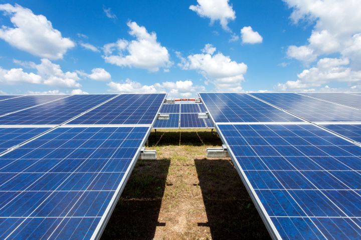
On the left side of the chart, you can check out the sources of our energy. Unsurprisingly, most of our electricity is provided by coal. While renewable sources like solar power are growing in popularity, they still make up a tiny fraction of the whole picture (solar power, for example, accounts for less than 1 percent of energy production). The really interesting part, however, comes in following each of these sources to see how much is wasted on the right side of the chart.
Natural gas, for reference, is sadly inefficient — we waste over half that energy. “This is really the first time that all of this data is brought together in one flow diagram, which is important if you really want to understand the consequences through the whole economy of things like defense,” said Griffith.
So if you’re looking to learn more about not only your carbon footprint, but that of the entire country’s, this may be a great place to start.
Editors' Recommendations
- White House unveils 31 U.S. tech hubs to boost industry
- Amazon expands its virtual healthcare service across the U.S.
- U.S. airports safer after software upgrades aimed at preventing taxiway landings
- Alaska Airlines to offer digital baggage tags in U.S. first
- How to watch SpaceX launch a U.S. spy satellite today