Productivity apps have become a force in the Web and mobile market. They run the gamut from entirely to-do-focused (making them militaristic or even boring) to overly integrated with social sites (meaning their usefulness takes a serious hit). And this variety as well as the extreme amount of options mean that as users, we’re hard-pressed to find something that delivers on multiple levels. Excel-like task managers won’t cut it, and over-the-top Twitter and Facebook integration or social streams dumb it down.
Evernote has risen beyond app status – it’s much more than a productivity solution, it’s a life-manager. And that ascent has paved the way for some new exploration in the purely task app space; a space that Springpad 3.0 proves it fits into very nicely.
Interface and design
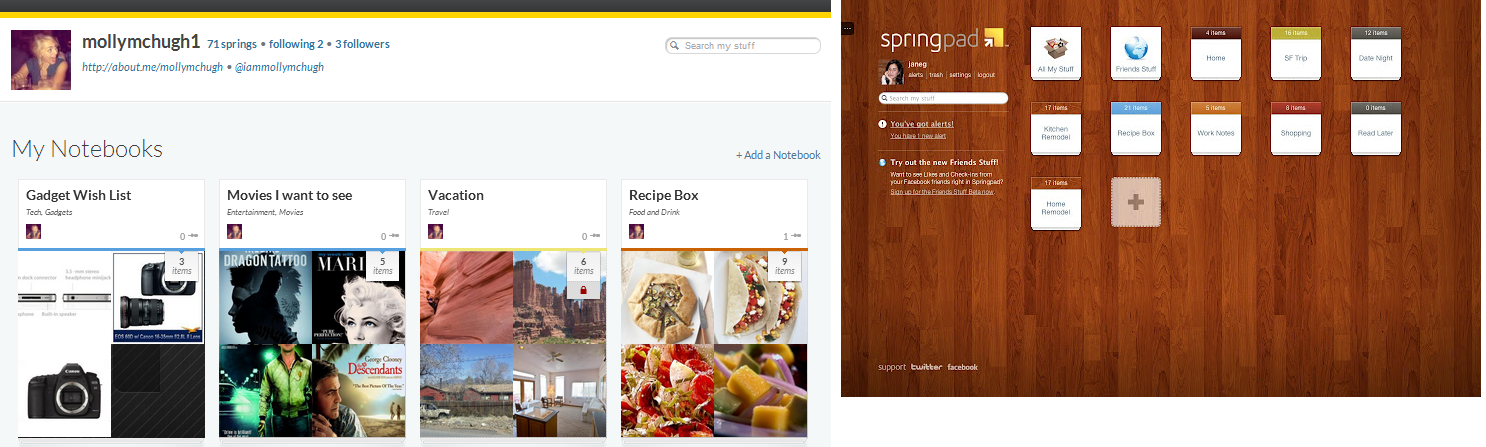
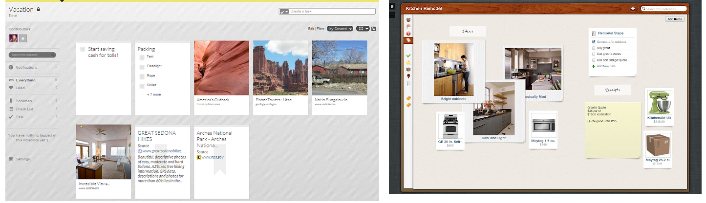
Springpad has always been a visual application, but the redesign has given it a noticeable facelift. Everything is just a little cleaner, and little easier on the eyes. Now notebooks take up more space and feature a literal glimpse of what’s inside. You also have more customization options. In general, everything is bigger, better, and brighter.
Creating content within your notebooks is now quicker as well – the fewer clicks, the better, and Springpad has definitely cut down on them.
There’s been something of a trade-off, I will admit. The quirky bulletin-board aesthetic has been downplayed a bit. You used to have a board where you could shuffle your notes around randomly, giving it a tangible look and feel. Now things are linear and more uniformly organized. You sacrifice some fun, but it’s worth it for a cleaner left-hand navigation sidebar. You obviously can toggle between notebook views, whether in list, detail, or gallery form.
Search plus Web
 Search has received a nice tweak with Springpad 3.0. It’s now easier to stay within Springpad but grab content from the Internet to fill up your notebooks. This was available prior to the update, but wasn’t nearly as user friendly. You spent a lot of time working your way through the client’s tabs and text before you were able to pinpoint what this content was and where it should go.
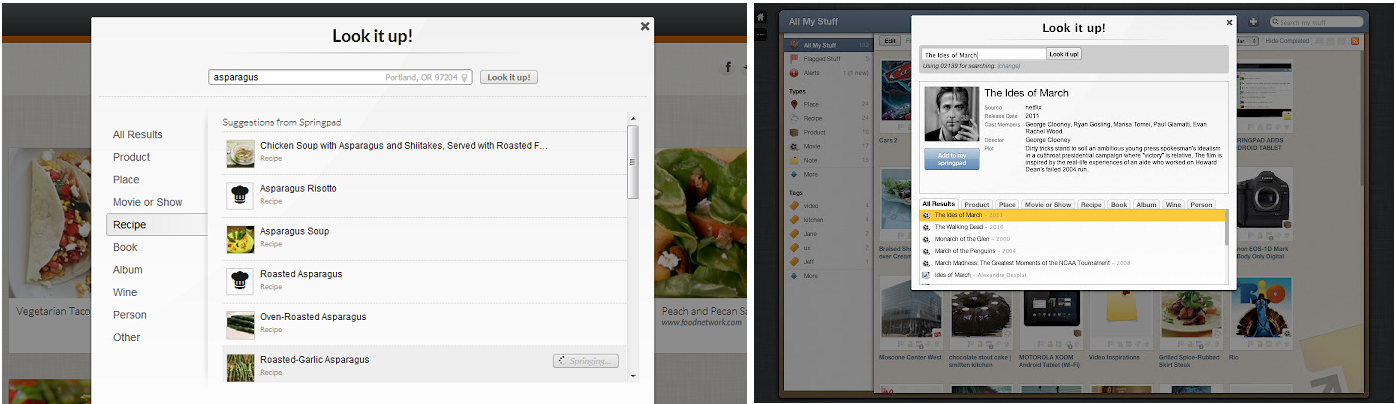 Now it’s rather seamless, and the ease of use actually motivates you to fill out the metadata you might normally ignore.
My only complaint was that you couldn’t fully fill out additional details without being directed away from the search box results. In order to add tags, notes, pictures, or other information, you had to click back into the note. And I’ll chalk this up to beta glitches, but adding an URL to a photo never worked, and I if I wanted that media I had to upload it from my computer.
Interactivity and community
The aforementioned updates – though fairly significant – pale in comparison to how Springpad has upped the interactivity ante. There’s a lot to cover here, so we’ll start with what might be the most basic new feature, Notebook collaboration. Springpad founder Jeff Janer tells me the ability to create and view notebooks with another user has been the biggest user request, and for good reason.
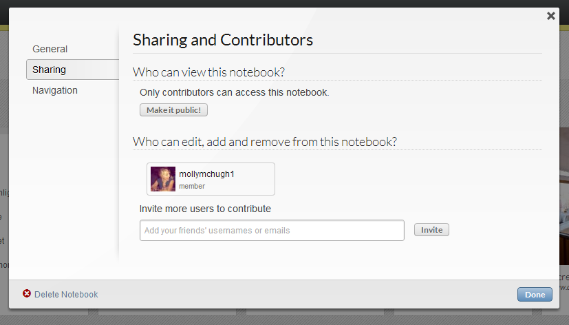 Prior to this update, it was all or nothing: either everything in a notebook was public or it was private. Frankly, that just doesn’t make sense for a productivity solution and it’s incredibly limiting. “We had users who would say ‘I just want to share a shopping list with my wife but I don’t want to share it with the whole world,'” Janer tells me. Fortunately, they won’t have to anymore and inviting and interacting within one notebook (private or public) is as easy as it sounds.
The most noteworthy new addition to Springpad, however, is the Explore feature. Janer calls it “the realization of our vision.” A search and curate element has been introduced to the application that makes it like a digestible version of Pinterest. My biggest problem with Pinterest (aside from spam, malware worries, and copyright issues) is that it’s messy. Springpad takes that visual aspect (sans full res images, no lawsuit threats here) and helps you give it context and purpose.
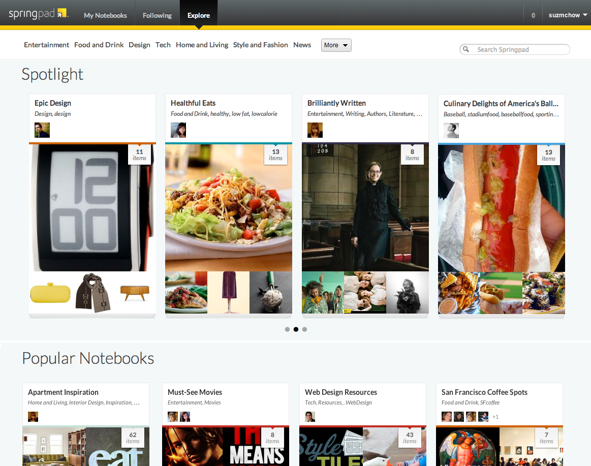 You can explore Springpad by clicking on tags (which will surface content from public notebooks), or via the Explore icon. Here you’ll find Spolight items, categories, and the ever-present search bar. While it’s a great and fun tool for surfacing data, it’s also a motivational tool for users. “A lot of people want to be the go-to person for something,” says Janer. You can follow individual notebooks or users as well.
User experience
Springpad 3.0 is trying to play both sides of productivity – and it’s doing a pretty good job. It’s retaining its purposefulness and focus on checklists and personal tasks while also taking a much more sophisticated stab at social and curation. And these new updates are a better way to do social for these types of apps: I don’t need full blown Facebook integration in a productivity solution – in fact I absolutely don’t want it. So choosing to curate its own community with the Explore element is a much more user-friendly solution. You can, for the record, share out to social networking sites and link accounts at your choosing.
Any and all confusion leftover from Springpad 2.0’s interface have been swept away in the upgrade, and this feels and operates like a finished product. It rides the line between technical and visual, personal and shareable, and offers itself as a solution for the daydreamers that love to wander Pinterest as well as the taskmasters who need an ever-present checklist.