![]() Leave it to AOL, they of the enduring “You’ve Got Mail!” tagline, to surprise us all with a new webmail client. Alto is a heavily stylized, sleek, downright pretty take on creating a collective space for your various email accounts. With an innovative approach to categorizing your content and quick-share functions, Alto has quickly found itself among the bevy of supposed “email killers.” Let’s face it, nothing is ever going to kill email — but maybe Alto can help evolve it.
Leave it to AOL, they of the enduring “You’ve Got Mail!” tagline, to surprise us all with a new webmail client. Alto is a heavily stylized, sleek, downright pretty take on creating a collective space for your various email accounts. With an innovative approach to categorizing your content and quick-share functions, Alto has quickly found itself among the bevy of supposed “email killers.” Let’s face it, nothing is ever going to kill email — but maybe Alto can help evolve it.
Getting started
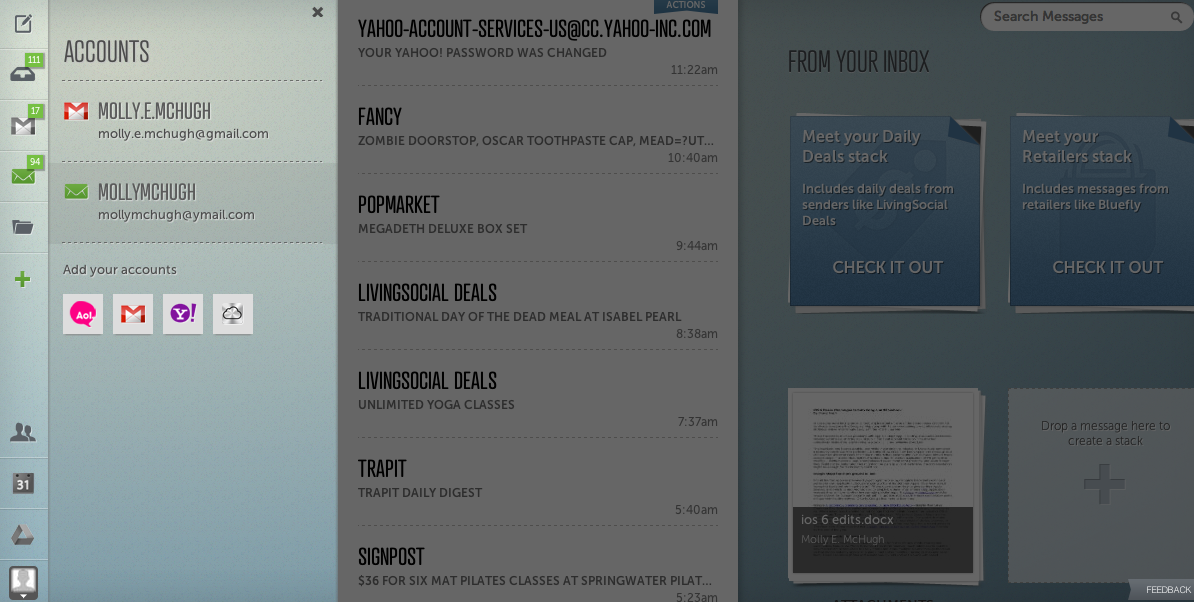
If you’ve been invited to try out Alto, all you have to do is connect the client to your respective account, sign in, choose to connect Facebook (this will do things like show you Facebook friends you have in common with people sending you emails and let you auto-share content to the site if you so choose), and you’re in. From there, you can hit the plus sign on the left hand side of the screen to add your other email accounts, giving you one place for all your email (which, for most of us, is sort of a scary thought).
Looks do matter
As you can expect, Alto does not look like your typical inbox. There is nothing spreadsheet-like about its design approach, and there’s a lot of style here. From typeface choice to color choice, you won’t mistake Alto for any other client you’ve used.
 It takes but a minute for your eyes to recognize this as a fancy attempt to make email prettier. It’s a small (and short-lived) price to pay for a much more manageable presentation. However, this is sort of a facade: It might look like your inbox is clean, and organized, and that you’ll have far fewer problems attacking it — and that’s not quite the case. You still have a mountain of content to pour through, it’s just that the process is made much more pleasant with Alto’s design and segmenting choices.
There’s no denying that Alto is a beautiful webmail option — but you need to dive in a little deeper before you determine its usefulness.
Stacks on stacks on stacks
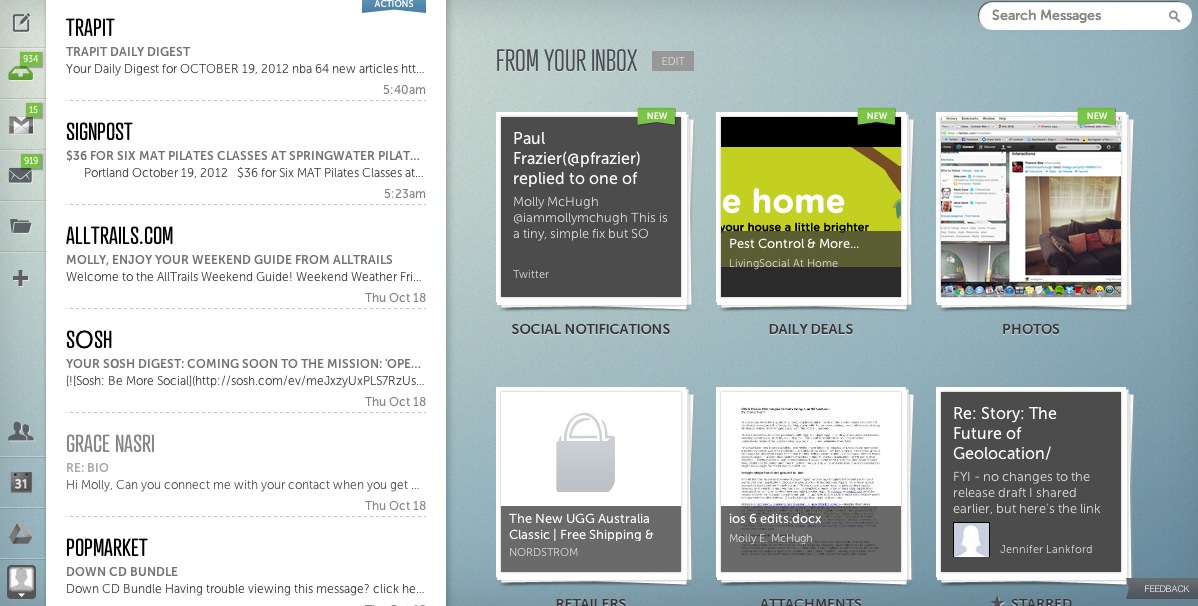
Immediately when you’re launched into Alto, you’ll notice Stacks. A vaguely familiar, incredibly stylish inbox will sit on the left hand side of your screen, but most of the real estate will be dedicated to a series of pre-made tiles called — you guessed it — Stacks.
You’re able to make your own Stacks, but Alto takes the liberty of creating a few to kick things off: daily deals, social notifications, retailers, photos, and attachments are up and running from the get-go. As you can imagine, these Stacks contain their respective content; hit up the daily deals Stack and you’ll find a collection of the many local deal services you’ve signed up for — your Groupon, Living Social, Amazon Deals, Google Offers… you get the picture. It’s all in there.
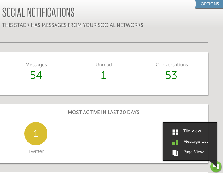 Within Stacks, you can adjust the view between a tiled, vaguely Pinterest design, a message format which segments your screen between the inbox and a number breakdown of what’s exactly in said Stack, or a full page view which pulls up emails one-by-one and lets you flip through them.
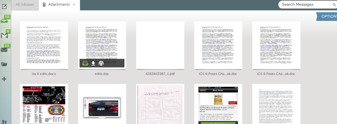
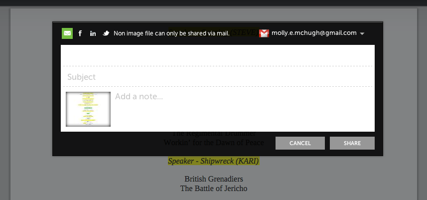
This is how most of your Stacks will function, with the exceptions being photos and attachments. You can’t choose the view format here — it’s tiles or nothing. Hovering over the individual icons will surface three options: share, download, or view message. The latter two are self-explanatory, but there’s a little more to be said about sharing this content. Unless it’s an image, you can only email this content on; which is a little frustrating with media files like videos. Why can’t I share that to Facebook? But images are shareable to Facebook, LinkedIn, and Twitter. However, only the Facebook function worked for me; with LinkedIn and Twitter, I kept getting bounced to the “authorize app” screen round-and-round without ever being able to share to these networks.
 When you open a Stack, it becomes a tab within Alto, so to get back to your home view, you can either toggle to your Inbox tab or X out of the Stack. You can have all of your Stacks open if you want. Also, if you navigate to your user settings, you can set your preferences so that a Stack moves to the top when it has a new message.
Stacks, honestly, are sort of what Alto’s all about — they are the big innovation on the inbox here. That said, there are a few other features worth mentioning, for starters, multi-account integration. Alto allows you to bring your Gmail, Yahoo, iCloud, and AOL email accounts under one roof, with icons on the left hand side that allow you to navigate between these inboxes. The only thing that gets overwhelming is when the new message notification on your browser’s Alto tab reads something like… oh I don’t know… 940. And that’s only with two accounts connected. Yikes. That right there might mean Alto is not the solution to our email overload problem — but what really ever will be? Before I wax philosophically about the doomed, never-ending, life-eating cycle of email, let’s move on.
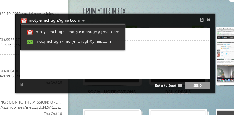
In addition to viewing your many inboxes, you can also easily send mail from whichever account you please via a drop-down function.
What’s still missing
For all the things Alto does right, there are still a few missing pieces. For starters, chat: Many of us are reliant on Gchat, Yahoo chat, Facebook chat, or some other Web, possibly-emailed based instant messaging service for inter-office communication throughout the day. And there’s a somewhat misleading “people” icon within Alto that I initially thought would pull up my connected accounts’ chat lists — unfortunately, that’s not the case, it’s simply an address book. This means that I can’t entirely just rely on Alto like I should be able to, like a total collection of my inboxes, and click out of Gmail and Yahoo entirely. I still have to have Google Talk and Yahoo Messenger running so I can chat with coworkers throughout the day. This would be a huge, much-loved integration. The new Outlook webmail client released recently included Facebook chat integration, and while this isn’t good enough for most of our daily needs, it’s at least the right idea.
Another missed opportunity here is the inability to send different types of content, aside from images, to Facebook. Within Facebook Messages, you can send all sorts of file types — .doc files, PDFs, MP3 files. It’d be great if the share option were expanded to include not only uploading photos to the News Feed and your Timeline, but to sending messages with attachments as well.
Lastly, Alto would be well to improve the algorithm or natural language processing technology it’s using for created Stacks. I attempted to make a new Stack that would collect all the new product pitches or announcements I get, but noticed that a great many of them were still in my inbox. There’s a little too much manual work required here, although it seems like the effort you put in would be worthwhile.
The verdict
Alto has both brains and beauty — although it’s definitely got more to show on the beauty side. It’s easy to get mesmerized by how pretty it looks and how fun diving into your Stacks is at first. But the overwhelming email problem persists, fancy interface or no.
Most inbox-collector clients have failed to impress either because they were shallow on features or clunky to setup, but Alto avoids both of these hiccups.
Also worth mentioning is that this is just the start; AOL is likely to refine Alto into a more alpha product before opening it up to the public. And if this is just the beginning, I’m impressed with how closely Alto is able to balance style and substance.