
 Yesterday Yahoo introduced its Flipboard competitor Livestand. The news aggregation app dutifully pulls content from a variety of sources to offer a magazine-type experience on your iPad. But how does it actually measure up?
Sign-up and sign-in
On Livestand, you’ll immediately see designated spots for new users. Here you can choose to sign-in with either your Yahoo or Facebook account, or forgo that step entirely.
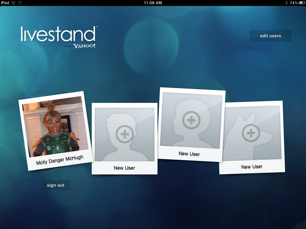 Right off the bat, we have to give kudos to Livestand for automatically providing an option for multiple Livestand accounts from the get-go. Flipboard doesn’t provide this option as instantaneously. You can pull up the settings to link your various social networking accounts (something Yahoo doesn’t really address, although we’ll get to that later) but you don’t have an option for multiple stand-alone accounts. So props to Yahoo for making Livestand so multi-user friendly, especially considering tablets are quickly becoming a family or office-oriented product.
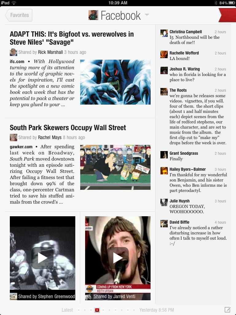
However the lack of personal information it allows you to pull is extremely lacking. It grabs your name, gender (if provided), and image from your Facebook or Yahoo account—and that’s about it. Flipboard, on the other hand, lets you link a variety of Websites and uses them to personalize your page.
From there, Livestand directs you toward content. You can either explore the featured news or the entire collection. Bookmarking and adding to your personal mix is easy, although not as quick as you might like (we watched that spinning wheel more than we wanted to).
Content collections
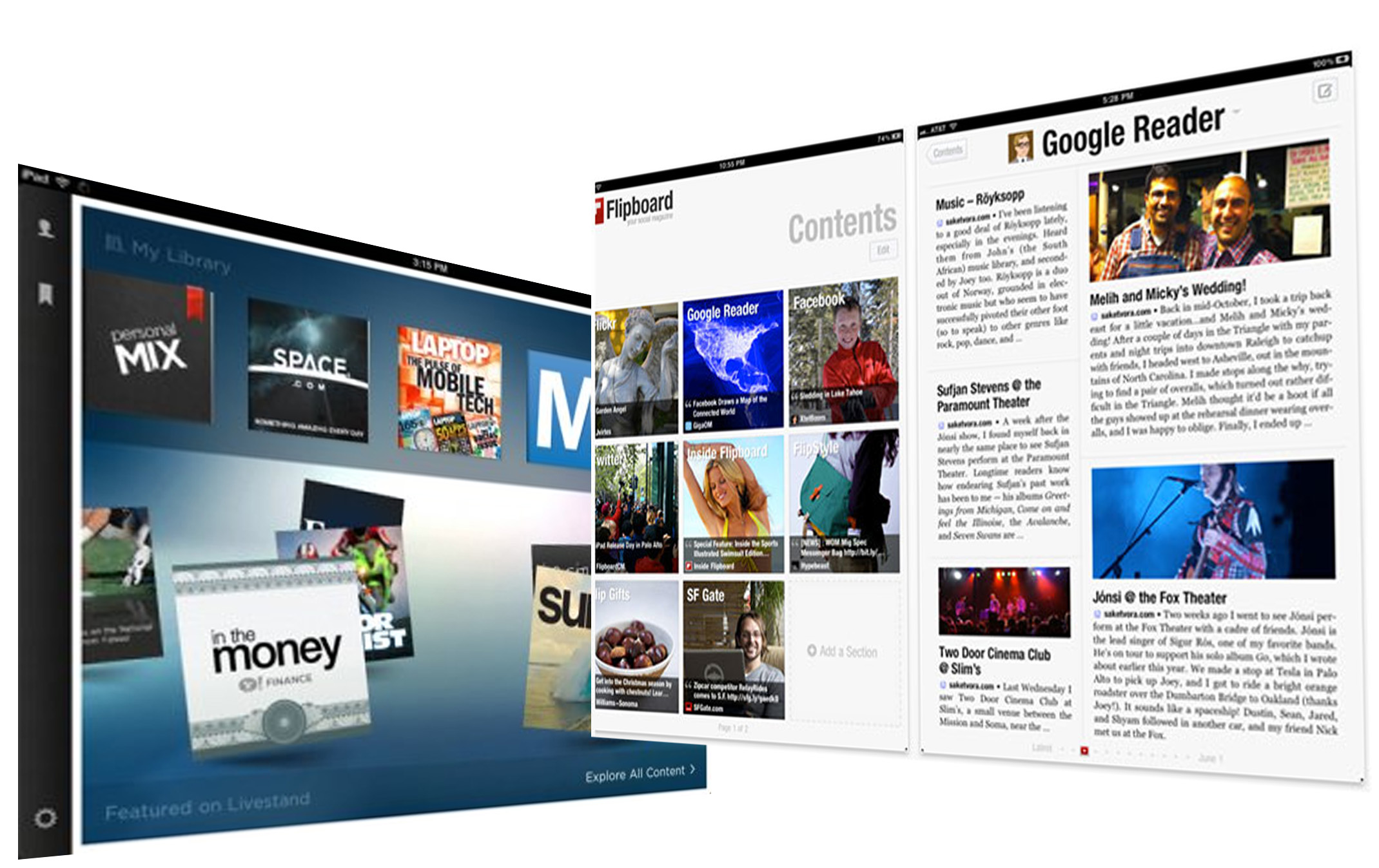
 Here’s where Livestand and Flipboard truly divide: Livestand is not a social product. Livestand is a new way to package your news and online reading; it’s a well-designed, eye-catching way to offer apps within an app to more collectively access this material. But it is absolutely not a social news curator.
There is no option for viewing your Twitter or Facebook feeds as news stories, something that Flipboard has done so well and a major reason why it’s become the magazine app to contend with. This omission by Livestand is a bit bewildering.
And while there are plenty of sites to pull from and we didn’t necessarily feel limited, there isn’t the seemingly-infinite library that Flipboard provides. There is not an option for searching and selecting your own sources, and you’re pigeon-holed within whatever publications Yahoo has partnered with.
User interface and design
Part of Flipboard’s allure is that it somehow finds this ideal middle ground between old-school, tangible magazines and newspapers and touchscreen technology. The actual method of flipping through your selected content is a nice, comfortable translation from paper to screen.
That’s not to say that Livestand’s more blocky UI is bad—we just happen to better appreciate Flipboard’s design choice.
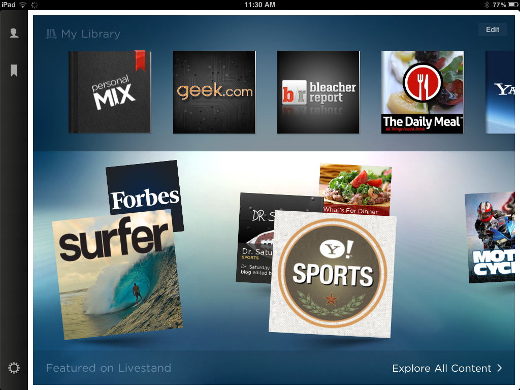 There is also some minor confusion within Livestand’s setup. You’re first greeted by two blocks on top of one another: One will be your dedicated library and the other displays Livestand’s featured content. What isn’t exactly explained is that in order to add to your library, you need to pull up “explore all content.”
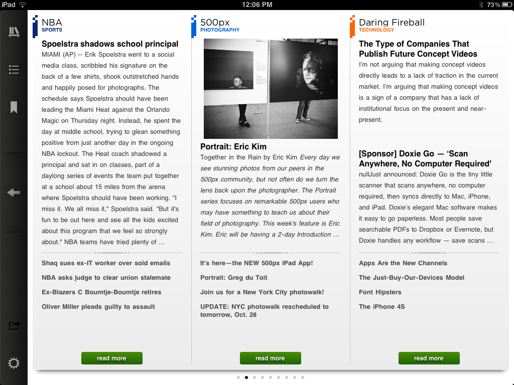
Within the “personal mix” tab is your curated content, which you can view by subject or everything culminated together. Unfortunately, the design leaves something to be desired (see the image below). The rest of Livestand (the featured publications and other standalone news apps included in the catalog) are quite stunning: Big, interactive images, sleek formatting, and attention to details like typeface and integrated Twitter feeds. But within your actual, self-created zine is nothing more than plainly formatted text. It isn’t enticing to look at or particularly attention-grabbing. Add to all this that Livestand can’t be viewed in portrait mode: You’re stuck in landscape.
 Which is just another reason why Flipboard still trumps its competition (although we’ve seen good things from reader apps like Zite and Pulse). The bits and pieces that Livestand gets right are commendable, but the big picture lacks Flipboard’s commitment to a truly, thoroughly personalized reader app.


