“Why you can trust Digital Trends – We have a 20-year history of testing, reviewing, and rating products, services and apps to help you make a sound buying decision. Find out more about how we test and score products.“
After years of rumors, plus a leak prior to its announcement, Windows 11 is finally here — and I couldn’t be more excited. After putting up with smaller twice-a-year updates for Windows 10, this is a feeling I’ve never had before.
Over the past five years, Windows 10 has really felt a bit dated when compared to other operating systems — both visually and in terms of features. But now, with Panos Panay in charge of Windows, things feel different over at Microsoft, and I couldn’t be more pumped.
TPM 2.0 and CPU compatibility controversies aside, Windows 11 has officially hit the Windows Insider program for testing, and I didn’t even hesitate to install this early preview version on my laptop ahead of the final release this holiday season.
This is merely the first iteration of what will eventually land on consumer PCs, but for the first time in a while, Windows software finally seems matched to the hardware powering it. And, there’s a ton of new features in Windows 11 that usher it into a modern era for the operating system where productivity comes first.
Sweeping visual changes in the areas that matter most
Some of the areas most frequented by any Windows user like myself are the Start Menu and the Taskbar. Since Windows 10 was released nearly six years ago, these areas have largely been unchanged. Just a few very minor visual changes to the way Live Tiles and the list of apps look on the screen — and that’s it.
It’s been a disappointment to look back and realize just how little Windows 10 has lived up to its potential. Seeing how much ground Apple was able to cover in its Big Sur update last year only made it worse. That rollout of new visual ideas had me optimistic for what Microsoft could do with Windows. But based on recent history, I was getting my hopes up for nothing. Until Windows 11, that is.
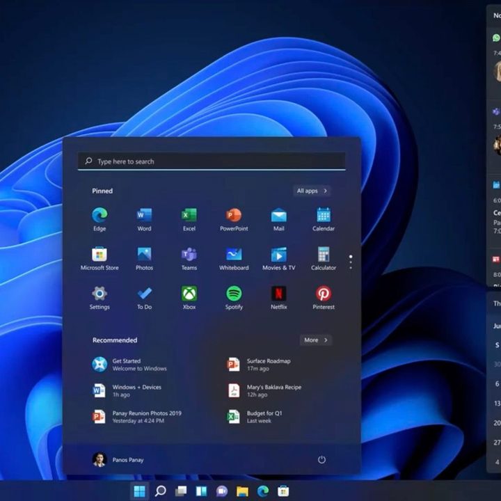
The first big things to notice in Windows 11 are the Start Menu and Taskbar. Microsoft went back to the drawing board and redesigned the Start Menu so that it puts a bigger emphasis on your apps and documents — and everything else you need — right in the middle of things. Yes, these are now centered. Of course, you still left-align it if you want, but it makes a lot of sense with the size of monitors these days to have them centered.
Notably, that means Live Tiles are dead, as your apps are now just static icons. The decision is divisive, but for me, it means two things. No more need to go digging in the File Explorer. My journal, screenshots, movies, and other files are front and center. Even the files I touch the most in the cloud are there, too. Secondly, I can also see apps easier, as the list lets me pin icons, just like I would on an iPhone or Android phone.
Oh, and the corners in Windows 11 are now rounded, rather than flat, with touches of the glasslike Fluent Design effects and tons of new animations throughout for common tasks like opening and closing windows.
It’s a visual treat and feels very refreshing to sore eyes that have grown overly familiar with Windows 10. The new Start Menu and the Taskbar look and feel inviting, and I just can’t wait to reach out and touch my screen and jump into my to discover files and my favorite apps.
A new and useful Quick Settings menu

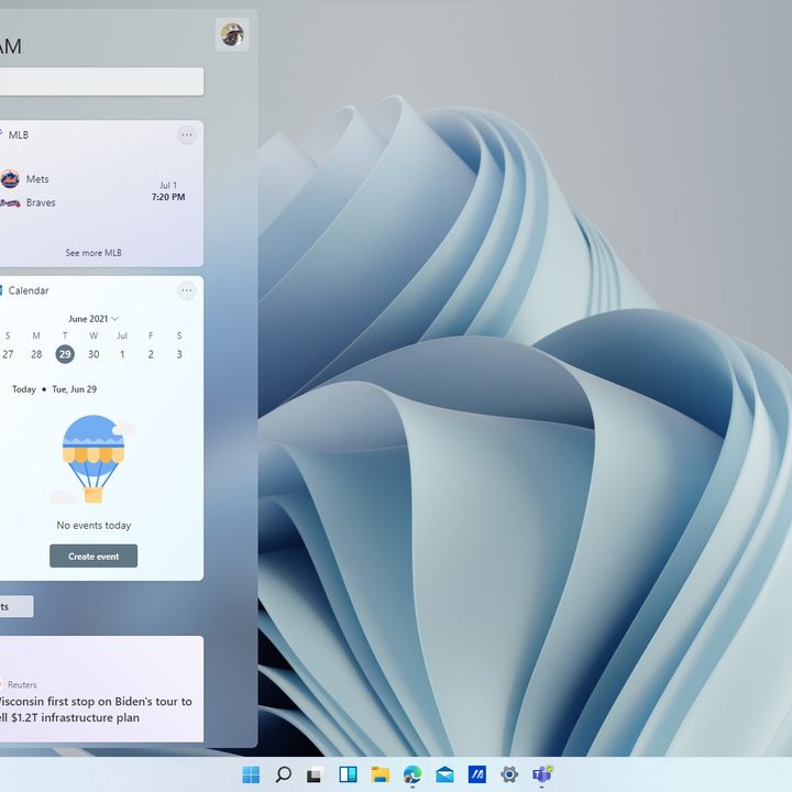
But that’s just the start. The visual changes in Windows 11 also carry over to a new Notification Center and Quick Settings panel. This is a change from Windows 10, where your notifications and quick action toggles for Bluetooth were in one place.
Now in its own space, Notification Center has a calendar, letting me peek at the full month while checking through a list of emails and other things. It also is a lot cleaner, designed to be less intrusive, and floats on top of what I already have on the screen. You even can see what’s happening under it with a glasslike effect, unlike in Windows 10, where visiting your notifications interrupted your work.
As for that Action Center, it’s now been rebranded to Quick Settings. During a busy day, I don’t want to have to dig through menus to control the volume, brightness, or sound, or even change Wi-Fi networks.
There’s some room for change, though, as I’d like to see more integrations with apps like Teams, or even Zoom. I’d like to see Microsoft open it up so developers can plug into Quick Settings in the same way that was mentioned for the File Explorer context menus.
But there’s a lot to like. After years of dealing with the combined Action and Notification Center, which when clicked would often just direct you to a settings page, Windows 11 feels refreshing. It puts all the controls that I need front and center in a handy little hub.
Productivity-first features
Microsoft most recently said Windows 10 runs on 1.3 billion devices, and there’s no doubt that a lot of those devices are being used for productivity. That includes web browsing, office work, chatting in Teams, and more. It’s no wonder that Windows 11 steps things up a bit and introduces new productivity features.
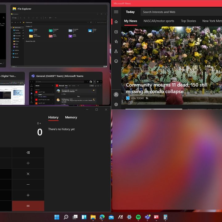
The first of those is a feature known as Snap Layouts. It’s one that I was excited about in the leaked version of Windows 11, and it’s even more responsive in this official preview version. I can just hover my mouse over a window to see different ways I can multitask and snap my windows side by side. Windows 11 will then remember that combination with a feature known as “Snap Groups.”
It’ll keep the group paired in the Taskbar, so I don’t need to constantly keep snapping it or opening the same combination over again. I can’t mention how much time this has already saved me in just the one day of using the next-generation Windows.

Microsoft also made it easier to access your desktops on the Taskbar. With a new Task view button, you can reorder and customize backgrounds for each virtual desktop. Talk about productivity!
Wrapping things up is the new docking feature. I’m always plugged into a monitor for work and occasionally will unplug and sit in the yard to finish things off. Now, when I redock my PC to my monitor as I plug and unplug things, Windows will remember how things were organized on my monitor. No more dragging windows back and forth. Windows finally remembers how I left my apps on the screen.
Modern changes to settings and File Explorer
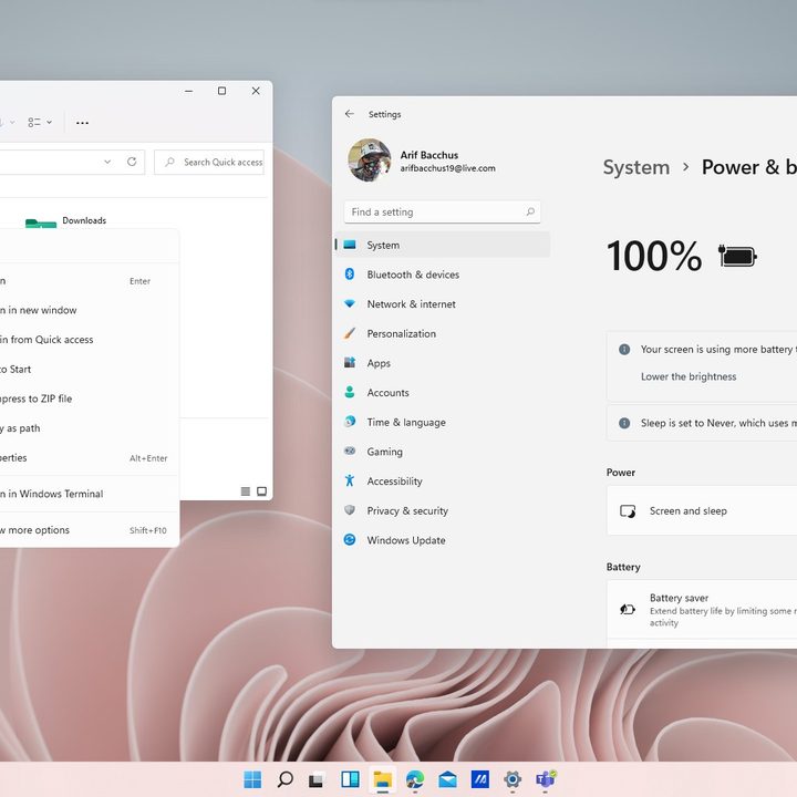
I’ve spent a lot of time talking about the big feature of Windows 11, but smaller things like the File Explorer and the system settings app are also seeing meaningful changes. File Explorer, for example, is now built with touch in mind. There’s a new command bar and new context menus that are clearer to understand. As for the Settings menu, it now has a left-handed navigation bar that will always follow you around to help ensure you don’t get lost if you need to go back to something else.
Even settings pages have hero controls to better highlight key information and your most frequented settings. The Battery settings page is a good example, as it’s now more thorough and shows you all the information you need about power consumption without having to run prompts in Command Prompt.
The Microsoft Store has received a similar update, with its new layout now being more friendly on the eyes. It now has an easy-to-understand sidebar for discovering apps, games, and movies, a cleaner search bar, and layouts that make popular apps easy to download. These changes make Windows 11 feel a lot more modern in an era dominated by iPhones and iPads.
Live Tiles are gone, but reborn as Widgets
Live Tiles were always close to my heart, as they helped me keep up with the weather, sports, and other information. So it did hurt to hear Windows 11 killed them off. But don’t worry! Live Tiles are actually back in Windows 11, but not in the form you think. Rather, they’ve been reborn as Widgets.
Swiping to the left side of the screen in Windows 11 (or hitting Windows +W) brings up widgets. While there are a couple of defaults set up, you can reorganize widgets in this space just like you would with Live Tiles on the Start Menu.
Widgets are small in scope at the moment, but cover the basic things I need to stay productive and not have to run extra web searches. Weather, sports, and news are just a few examples, but Microsoft also lets you add other system widgets for to-do, photos, traffic, and even esports and your calendar.
Tablet mode fits tablets
I’ve written before about Windows 10’s tablet mode and the need for improvements, and Windows 11 fixes this by removing it entirely. That’s actually a good thing as it moves Windows 11 closer to what Apple has done with iPadOS.
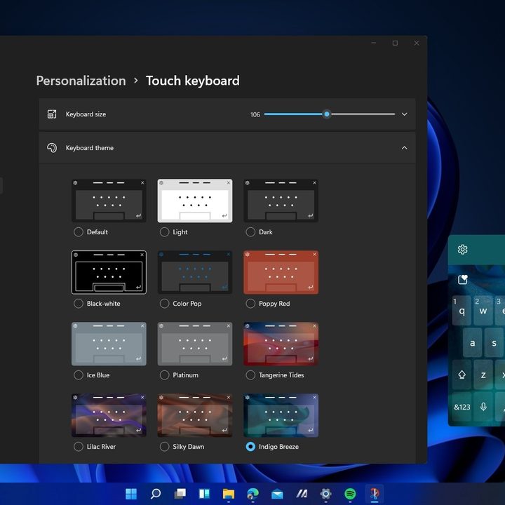
Windows 10’s tablet mode was a complicated mess, but Windows 11 drops it for some meaningful features that really made the 2-in-1 that I tested Windows 11 on fun to use. These cover the touch keyboard, gestures, and touch targets.
That new touch keyboard can be personalized with new colors and the ability to insert GIFs, and you can even use your voice to control Windows. The new keyboard is very reminiscent of Swiftkey on Android and iOS, floating where you need it and staying out of the way. You even can drag on the spacebar to scroll, a feature that makes holding my 2-in-1 in my hands so much more convenient.
Improved gestures make navigating Windows 11 a breeze on tablets, a bit like what Apple did on iPad OS 13. A three-finger left and right switches to the most recently used apps. A three-finger swipe down lets you go back to the desktop to restore or open windows, and a swipe up will let you view open apps. Pressing and holding down with four fingers then swiping will get you to your different desktops.
Microsoft even made touch targets easier to use, so that windows are easier to drag with fingers and there’s more spacing between icons and touch bars. Then there’s the pen menu, which now lets you add your own apps for quicker access.
The gestures take some getting used to after five years of Windows 10, but smaller changes like these make a huge difference in the long run and add a lot of value to Surface devices.
Android apps and more — the best is yet to come
Windows 11 is still in a preview state, so a lot of the big features Microsoft announced at its June 24 event are not yet available in this initial build. You won’t find Android apps in the Microsoft Store just yet, and neither will you find the new Teams chat app.
This is just the start, and with the biggest visual changes now introduced, Windows 11 can only get better from here on out.
You can actually shape that future by joining the Windows Insider program and installing Windows 11, then submitting your feedback to Microsoft via the Feedback Hub. For everyone else, expect Windows 11 to come later this holiday season as a free update for Windows 10. It also ships preinstalled on new PCs.