The mythical Google Pixel foldable has again popped up in a leak, and this time, we get the first realistic look at its design. The leaked renders and video, which come courtesy of @OnLeaks, show us familiar Pixel 7-inspired aesthetics.
We’re looking at a pearl white rear panel with a huge camera bump that rocks a metallic polish, matching that of the surrounding frame. A dark gray or black trim is reportedly cooking up in Google’s design labs as well. On the front is a 5.79-inch screen, while the inner foldable panel measures 7.69-inch across.
The second-gen Tensor chip is said to power the Pixel Fold, coupled with 12GB
A rather peculiar design
So far, everything seems fairly normal for Google’s upcoming foldable phone. That’s until you absorb the leaked dimensions and take a good look at the rather stout frame of the
Google is chasing a design where the width of the inner screen is more than its height. What you get upon opening the
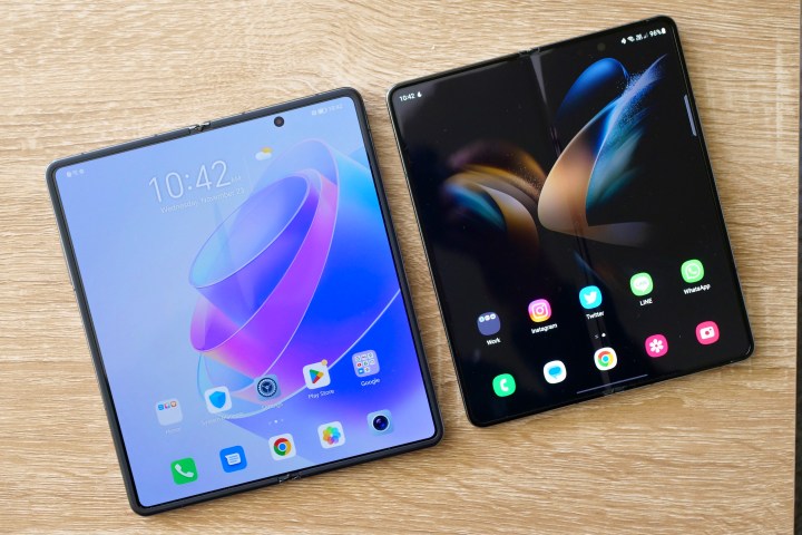
In comparison, Samsung’s Galaxy Z Fold 4 unfolds into a tablet view that is still in portrait orientation. You need to rotate it 90 degrees to get a more natural-feeling horizontal view. On the Oppo Find N, well, its inner display is almost squarish, so there is no rotation hassle.
I am not entirely sure about Google’s design approach and UI optimization. For all its amazing tricks, the split-screen experience on the
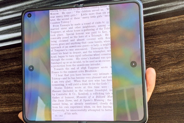
If you’ve tried to get stuff done on the outer cover screen, you know the drill. You have to rotate the device to give apps a slightly wider window for scaling, which feels natural. But it does create a difference in the overall feel and appearance. On the Oppo Find N’s squarish screen, you couldn’t do anything about it.
It appears that the
When launching apps in split-screen mode, you will still have enough width in each half for apps to scale properly. Yes, you will lose a bit of vertical space, but at least apps like Twitter and Instagram won’t look like badly scaled cramped messes.
Just take a look at Twitter running on the
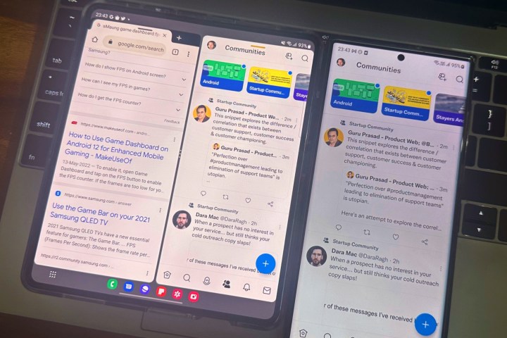
Depending on the scaling versatility coded at the heart of each app, they might look better or worse. Letterboxing is a necessary evil for video-centric apps, while games tend to cut UI elements. For apps like Asana and even Instagram, you don’t want to live with that weird visual experience. Trust me!
Oppo implemented a clever system to avoid the scaling issue. You can run an app in its natural aspect ratio by taking up slightly more width than half of the screen area. The rest of the area is blurred. You can also move the app window toward either edge or keep it centered with blurred pillars on either side.
Google might take either path; we haven’t really seen a vanilla Android experience run on a foldable phone. One UI 5 has been heavily customized, and from my experience, it is amazing. Oppo also did its fair share of dressing
Android 12L gave us a taste of what Google wants to do on bigger screens, and
That’s because they all have a different aspect ratio for the inner screen. Can Google solve it with some universal resizing approach for all apps at the code level? So far, we haven’t heard any such rumors.
However, it is safe to assume that the two-column view for core Google apps that is currently available on tablets will make its way to the
What Google has to get right
The
Assuming Google gets the hardware design and software optimization parts right, we need to take a peek inside. The Tensor G2 inside the
Owing to its fundamental design, the
Google can create some eye-catching new software tricks that make the best of its larger foldable screen, but the
Editors' Recommendations
- Why you need to be excited about the Google Pixel 8a
- The 6 biggest announcements we expect from Google I/O 2024
- The Google Pixel 8a leaked again, and now I’m nervous
- This Google Pixel 8a leak just spoiled everything about the phone
- Google is going to change Pixel phones forever, and I can’t wait