
Twitter has released new versions of its mobile apps for iOS and Android devices that copy the newly revamped design of its website, which began rolling out today. The changes, which are more or less consistent across all versions, are intended to make it easier to post tweets, see who’s engaging with your posts and find new content. We’ve taken a hands-on look at the new iOS app to show you what’s new and improved.
Toolbars
Twitter has redesigned the navigation bar, which appear at the bottom of the app screen. (This appear at the top on the Android version, which is really the only thing that sets the two versions apart, from what we can tell.) The buttons on the nav bar now include: Home, Connect, Discover and Me. The Messages, Lists and Search buttons from the previous version have been moved to other parts of the app. In addition, a blue bar appears at the top of the screen with a new Tweet button in the right corner. Both the nav bar and the Tweet bar remain on the screen, no matter where you are in the app. Since the new buttons are a major part of the redesign, let’s take a closer look.
 Home and tweets

The Home screen, accessed by hitting the Home button, simply shows you all the incoming tweets from the accounts you follow. In other words, there’s not much new to see here. The Home screen is redesigned, however, with a light gray border running along the sides of your feed. They’ve also removed the little “>” symbol that appeared on each tweet to show people that you can tap an individual tweet and see more details about it. That functionality still exists, of course, but apparently Twitter feels that everyone understands this enough that they don’t need extra details in there cluttering up the design.
When you click in an individual tweet, you can now see not only the tweet, but also a detailed list of replies to the tweet. Replies appear in full beneath the original tweet. If anyone has retweeted or favorited the tweet, tabs show the number of times each has been performed, and can be clicked to see who retweeted or favorited the tweet. Twitter has also added a redesigned Follow button next to each user’s name, which makes it much easier to follow new people than was the case with the previous version.
Writing and posting new tweets, as well as retweeting, all works exactly the same as it did before, so nothing to see here. Moving along…
Connect

Under the Connect tab, you can see all activity that’s related to your account, including mentions, retweets of your posts, and new followers. When on the Connect screen, you can also choose to see all interactions, or mentions only, by selecting the category that appears on the blue Tweet bar at the top.
Click on a particular mention, and you’ll be shown which tweet that person was responding to. This makes it much easier to look back at was was previously said in a conversation, something that’s particularly useful to people who use Twitter as a kind of instant messenger platform.
Discover
Entirely new to this version, the Discover section gives you a mix of Twitter stories, trending topics, and suggestions for new accounts to follow. The stories and follow suggestions are apparently curated specifically for each users based upon language, location and which accounts a person follows.
At the top of the Discover screen is a search bar, where you can type in hashtags or keywords to find content on specific subjects. At the bottom, you can choose to see more follow suggestions, find friends and browse the new Categories section.
Categories allow you to find users related to specific topics, like music, sports, new, science or business, among many others. Click on a category, and you’re given a long list of people to follow from that topic. This is especially useful for users who like to use Twitter as a sort of RSS reader, or news feed, as you can now easily find accounts that tweet regularly about topics you might be into.
Me
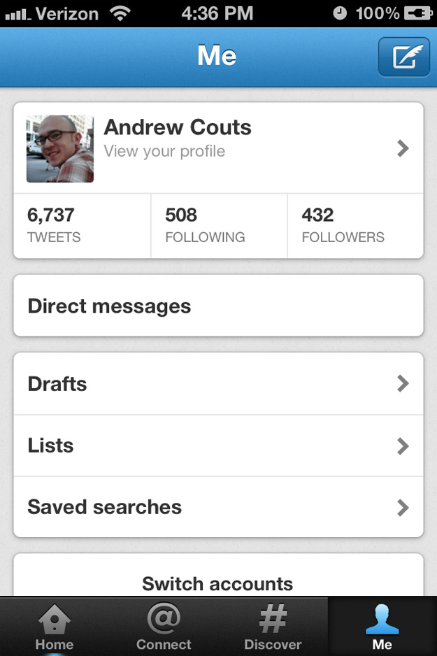 The Me section of the app is very straightforward, giving you access to your profile, stats, drafts, lists and saved searches. This is also where you can access your direct messages, as well as change you settings or switch to a different account.
Profiles
Profiles look basically the same, with a user’s photo, bio, and profile stats. You can now also see the last three tweets a user posted, as well tabs to see who a person is following, who follows them, favorites and lists. Twitter has also included a button to automatically send an @ mention to the user, and you can see other users similar to that person. Like the rest of the app, this part of the redesign is well done, and makes you have to click around less to find the information you’re looking for.
Conclusion
From our relatively short time with the app, we have to say that this redesign is a definite improvement over the previous version — which, we must say, already wasn’t too shabby. The main thing this new version gives you is the ability to find new content and users that you’ll likely enjoy thanks to the Discover section, as well as the ability to more easily add new people to follow. Another major area of improvement is navigation; you just don’t have to click around as much to find the function you’re looking for. We could be wrong about all of this of course, once we’ve spent weeks using the app. But from a first-impressions standpoint, it couldn’t be much better.
Editors' Recommendations
- Apple’s new iPad Air isn’t even out yet and it’s already discounted
- How to connect an iPhone to a Mac with or without a cable
- iPad Pro (2024) vs. iPad Pro (2022): a surprisingly big upgrade
- iPhone 16: news, rumored price, release date, and more
- iOS 17.5 just launched with a huge security feature for your iPhone

