One of Apple’s recent focuses on iOS and watchOS is mental health and wellness. In the most recent watchOS 10 and iOS 17 updates, Apple added Mindfulness capture, which lets you log your mood for the day or how you feel at a particular moment. Similarly, it also launched a new Journal app.
Though Apple announced the Journal app in June’s WWDC23 keynote, Journal was absent from the initial iOS 17 release. With iOS 17.2, Apple finally released Journal to the public as another tool for better mental health and wellbeing.
Apple’s Journal app is now another option for users who want to keep a digital diary of their memories and reflections. But the market already has some well-established options, such as Day One, which I have personally used for several years. As someone who has anxiety and a bit of depression, journaling has always been one of my methods of catharsis.
So, does Apple’s Journal hold a candle to these popular journal apps from third-party developers? Let’s find out.
Apple’s Journal is a little too simple
When you launch Journal for the first time, you’ll go through some prompts that introduce the app to you and show you how to get started with journaling. It’s pretty self-explanatory for someone who has been journaling already, but it’s a good introduction for beginners.
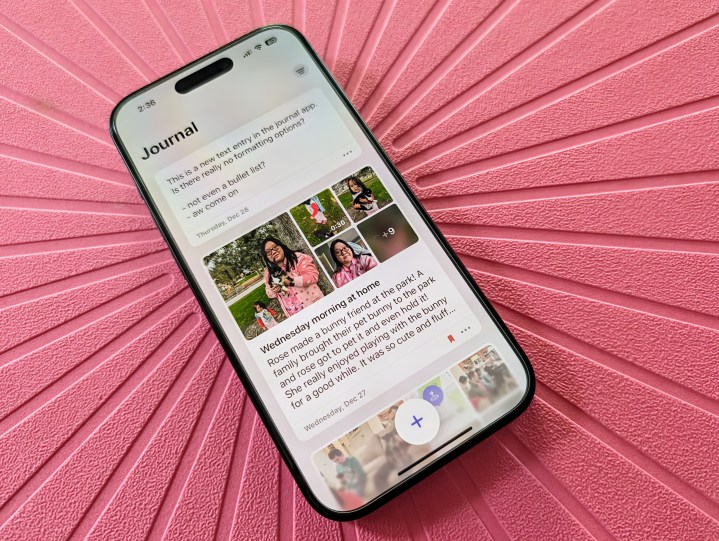
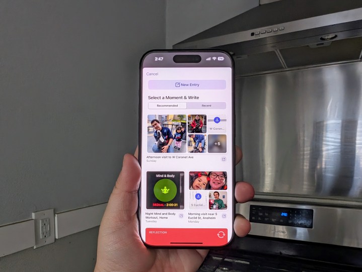
Once you get past that, you’ll pretty much find a blank canvas. Tapping the large button at the bottom will bring up suggestions that are based on the activity and moments on your iPhone. These suggestions include photos and videos, workouts, locations, contacts, music played, and more. Select one of these recommendations or pull one from recent history, and Journal will add all that into a new entry. You can add text for more context if needed.
But when you use one of these suggestions, you’ll have to change the entry date to the moment’s date manually; otherwise, it will (oddly) default to the current day’s date.
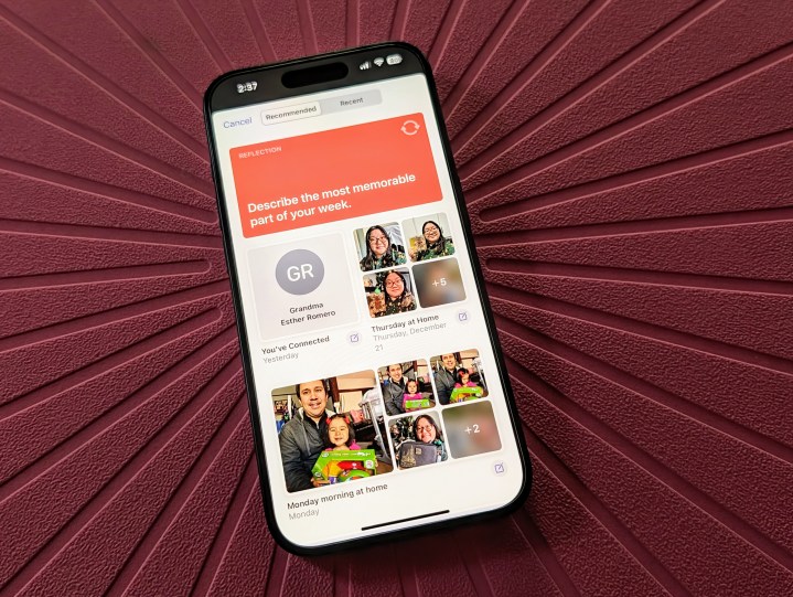
There are also “Reflections,” which are writing prompts that are helpful if you are stuck. Apple said it uses AI for these suggestions and reflections, but they aren’t very personal and much more generic than I’d like. Maybe it will get better through machine learning after you use it for a while (along with the Mindfulness capture and other Health data), but so far, the reflection prompts definitely feel more like a general gratitude journal.
When adding text to an entry, whether it’s from one of the suggestions or just a blank new entry, it’s pretty barebones. You can format the text with bold, italics, underline, and strikethrough with the standard iOS text menu (select text and bring up that little popup menu), but there’s no text formatting toolbar like in most other text-based apps. You can’t even make a bullet point list easily, which is surprising.

In addition to text, you can add photos, videos, short audio clips, and locations to your new entries. Locations are helpful to have in journal entries as they add necessary context for why you feel a certain way — perhaps a specific location makes you feel happy, while another relates a bad incident that makes you upset.
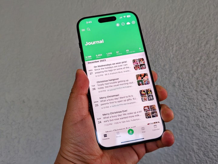
Overall, the Journal app is simple, but it’s also too simple, in my opinion. Once you start adding entries, there’s no way to search past entries for something, so you’ll have to scroll through and hope you find what you need.
And while there are filters, it only lets you filter entries by photos, videos, and bookmarked if you favorite any. There’s no way to filter by date, location, or even add tags. Things are also made worse by the fact that the date is too small and hard to see, as it’s located at the bottom of an entry when viewing the main screen.
Day One does it better — a lot better
As I mentioned earlier, I’ve been a Day One user for many years — my first entry was from March 2011. I am also a Day One Premium subscriber. I’ve seen Day One evolve over time, and it’s become packed with incredibly useful features.
Apple’s Journal app is quite barebones and has a long way to go if it wants to be a serious journaling option. Of course, I’m not sure if Apple planned to sherlock third-party journaling apps with its first Journal app attempt, but if so, then there is a lot of room for improvement.
For one, Journal needs a search option, because once you start to fill it up, it’ll become unwieldy if you want to find something specific. Even tags would help with organization. It would also be nice to have the option for multiple journals, as that’s how my Day One is set up at the moment.
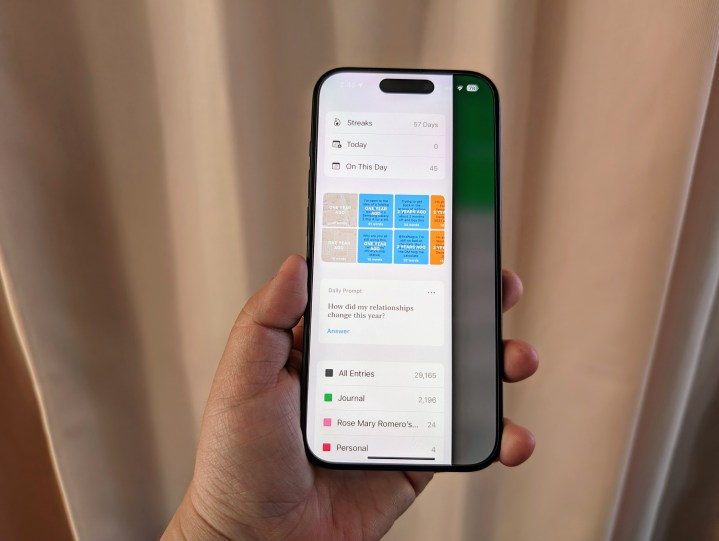
It’s also surprising that, for a journaling app, there’s no way to look at throwback entries in Apple’s Journal, which is a common feature that you’d expect from an app of this nature. What I mean by this are those “On this day” or random old entries that pop up for you to revisit and relive. After all, when you keep a journal, one of the best parts is to open it up to a random entry and just reflect on it.
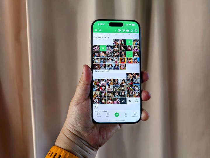
Another thing I like about Day One is that I can view my entries via a map or even a calendar view to see all the days I logged an entry at a glance. The Journal app lacks both of these views despite the fact that you can add location data to entries.
There’s also a lack of templates besides the suggestions and reflection prompts, and there isn’t even a widget. And the most peculiar part is that Apple did not bring Journal to the iPad or Mac.
While I typically just throw in my photos into a Day One entry on my iPhone 15 Pro, I would much prefer typing in the text on my Mac or even an iPad with a keyboard attachment over the touch screen iPhone keyboard. It’s strange that Apple does not have an iPad or Mac version of Journal in iPadOS 17 or Sonoma. I would think the iPad would make the most sense even, especially with Apple Pencil support. But, as it stands right now, your iPhone is the only way to access the app.
The Journal app has a long way to go
As a user of Day One for over a decade, I’m not sure I could ever see myself switching from it to Apple’s Journal app — especially in its current state. It’s just way too simple and lacks even the most basic things you’d expect from a journaling app. Perhaps I’m not the target demographic for Apple’s app, especially since there isn’t even an import/export option.
Apple’s Journal app is a good way for someone who hasn’t journaled for years to get started. After all, simplicity is a draw for some people; open it up and jot down your thoughts and feelings, add some photos, and you’re done.
For my use, though, it feels like Apple overhyped the Journal app. It’s fine for what it is, but there’s no hiding its lack of features compared to third-party options. I hope to see Apple add features to make Journal more useful for those who choose to use it, but I won’t be switching any time soon.
Editors' Recommendations
- Nomad’s new iPhone case and Apple Watch band may be its coolest yet
- 5 phones you should buy instead of the iPhone 15
- Why you should buy the iPhone 15 Pro instead of the iPhone 15 Pro Max
- 3 reasons why I’ll actually use Anker’s new iPhone power bank
- Here’s how Apple could change your iPhone forever