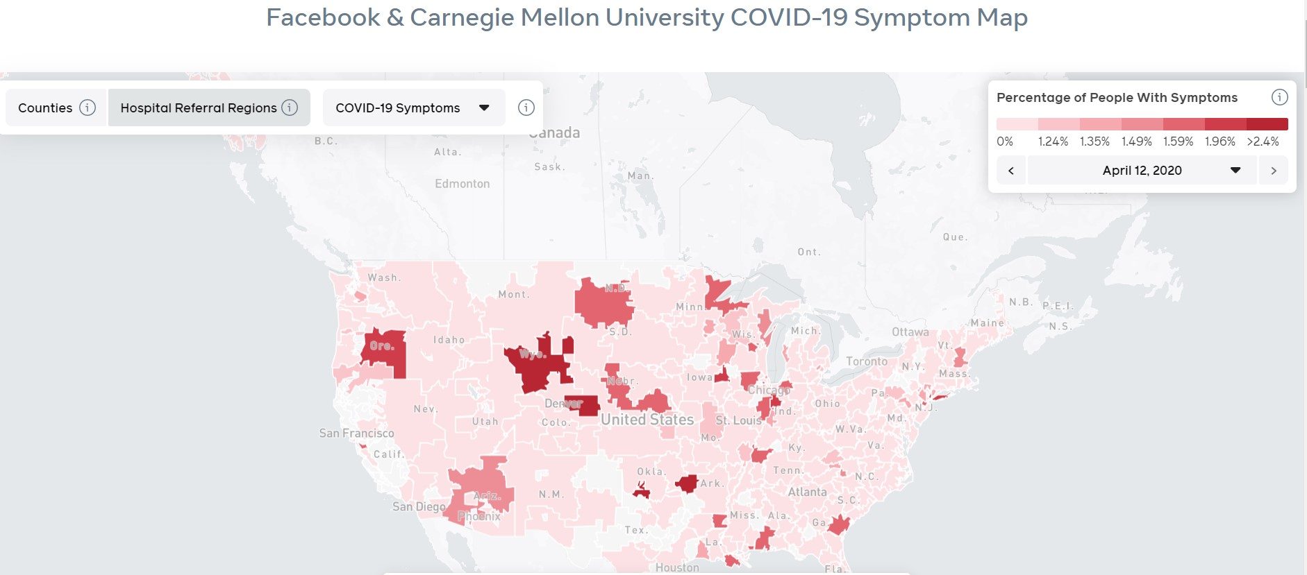
Facebook has posted an interactive map that tracks where people are self-reporting symptoms of coronavirus, officially known as COVID-19, by county.
The map pulls data from a survey of Facebook users who self-reported symptoms to researchers from Carnegie Mellon University. Scientists say the information could be used to predict where coronavirus outbreaks will hit next.
What is the purpose of the map?
The map could help give public health officials and governments a clearer picture of the spread of the disease and might aid them in trying to decide when and how to reopen the communities.
The map is particularly important because of the lack of widespread testing. The number of people confirmed as being infected isn’t a good indication of the spread when there could be hundreds or thousands of people who have symptoms but either are not sick enough to get tested or unable to get tested for another reason.
“I think providing aggregate data to governments and health officials is one of the most important tools tech companies can provide,” Facebook founder Mark Zuckerberg said in a statement.
How does the map work?
The map provides a breakdown of Facebook users who responded to the survey in each U.S. county. When a user hovers over a particular county, a percentage displays showing the estimated percentage of those in the county infected with COVID-19, based on the surveys.
Researchers say the data from their survey correlates with areas where testing has proven coronavirus cases are soaring.
As expected, counties around New York City, including the boroughs of Queens and Brooklyn, are in the darkest shades of red because of the concentration of confirmed cases of coronavirus.
The map also features an option to filter only flu symptoms to show a comparison between COVID-19 hotspots and likely seasonal flu cases.
Local officials and hospital administrators could also use the map as a predictor of which facilities could be hardest hit by an influx of symptom-exhibiting patients by checking the map continuously with the “Hospital referral regions” filter.
Who is surveyed?
The surveys are being conducted via Facebook with 1 million new data points every week. Facebook said Monday that new platform users would be surveyed each week and the map would be updated on a daily basis as results are tabulated.
Google is also running its own survey, though those results have yet to be released.
Will I be asked to participate?
Possibly. The survey is completely voluntary and Facebook prompts random users to take it when they open the desktop site or web app.
Facebook plans to roll out the survey internationally as well.
What about my privacy?
Users’ information is not included in the survey results which go to Carnegie Mellon’s Delphi Research Center. The survey also does not track your movements, divulge passwords, or give researchers access to your account.
Instead, Facebook uses aggregated data based on survey responses.