Ever wonder what it would be like if Twitter got a complete makeover? Melbourne-based designer Fred Nerby wowed the Internet with his breathtaking re-imagination of our favorite micro-blogging platform (see video below), and it’s not the first time he’s done something like this. In the past, he also conceptualized a brand-new Facebook featuring a more streamlined and visually captivating layout. Both designs have more modern feels, which sparked huge reaction this week. We all started asking “what if our social networks looked like this, had these features, and worked this way?” So now we have to ask: Is it because we’re actually bored of the real deals, or are we just impossible to please?
According to a recent online poll, despite the rise in users for major social media players like Facebook and Twitter (140 million and 92 million unique monthly U.S. visitors, respectively), most people are bored by social media and feel that it’s becoming a tedious part of their routines rather than a fun, engaging tool. And what better way to spice things up than to offer a new look and feel and apply it to the social networks that we use (but don’t necessarily love) the most?
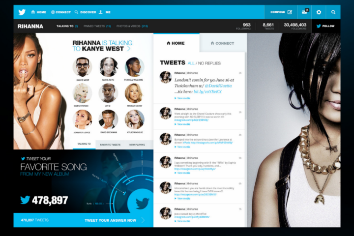
Nerby’s design can truly inspire anybody bored by the current Twitter interface to get more into it – not only does it showcase photographic content better, it also improves existing functions that are presently limited, such as private messaging (you can write notes as long as you want), and custom galleries (as opposed to a plain media stream). Perusing someone’s timeline is now easier to do, thanks to an organizational style that doesn’t sacrifice form – stats appear as infographic summaries and people’s conversations with other users are arranged in neat grids and columns.
It’s no secret that the square layout is all the rage these days, and everybody is eager to get on the bandwagon – even Nerby’s redesign for Facebook resembles Windows 8’s user interface. And if there’s anything that Pinterest’s soaring numbers prove, it’s that appealing to the eyes works.
To be fair, not everyone has successfully ridden Pinterest’s coattails. The new eBay homepage hopes to encourage online shoppers to discover new products they hadn’t thought of buying in the first place by entrapping them in a never-ending stream of items as they become available – this may be a tough sell for eBay’s regular clientele who usually already know what they’re looking for beforehand and immediately use the search function to find them. Myspace has also taken a step forward with its sleek and shiny new app that employed the tile layout, but recent reports show that the social platform now focused on music discovery is actually losing some of its loyal users due to its unceremonious removal of old blogs. Although both sites are obviously following the visual tile trend, the problems they may be experiencing don’t really have anything to do with layout design. As far as we’re concerned, their move to a more modern look is a step in the right direction.
It’s easy to see a pretty new design and scream “I want that!” It’s easier yet when we’re fed constant stories about our frustrations with Facebook, and about how we’re tiring of Twitter. But in the face of this complaining and bandwagon love for new UI concepts, we also deliver a steady stream of user rage anytime our social networks add a feature. The Facebook Timeline was easily the most comprehensive, far-reaching, design-based update the social network has ever given us, and we all know how that went.
We just can’t be happy and these platforms know they’re damned if they do, damned if they don’t. So before someone makes a group supporting the new Facebook design concept, or tries to get a #newTwitterlook hashtag trending, maybe ask yourself: Can I really handle the change?