With flashy finishes and improved user interfaces, the tech industry has shown that it takes style and substance to sell a gadget today. The same holds true for a website – which is why we’re unveiling a brand-new Digital Trends today: a faster, more modern site designed for the way we live.
DT has had the same look for over half a decade, and while we’re flattered that other tech sites have “borrowed” our beautiful design – you know who you are – it’s become clear that we can do better. You demanded more from us. So over the last year, we’ve built a new site for you.
Our design team has rethought what we do from the inside out, while our tireless engineering team spiked their Visine bottles with coffee to ensure that every widget works, every slider slides, every text box wraps or aligns or does whatever it is that text boxes do. Indeed, relaunches like this take an entire company, and truly, everyone made this happen.
So what should you look for as you stroll through the new Digital Trends? Note first that the website is dramatically faster; we stripped away years’ worth of legacy code and shrank the average size of images to optimize for the size of the screen, meaning every page should load like lightning. In early testing, we saw some key pages load twice as fast. That’s across the board improvement, by the way.
The new site uses Gotham Narrow, a simple sans serif that is extremely legible at small sizes.
A KPI — key performance indicator, in project management-speak — was speed, so we focused on a significant reduction of the size of HTML on pages for faster render times. And with 50% fewer HTML elements, pages should blaze. Speed is good, but we didn’t stop there. We significantly reduced the number of front-end assets needed to render on each page for faster page load speeds. Hit DT and you’ll load 65 to 75% less CSS and JavaScript code. Lightning!
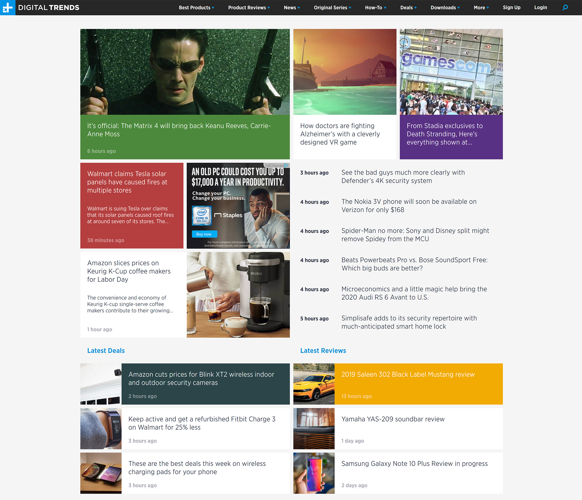
Meanwhile the new layout is far more flexible, making it easier for our editors to highlight the latest content, and letting us respond in real-time to the needs of our audience. We can customize around events in the blink of an eye, strip away everything but that amazing new feature, highlight everything you need to know about a new product, and so on.

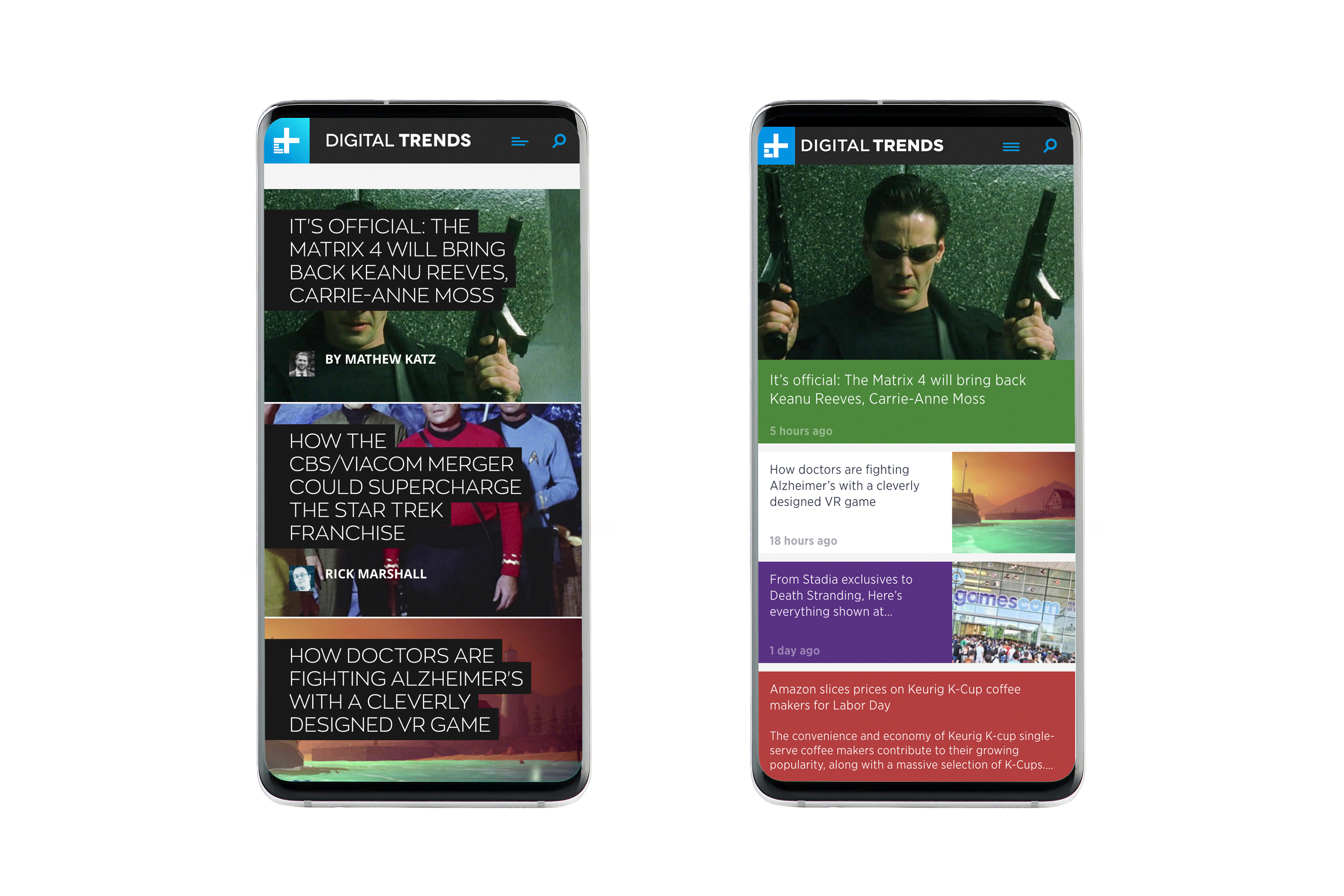
The new, more curated homepage makes it easier for you to find the content you like. The new look is designed with mobile devices in mind, which is how 65% of you read DT already. And the new look shines like a star on your phone. Our homepage used to show two or three articles at a time; now it can show dozens.
We also have a powerful new topics page layout editor that should let the editorial team gather a variety of articles together around a subject, such as the best of everything page, a collection of all of our editor’s picks across dozens of categories.
Tons of usability enhancements are laced throughout, including a font change: We had been using Zona Pro for headlines, and Open Sans for body copy. And they were okay. The new site uses Gotham Narrow, a simple sans serif that is extremely legible at small sizes. Its narrow character width allows us to increase type density, so you can browse more content quickly. We even optimized each page for a smoother scrolling experience (a silky 60 frames per second).
Like any big change, some of what we plan will need work. Some of the edges are still rough, and there’s some polish yet to be applied. We could use YOUR help finishing things off! So please, drop me an email if you see something that doesn’t work or needs some help. Drop me an email if you love what you see (or if you hate it, I suppose). And reach out to suggest improvements, or things we need to add. Site design is an evolutionary process and we will continue to refine from user feedback. We look forward to hearing from you.
But some things won’t change, notably our mission: To guide our audience through an increasingly complex digital world by humanizing technology and filtering out the noise. And that holds across the award-winning features we write, the videos we shoot, and everything else. We hope the new design helps guide you – let us know what you think!
Editors' Recommendations
- HP’s new all-in-one PCs include wireless charging stands
- Peak Design’s new universal phone case could meet all your mounting needs
- With a touchscreen, the new Loupedeck goes all in on tactile photo, video work