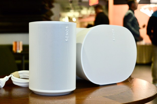
How it started: Sonos releases the biggest update to its mobile apps in years, with an entirely revamped interface.
How it’s going: People aren’t happy that many of their favorite features haven’t survived the transition.
That pretty much sums up the state of affairs now that we’re about 3 days into Sonos’ new mobile apps for iOS and Android. The new version has some clear advantages, especially for those who regularly only use a handful of
The Sonos subreddit is quickly becoming a space for unhappy users to vent their frustrations with the changes, even if they’re only a vocal minority.
I’m sympathetic to their concerns and share many of them. I was unpleasantly surprised to learn that the Music Library — which lets
For its part,
But before this becomes a litany of complaints, let’s take a deep dive into the new design and give
Smooth operator

As long as the music you want isn’t stored in your Music Library (see above), I think the new design succeeds.
In removing the bottom tabs from the previous design, and rethinking the organization of the home screen, you can now get to your favorites, the search function, and the full list of
Before, you had to perform a kind of mental order of operations by deciding which tab to start in. Are you performing a search? Start on the fourth tab. Found what you want, but not sure where it should play? Switch to the third tab and pick a room. Changed your mind and now you want to browse your music services? Switch again, this time to the second tab.
Now, the same decisions must be made, but everything is closer together and quicker to access.
The design also presents a lot more on the screen. I can see how some may find it a tad more cluttered, but I really appreciate the smaller thumbnails for
More responsive
I’ve also found that managing my
The previous app hated this. It would constantly remind me that the speakers weren’t connected, and when I tried to adjust the app preferences to never display disconnected speakers, that setting never stuck. The moment I closed and reopened the app, the speakers would reappear along with their error message.
The new app happily ignores these disconnected speakers, giving me a clean list of the speakers and components that I can actually control.
More customizable
You’ve always been able to edit the content on the My
I think everyone will agree that being able to select one of your services as your “preferred” choice makes sense (especially since my preferred service can be different than my spouse’s). But in this case, I don’t think
I don’t like the new search


Time for some constructive criticism. The previous app gave us a choice between Sonos’ classic search results and its “new” search. After a few days of using the new search, I gratefully reverted back to the classic version. Little did I know that I was about to be dragged kicking and screaming into the new search with the app update.
Why don’t I like it? Perhaps my searching habits are odd; I like to enter a query like “queen” and then filter the results by type. Yes, the obvious match would be the legendary band. But maybe I’m looking for a particular song, like The Sex Pistols’ God Save The Queen, or an album like Nicki Minaj’s Queen.
With the old search, I could quickly refine results by tapping on the appropriate category (artist, song, album, etc.), and
In the new search interface, results are always grouped by streaming service, with each service doing its best to guess what you’re looking for. Needless to say, “queen” brings up the British mega band right away. But if that’s not what you’re after, you need to dive into each service’s deeper search results. At that point, you’re down the rabbit hole and switching to a different service’s results means backing your way out.
And even though your preferred service will always be the first set of results, there’s no way to set the order of the remaining results. And annoyingly, if not surprisingly,
Part of my negative reaction to the new search has to do with my historical praise for
Volume is just a number


- 1. Before the redesign, a numeric volume indicator was visible on the now playing screen.
- 2. After the redesign, it’s only visible in the grouped speakers page.
Redditors were quick to note that
Well, not entirely gone, but it has been buried. If you tap the new group icon, you’ll see the current speaker and all of your other components as a list. The volume sliders in this view have numeric displays. Let’s hope this change was inadvertent on Sonos’ part.
A move that seems quite intentional by comparison is the removal of the EQ shortcut that used to live beside the numeric volume indicator.
Wake up, never
If you’re among those who like to use the alarm feature built into the
I don’t know if previously set alarms will continue to work (I hadn’t set any before the update), but one thing’s for sure — you can no longer create or modify them from the mobile app.
There is a workaround: Even though
It’s anyone’s guess as to when alarms and sleep timers will return to mobile.
Cue the culling of the queue


- 1. Queue options in the new app.
- 2. Queue options in the previous design.
One of my favorite
If I tried to do the same thing in the new app, I’d be out of luck. The Clear, Edit, and Save buttons that used to grace the bottom of every


- 1. This is how the more options page is supposed to look.
- 2. This is what it actually looks like.
Perhaps more frustrating is the absence of queue-related options when you tap the three dots next to a track or an album. Play Now, Play Next, and Add to Queue have disappeared — only Save to
‘The app is effectively broken’
So far, I’ve covered the big, obvious problems with Sonos’ app redesign. However, as annoying as they are, they don’t prevent people from using their
After I initially wrote about the difficulties blind people were having with the redesign, Christopher Danielsen, National Federation of the Blind director of public relations, reached out to me via email to express his deep frustration with
“Accessibility isn’t a ‘feature,'” Danielsen said. “Please understand that for blind users, the app is effectively broken. Unless you are a pretty motivated and experienced screen reader user, you likely won’t be able to get it to work at all.”
At issue is how the new design works with Apple’s VoiceOver accessibility feature. “Selecting a streaming service and speaker may take [sighted users] seconds; it literally now takes me well over a minute,” Danielsen points out. “[
Blind usability advocate Jonathan Mosen has written a lengthy post on his site cataloging the concerns, along with an earnest plea for
Others have noted a plethora of error messages as they try to use the app. There have been reports of people who can no longer access their Music Library if it’s stored on an NAS, and
Why, Sonos? Why?
The sentiment that keeps popping up in many of these complaints is sheer incredulity. Why would
My guess is that the company became a victim of its own promises.
If this new product relies on features that could only be delivered via a completely redesigned app architecture,
I can only imagine what the meetings were like in the final days before the new app launched as staff argued over the list of features that wouldn’t make the cut.
Despite this decision, I have confidence that
Editors' Recommendations
- Wait! Don’t update your Sonos app until you read this
- HEOS app refresh adds some of Sonos’ best features
- Android users are about to lose a handy Sonos feature
- Sonos’ new search feature needs work
- Bluetooth on Sonos’ new Era speakers isn’t what you think – it’s better