
It’s 2024, a year when generative AI chatbots are browsing the web for us and presenting answers that are essentially a summarized version of the information hosted on different websites. The approach is convenient and saves us the hassle of visiting multiple ad-ridden, tracker-happy websites to find the required details.
Yes, a wall of information isn’t the most pleasing way to find answers, especially when these AI-generated summaries could result from hallucinated misinformation or sourced from garbage content-farm websites. Thankfully, the likes of Google’s Bard and Microsoft’s Copilot now provide citations, but tests have proved that these summarized answers are still not perfect.
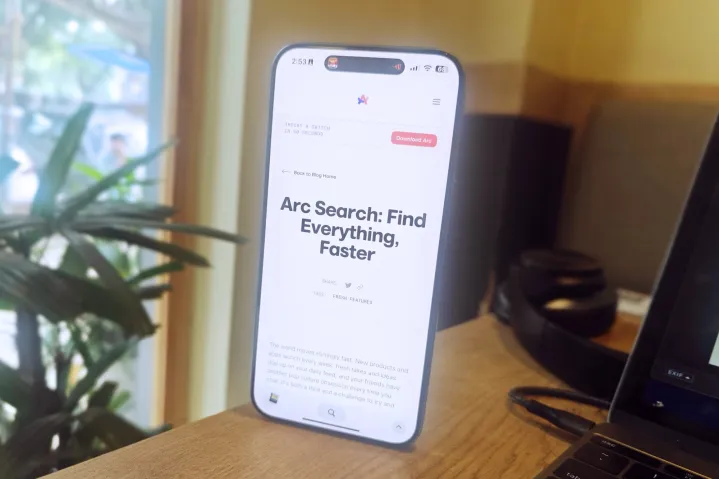
That’s where Arc Search comes into the picture. A new app from the folks at Browser Company, this app is as barebones as a mobile web browser can get. It also tries to pull the AI-assisted web summary trick as Bard or Copilot, but to its credit, this one presents web content in a far more rewarding, trustworthy, and aesthetic fashion.
Easing knowledge discovery
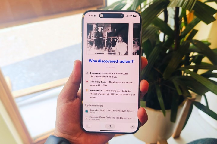
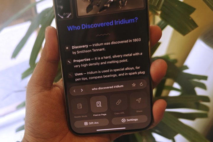
To put it in the simplest terms, Arc Search crawls the web for information, shortlists six websites, verifies and extracts useful content, and then presents it as a custom webpage. This webpage has the answer you seek right at the top, like the title before a lengthy Star Wars film credit.
But that’s where Arc Search goes a step further and lifts the entire experience. Remember those school science projects where you would go all the way with neat bullet points, colorful headlines, a carousel of images, important highlights, and more?
Well, the custom webpage that Arc Search makes for you is just that, translated to a phone’s screen. All this comes to life courtesy of a feature called Browse for Me. As the name makes it abundantly clear, the browser looks up the web for answers, saving you the hassle of going back and forth between websites, and then presents it in an organized format.
While at it, Arc Search goes above and beyond contextually and pushes more relevant information to save you the hassle of follow-up queries. It’s somewhat like those prewritten search templates that appear below the search box when you start typing your query. Except, in this case, those possible follow-up or related searches are answered right on the AI-generated webpage.
So, if you are searching for something like “Who discovered Radium,” the browser’s custom webpage will also curate more related details such as the discovery date, whether the feat garnered any notable awards, a brief biographical detail about the scientists, a bit of information about Radium, its industrial application, and more.
But the presentation format, which is more like little nuggets of knowledge instead of massive paragraphs, makes it far less intimidating to scroll and absorb the information on the screen. The design of this knowledge page is familiar if you’ve used Arc for desktop, which is good news.
A beautiful familiarity
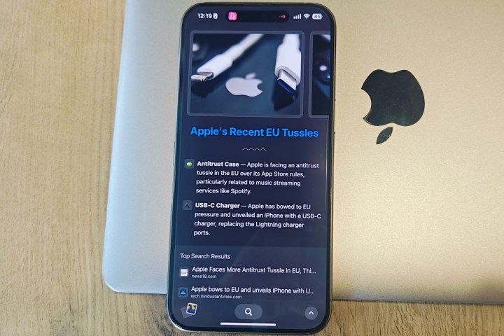
One of the standout software products to make a splash last year was Arc browser. Despite being limited to the macOS platform, it won a legion of followers — including me — primarily because of the sheer customizability, a fresh interpretation of browsing flow, and the standout design.
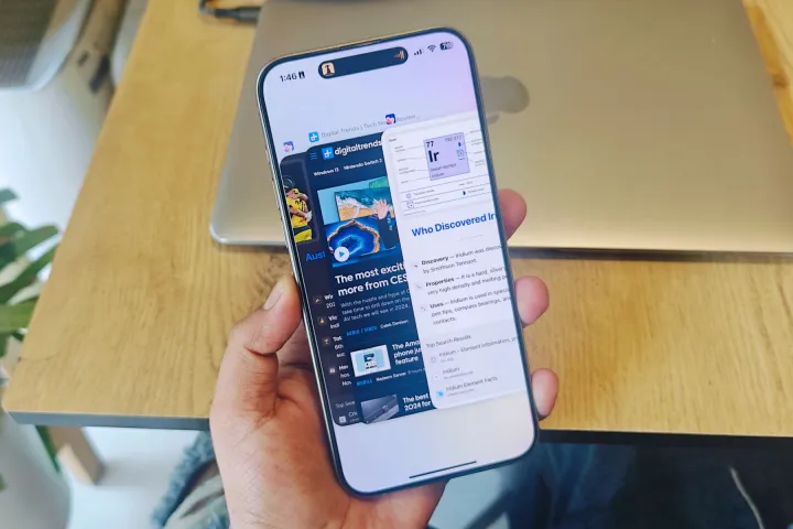
Yet, at the same time, Arc Search retains that signature iOS feel that would make you believe that this app was developed by Apple. Take, for example, the tab switcher, which looks identical to the app multitasking view on the iPhone. Even the tiny swipe-up menu dashboard borrows from Control Center aesthetics.
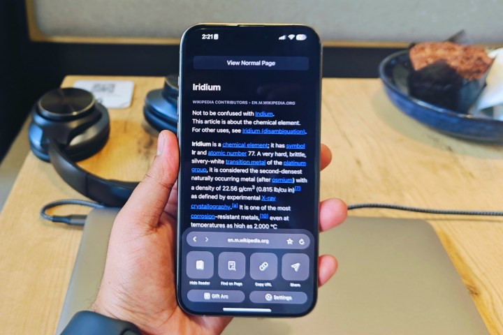
Another UX-centric perk many smartphone users overlook is the ease of reach. In Arc Search, all the controls and buttons are arranged along the screen’s bottom edge. At no point during the browsing chore will you feel the need to stretch your thumb to tap on an on-screen item. Not unless you are trying to access another active task visible on the Dynamic Island at the top.
There are a few tricks worth appreciating. Those niceties include a native ability to block ads, cookie banners, and trackers. These are enabled by default, and the distraction-free web browsing experience is downright lovely. If you appreciate a non-cluttered web surfing experience devoid of nasty pop-ups and eyesore banners, you should set Arc Search as the default browser on your iPhone.
A few sacrifices
On its own, Arc Search is not a bad browser, assuming you are a fan of minimalism and not exactly a power user. At this juncture, the app appears to have made a deliberate sacrifice between functionality and minimalism. In the name of core controls, you only get starring, find-in-page, reader mode, and sharing.
Furthermore, you can’t save or bookmark a custom webpage created after a “Browse for Me” session. The only option is to extend the auto-archiving system to 30 days. Likewise, you can’t enable reader mode for this view or even share it.
That’s because the custom website created by the app is only a webpage in name. It’s a temporary layout of text and media assets without its unique shareable URL. The only avenue for sharing this webpage is a scrolling screenshot or screen recording.
Other notable absent features are the ability to create saved or reading lists, switching search engines, native password manager, incognito browsing, desktop mode toggle, and direct media downloads, to name a few. Also, you can’t access the browsing history, which is a notable miss.

You can only wipe the entire slate without the ability to customize the deletion duration. However, there is a somewhat similar feature on the table called Archive Inactive Tabs, lifted straight from the desktop client. The range varies between 12 hours to 30 days for automatically clearing inactive tabs. However, no option is available to pause this automatic archiving system permanently.
I also want to lament the lack of syncing features, especially those that can be tied to the Arc desktop browser. In a similar vein, I also miss the seamless activity handoff you get to enjoy with the likes of Chrome or Safari across different devices tethered to the same Apple or Google account.
Try a fresh vision, for once

Will any of the aforementioned missing web browser features arrive with a future update? I am not sure. Should Browser Company add them? Well, that depends on their original vision for Arc Search. With Arc Search, Browser Company apparently set out to create a no-frills browser that gets its core task done in as clean fashion as possible. On that front, the team has delivered beyond expectations.
But at the same, this browser targets an audience that predominantly fires the web browser on their phone to get quick answers from Google Search or visit a website of their choice. At this parameter, the fluidity of Arc Search truly shines, while its familiarity with the core iOS look is a bonus.
However, if you like to take advantage of all the cross-device syncing offered by a full-fledged browser with deep investment in Apple or Google’s ecosystem, Arc Search won’t cut it for your demanding workflow.
But for whatever little tricks it can pull off, Arc Search comes out as the most refined product of its kind. It’s refreshingly fast, fluidic, familiar, and practically rewarding at the same time. Trust me when I say this: The convenience of this browser quickly grows on you.
It’s just a shame this beautiful app is exclusive to iPhones, and we have no clue when – or if – it will grace the Android ecosystem.
You can download Arc Search on iOS today.


