Anyone who has ever tried to switch from an Android device to iOS has undoubtedly noticed one major difference that can make or break your smartphone experience: Dealing with notifications. Specifically, you might notice how terribly inefficient the workflow is on iOS. Even more surprising, the issues stem from two ideals that are supposed to be the core of Apple’s design philosophy: The power of the Apple ecosystem and the simplicity of interactions.
The ecosystem failure
Everything Apple does is in an effort to get you to buy more Apple products. This means ecosystem lock-in at every turn with subscription plans, devices designed to work together, and devices being optimized for Apple apps and services, often to the detriment of other players (have you tried using a 3rd-party keyboard on iOS? It’s maddening, but that’s a story for another day.)
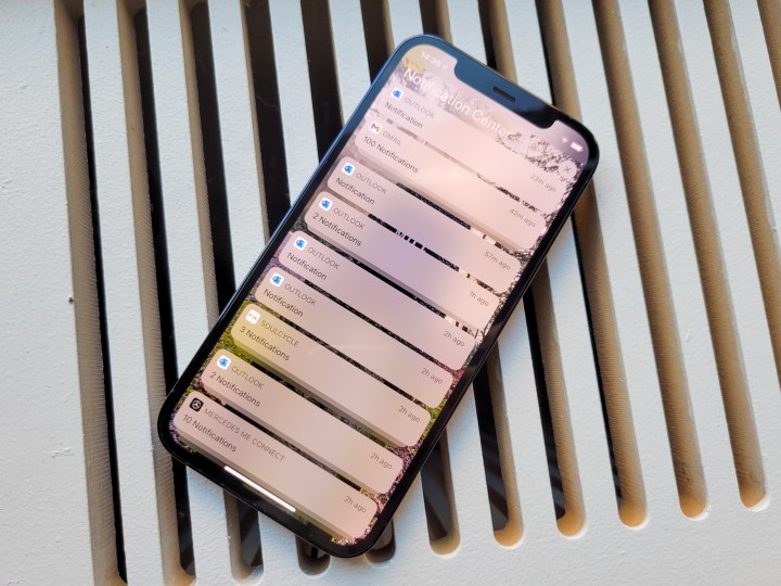
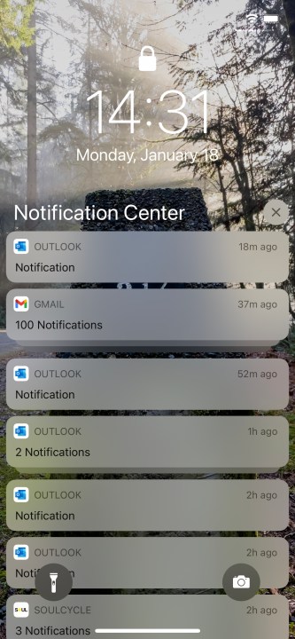
Apple loves to talk about how you can use your iPhone or Apple Watch to unlock your Mac, or how Handoff will seamlessly move what you’re doing from one device to another. But you know what doesn’t sync between devices? Notification states. Not in the slightest. If you deal with a notification on your iPhone, it’ll still be there for you to dismiss on your iPad. If you archive an email on another phone, tablet, or computer, that notification will still wait for you hours later on your iPhone.
If you leave an iOS device sitting for a day, you’ll find hundreds of old notifications on it.
On the scale of single interactions, maybe that’s not so bad, but consider how many notifications you get daily. Even if you filter out apps that don’t exist on multiple devices, that still adds up. And sure there’s always the nuclear option of just A) ignoring the notification tray on one device, or B) always clearing all notifications on your secondary device, but that just means something is going to slip by unnoticed.
To be fair, Android has its own phone-to-tablet communication problems, but that’s a separate argument. Android doesn’t suffer from the issue of app data being separate from notification data — if you archive an email on your computer, your
The simplicity failure
Android has evolved to make the notification tray, and notifications in general, as useful as possible, but trying to be productive in an iOS notification tray — although possible — is much more difficult. For example, on an
Conversely iOS displays the illusion of simplicity while hoping you don’t notice the redundancies all around. Long-pressing a notification should be your go-to move with iOS. This is how to expand a notification and get to any possible quick actions that can be taken with a notification, like replying to a chat, deleting an email, etc. The one issue with this interaction is in developer support, as you might expect. For the most part, developer support is fine but there are a couple-odd apps that don’t offer any quick actions, one great example being YouTube. In iOS, YouTube notifications don’t offer any quick actions like the option to add the video to your Watch Later list, which is available on Android. Issues like this one lead to a knock-on effect where if the notification has no extra info to show, it will still pointlessly give that notification prominence and blur out other items in your stack.
The unnecessary gestures continue with iOS notifications, too. If you swipe down on a notification, the only thing that happens is a very unhelpful animation of your notification stack pulling away from the clock, only to spring back into place. If you swipe left to right it will open the corresponding app, but you can also launch into the app by simply tapping the notification, so it’s unclear why the swipe option even exists.
Dismissing notifications in iOS makes absolutely no sense.
And then there’s what happens when you swipe right to left on an iOS notification. If you swipe all the way, it will dismiss the notification, but if you only go halfway, you get three options: Manage, View, and Clear. Manage, as you might expect, lets you adjust priority, but this option can also be found in an overflow menu on the card after you long-press. View does the same as long-pressing. And Clear does the same as a full swipe. So basically, swiping either way on an iOS notification gives you options that are in some way redundant.
How did we get here?
To be fair, these differences didn’t happen by chance. They highlight two divergent paths that have met and present two different ways of working. The notification tray has been a part of Android since version 1.0, back in the Before Time of 2008 when there wasn’t even a cute dessert theme name to go with the version number. By contrast, iOS didn’t have a notification tray until iOS 5 in 2011. Before that iOS relied on obtrusive pop-up notifications and users going into apps based on a dot notification badge on the home screen icon, something that didn’t even exist in Android until 8.0 Oreo in 2018.
Android was built with a notification center from the start — iOS added it far later.
A quick look at the version histories for each platform gives a fuller picture. Android had updates to the notification tray in 4.0 (expandable notifications and per-app options), 4.2 (quick actions), 5.0 (priority options), 7.0 (quick replies and bundled notifications), 8.0 (app icon badges and notification channels), 9.0 (smart replies and quick turn off of frequently dismissed notifications, and 11.0 (prioritizing conversations and adding bubbles).
Apple redesigned the notification center in iOS 7, merged it with the lock screen in iOS 11, and added grouped (bundled) notifications in iOS 12. That’s … it.

This fundamental difference can basically explain everything. Android users (and developers) have been primed by legacy to interact with apps via notifications because it’s always been a core feature of the platform.
On the other hand, iOS users (and developers) have been primed from the jump to need to dive into apps first in order to get things done. And even after Apple began to offer more robust notifications in iOS, Face ID (and the Apple Watch) made seeing notifications on the lock screen something users did less and less. The lock screen has always been a strength of Android, in no small part due to its great integration with notifications.
Change will come slowly
Apple is still content to force users to dive into apps in order to get things done on iOS. Case in point: Home screen widgets in iOS 14 are essentially read-only displays of info and not interactive.
On the other hand, Google seems to be trying to minimize the amount of time users need to be inside of a single app in order to get things done. Widgets are far more robust and interactive, notifications are more interactive, even the introduction of Bubbles is designed to allow messaging while not being in an app or the notification tray.
With these differences in philosophies, it’s not surprising that the iPhone still struggles with notifications. And it’s the biggest failure of the platform today.
Ultimately though, Apple shouldn’t get a pass for making notifications less useful, even if you’re encouraged to avoid the tray altogether. Mature platforms in 2021 should not be forcing users into a specific usage; iOS should be robust enough for those who want to get things done in the notification tray.
Editors' Recommendations
- Are you having iPhone alarm problems? A fix is coming soon
- iPhone 16: news, rumored price, release date, and more
- This one Apple Fitness feature completely changed how I exercise
- We finally know when Apple will announce its 2024 iPads
- Nomad’s new iPhone case and Apple Watch band may be its coolest yet


