  1. Home
  2. Phones
  3. Computing
  4. Mobile
  5. News

Newton axes the sent folder — and it makes for a better email experience

Add as a preferred source on Google
Image used with permission by copyright holder

Say goodbye to your sent folder. You never needed it in the first place.

On Wednesday, May 2, email client Newton decided to change up the way you interact with your inbox once again by ridding users of the sent folder once and for all. It’s a sensible move that streamlines the email experience quite a bit. Now, rather than having to navigate between your inbox and a separate repository for your responses, Newton is putting everything in one place, creating an interface that looks a lot more like a chat app or standard messaging service than a mailbox.

Recommended Videos

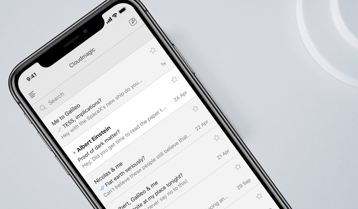
Now, when you send an email using the Newton client, you will see that email right in your inbox, alongside all your other conversations. When you reply to an email, that messaging thread is moved to the top of your inbox. And if you begin a new email correspondence, that message will go to the top until an incoming message or another response of your own pushes it down. All in all, it creates a more all-in-one feeling for your inbox, something that many of us could certainly use.

The impetus for getting rid of the sent folder, Newton explains via a Medium blog post, is that it’s simply no longer necessary. “Long ago, email clients worked by periodically checking a mail-box on the server and downloading email using a protocol called POP,” the team explained. “Once the mail was downloaded, it was deleted from the server and was shown in a folder called Inbox in the client. The client also had folders like Drafts, Sent, Outbox, etc. so that it could save emails you wrote and sent using the client in an appropriate location.” While the technology for email has improved, this formatting has not. And Newton decided it was time for a change.

“Going forward, when you start a new conversation in Newton, you’ll see it right on top in Inbox,” the blog post continues. “Also when you reply. Conversations in inbox will be sorted by activity … There’s absolutely no need to go to Sent folder any more.”

Of course, if you don’t want to have all of your messages in one place, that is fine too. Newton allows you to turn off the feature if you prefer the previous setup. But if you’re looking for fewer folders overall, this new update may be the one for you.

Lulu Chang
Fascinated by the effects of technology on human interaction, Lulu believes that if her parents can use your new app…
Android desktop mode made me miss my laptop in record time
I tried writing and publishing from Google’s phone-to-monitor setup, and the future of mobile computing immediately started sweating.
Computer, Electronics, Laptop

Android 17 desktop mode has a very simple pitch. Plug your phone into a monitor, add a keyboard and mouse, and watch the slab in your pocket pretend to be a computer. I wanted to give that pitch a fair shot, so I tried using it for an actual workday instead of a cute demo.

The goal was boring on purpose: write an article, edit it, build the page in WordPress, upload whatever needed uploading, and publish the thing without running back to my laptop like a coward.

Read more
After test-driving iOS 27, my iPhone still doesn’t feel like it has made a substantial leap
Siri learned new tricks. Safari got smarter tabs. My morning routine didn't change at all.
iOS 27 new star rating feature in Photos

Every June, after Apple wraps up its annual WWDC keynote, I install the latest iOS beta on my iPhone, watch the progress bar crawl to completion, and wait for the inevitable restart. For years, picking up my phone afterward felt almost identical to how it did before the update. 

I saw the same grid of icons, the same Control Center, and the same version of Siri until iOS 26 finally broke that pattern in 2025.

Read more
Android 17 makes a strong case for ignoring Android version numbers entirely
When the most noticeable change is a better Quick Settings button, the annual update cycle starts looking more like branding than progress.
Android 17 logo.

Android 17 finally separated the Wi-Fi and mobile data buttons, and I hate how much that improved my mood. For years, Android treated internet access like one mysterious blob, as if Wi-Fi and cellular data were emotionally codependent. In Android 17 Beta 3, Google split the old combined Internet button into separate Wi-Fi and mobile data tiles, making each connection easier to switch off with a single tap.

That’s a good change, which is also why it’s a little damning. When one of the cleanest wins in a major OS update is “the buttons make sense again,” the celebration gets awkward fast.

Read more