 Judging from our hands-on time with iTunes 11, we can say it’s fast, sleek, and smart. Still, there are probably a number of users who are resistant to change and like how things were done in the old days of iTunes 10. They may be baffled and unhappy with the changes in the new iTunes. For those of you who are putting off updating to iTunes 11 because you’re weary of the new design and of losing things like columns and the sidebar, we can help.
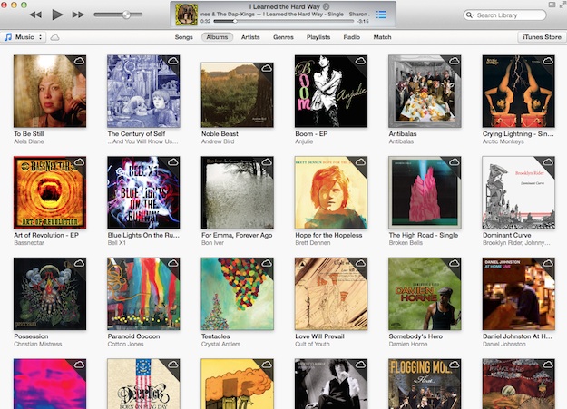
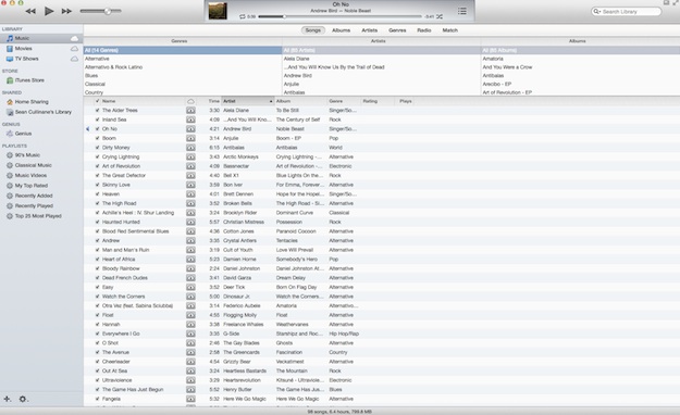
Apple hasn’t completely ditched the features you’ve grown to love in previous versions of iTunes. See that photo below? You might not even be able to tell it’s the same iTunes as the photo above. Here are a few ways you can make iTunes 11 look more like iTunes 10.
Using the View menu, you can bring back the sidebar, the column browser, and even the status bar that shows how much music and how many hours of content you have. And believe us, it’s very easy to do. Here’s how:
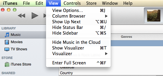 Click on the View menu:
- For the Status Bar: Click “Show Status Bar.”
- For the Sidebar: Click “Show Sidebar.
- For the Column Browser: Click “Column Browser.” Note that Column Browser will only show up when you’re under the “Songs” section.
There are even shortcuts that let you easily toggle the sidebar, status bar, and column browser features.
- Sidebar: Option-Command-S
- Status Bar: Command-/
- Column Browse: Command-B
You still won’t completely feel like you’re in iTunes 10 with these alterations, but you may at least feel a little more comfortable. Sadly, cover flow on top of playlists is now completely gone, so that part of iTunes 10 will never be the same.
It’s actually a nice detail that Apple made previous design features available to users who weren’t quite ready for the radical new design of iTunes 11. These viewing options are easy to find and activate, and might help weary iTunes users into updating to the new iTunes.
What do you think of the new design? Will you be adding these iTunes 10 features back into the mix?
Editors' Recommendations
- How to factory reset Windows 10 or Windows 11
- How to sync your Outlook calendar with an iPhone or iPad
- How to downgrade from Windows 11 to Windows 10
- How to screen record on an iPhone or iPad
- How to back up an iPhone using Mac, iCloud or PC