Apple’s M1 Macs are finally here, and that means the dream of using iPad apps on a Mac is finally a reality. Mac Catalyst, Apple’s system that allows developers to port their iPad apps to the Mac, makes it all possible. But are these apps ready for prime time? In previous years, Catalyst has been beset with problems, mostly centered around poor design decisions on Apple’s part. So, with MacOS Big Sur out in the wild, we took a second look to see whether it’s a new feature you’ll love, or still a half-baked compromise.
Looking back, it seems obvious Apple was in a rush with Mac Catalyst. Though we did not know it at the time, Apple’s plan to ditch Intel processors was well underway when Mac Catalyst launched in 2018, and that necessitated a tool that could help developers get their apps ready for the brave new world. Yet the idea of how an iPad app should work on a Mac was nowhere near settled, and even Apple apparently did not have the answer. It was very out of character for a company that prefers to wait until a technology is perfect rather than rushing to market with something that is not ready.
Two and a half years later, Apple seems to finally have a grip on its Mac Catalyst apps. Through many successive iterations, it has ironed out the creases that marred its early attempts. That means we can finally recommend Apple’s own take on Mac Catalyst apps, albeit not wholeheartedly. Today, we examine the reasons why.
Making sweet Music
When I looked at the range of Mac Catalyst apps in the Big Sur beta, Music was by far the worst of the bunch. It was a strange situation to find the app in, as it had been completely useable in MacOS Catalina, yet fell off a cliff in the beta of the next version of the Mac operating system.
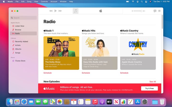
Perhaps someone at Apple was listening to my ranting and raving in that article, because Music has been greatly improved in the full release of Big Sur. The biggest improvements come to the Radio tab, which was a real mess during the beta. Previously, this tab was dominated by two large buttons that were unintuitive. Beats 1, Apple’s headline radio station, got one, while the other was allocated to a featured show. Yet a host of useful features were utterly absent, including a schedule showing the shows’ start and end times, as well as genre tags and categories. Inconsistent information also often totally omitted the name of the show altogether.
In the Big Sur full release, this sorry situation has been vastly improved. Now, the monolithically large buttons have been shrunken down, with two blocks being replaced by a more compact set of three. That means more choice and more information without any scrolling, which is a welcome change.
But it is not just about quantity — quality gets a boost, too. Each of these blocks (one each for Apple Music 1, Apple Music Hits, and Apple Music Country) prominently feature the show’s name, a short description, and its on-air time. You are now no longer left wondering what on earth you are about to listen to and when it will end. Clarity rules.
There is another welcome change just underneath these buttons — a link that takes you through to the show’s schedule. Sure, the information could be laid out a bit more clearly, perhaps like a day view in a calendar, but at least this info is available now. Previously, it was nowhere to be seen, leaving you wholly in the dark.
Finally, the smallest yet most inexplicable issue in the beta has been fixed: The Play button at the top of the app actually resembles a Play button once again, instead of looking like its top and bottom edges had been lopped off with an ax. Common sense reigns once again.
A double-edged sword
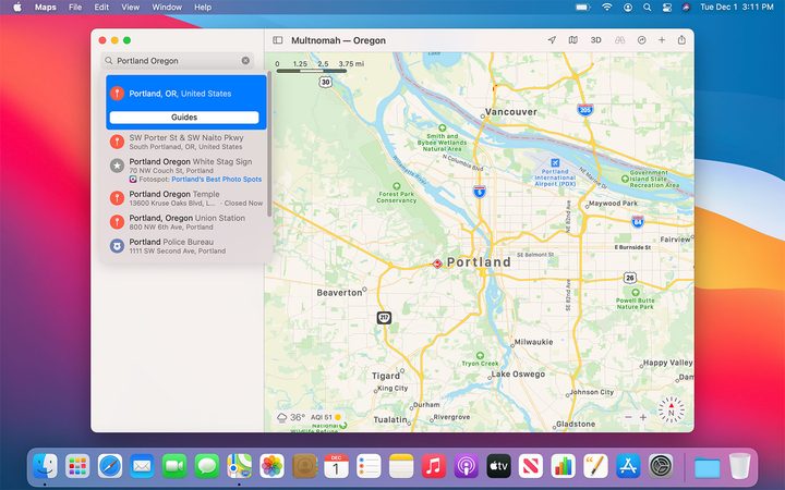
Most of Apple’s other Mac Catalyst apps are almost completely unchanged from the Big Sur beta. The same pleasing full-height sidebars, the same dull and hard-to-distinguish sidebar buttons. Most changes are minor, like the inclusion of a Guides button in Maps search results, which is welcome. The overall outlook is not impeccable, as there are clearly improvements to be made, but it is also not a disaster. Most of Apple’s Mac Catalyst apps are perfectly functional, if not flawless.
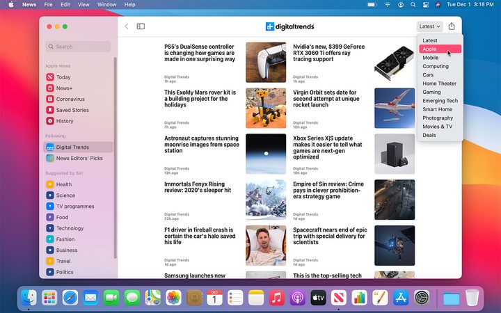
News, though, has had a few changes — some you will like, some you may not. The most positive is the introduction of categories on the pages of individual publications (and the News Editors’ Picks page). These take the form of a drop-down menu in the top-right corner of the app. Click it and you can view all the categories the publication has divided its stories into; select one and you will only see stories that match that category. It is a little hidden away, but in terms of improving functionality, it is a welcome change, and a sign that Apple is paying more attention to the small details of its Mac Catalyst apps. For users, that is encouraging.
Less positive is a change to topics. Previously a topic would have a large, featured story taking up a sizeable area of the screen, with smaller stories along its side and underneath. Now, though, every story is the same size, running in two columns down the page. It is bad for readability, as there is nothing to break up the wall of text and images you are now confronted with.
Should you use Apple’s Mac Catalyst apps?
Apple’s Mac Catalyst apps still have some way to go, but most of the complaints are now relatively minor. Sidebar icons are still too similar to each other, making it hard to distinguish them at a glance, while the TV app still lacks a sidebar that appears in every tab, meaning you still have an unreasonable amount of scrolling to do. But for the first time since Mac Catalyst was announced with MacOS Mojave in June 2018, there are no truly calamitous apps.
I feel confident enough to say you should not make a point of avoiding them. Each app has managed to purge the most egregious drawbacks from previous versions. Many, like Maps and Messages, are excellent apps that we enjoy using (see my exploration of Mac Catalyst apps in the Big Sur beta). Even TV, the weakest of the lot, is fine in everyday use.
It seems that after two years and multiple tweaks and revisions, Apple is finally starting to figure out a way forward for Mac Catalyst, with many of its own apps really finding their footing on the Mac. I only wish it hadn’t taken so long to get to this point.