“Why you can trust Digital Trends – We have a 20-year history of testing, reviewing, and rating products, services and apps to help you make a sound buying decision. Find out more about how we test and score products.“
Updates to Apple’s MacOS operating system do not always seem like huge affairs. Big Sur, though, feels different. Not only are there a bunch of new features and changes introduced to the Mac, but the entire look and feel of MacOS has undergone a sea change.
Apple may have gone all-out on overhauling MacOS, but is the latest iteration actually any good? Is it a big enough update to truly warrant the new MacOS 11 tagline? Now that it’s in public beta, we have spent the last few weeks exploring it in detail, poking and prodding to see how well it all stacks up. Is it worth upgrading early?
An all-new visual style
In many ways, the visual redesign in MacOS Big Sur is a subtle one, comprising lots of small changes in many different areas. Nevertheless, these tweaks add up, and when taken together, the result is vastly different from what we were used to in Catalina.
Let’s start with the Dock. The icons for Apple’s apps now all share the same rounded square style. Previously, Apple’s own icons came in a whole host of different styles, including circles (App Store), rounded squares (FaceTime), angled rectangles (Reminders), or something else entirely (Messages). Now, that grab-bag of styles has been dispensed with, replaced by a pleasing uniformity.
That may not sound like much, but it signifies an attention to detail that was lacking in previous versions of MacOS. You can see it elsewhere, such as app menus, where font spacing has been tweaked to give text more room to breathe. Confirmation buttons have been adjusted to be smoother, while retaining the familiar “Mac” feel. The menu bar is now translucent and takes on the colors of your wallpaper. The effect is clean, beautiful, and refreshing.
One of the visual changes Apple touted when it first revealed Big Sur was the introduction of full-height app sidebars. Gone are the full-width, metallic title bars of old. This has benefits and drawbacks. While items in the sidebar benefit, with more space around each item to delineate them more clearly, title bar buttons have suffered a little. Whereas before each button was clearly outlined, now you only see their edges when you mouse over them, making them a little harder to spot and discern.
Choice cuts from iOS

If there is one subject that just will not die, it is that Apple will one day merge MacOS and iOS. While there is no evidence of that in Big Sur, a couple of iOS features have been brought across to MacOS — much to the Mac’s benefit.
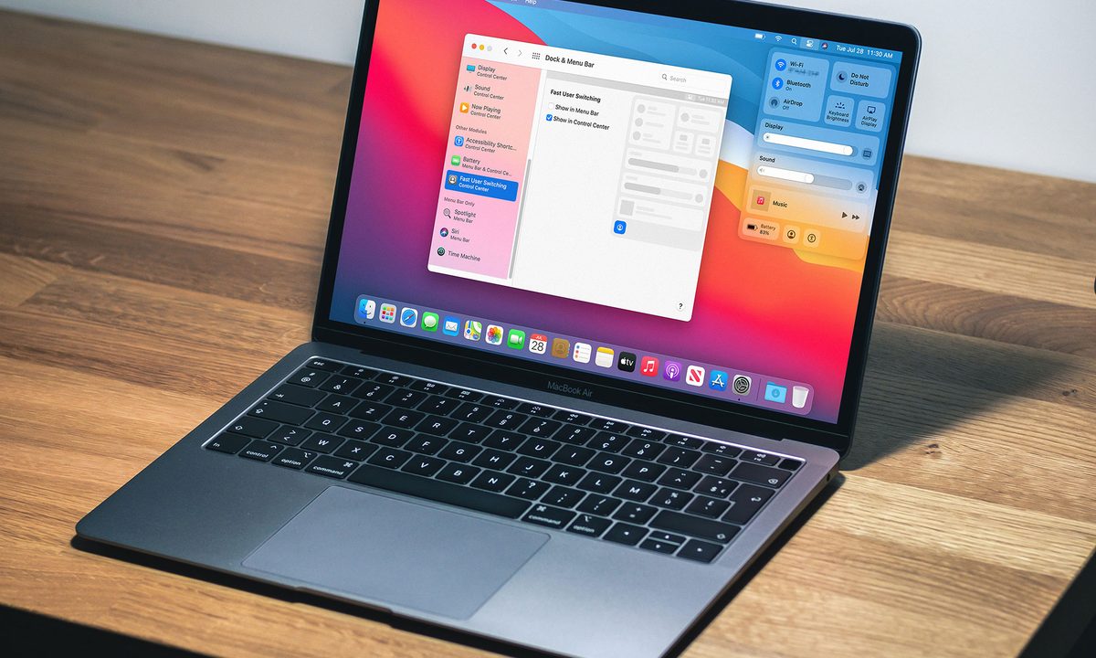
The first is Control Center. On iOS, this is a panel of quick options and controls that you swipe down from the top corner of the screen, and it works in much the same way on the Mac. Click the icon in the top-right corner and you are presented with a palette of settings, from Do Not Disturb and Bluetooth to display brightness and controls for the Music app.
That alone is an excellent addition to MacOS because it saves you from rummaging around in System Preferences or elsewhere in search of a setting. Rather than having to work out where you go to turn on AirDrop or adjust your keyboard brightness, common settings like these are quick and easy to access in Control Center.
Control Center makes settings much more streamlined and easier to use.
I have previously written about how Control Center is one of the best new features in MacOS Big Sur. A big reason for that is the ease of customization it brings to your Mac. Got a setting you adjust all the time? Simply drag it out of Control Center and onto your menu bar. Adding and removing icons from the menu bar is now done in the Dock & Menu Bar section of System Preferences, rather than having these options scattered in various System Preferences submenus. The whole setup is much more streamlined and easier to use.
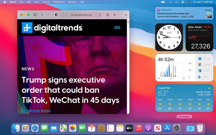
That is not the only addition from iOS. Also making its debut on the Mac is the new widget system introduced in iOS 14. Widgets now come in several sizes, are contained in the Notification Center, and are accessible by clicking the date and time in the top-right corner of the screen. At the time of writing, there are only Apple widgets available, such as Photos, Weather, Reminders, Calendar, and more. Apple says developers will be able to bring their own apps to the Notification Center. Notifications can also be grouped, just like in iOS 14.
Apple’s disappointing Mac Catalyst apps
Sadly, it is not all good news. Apple is still struggling with most of its Mac Catalyst apps, something it still has not put right since they were introduced with MacOS Mojave in 2018. These apps are designed to be cross-platform and are built using a framework that enables developers to port their apps from the iPad to the Mac. Unfortunately, that seems to have left many of Apple’s own Mac Catalyst apps feeling rather lost.
Here is an example. In Catalina, each sidebar menu icon had its own distinct color, helping it stand out from other options. In Big Sur, they are all the same color, while the text has been made thinner. While this brings the sidebars in Mac Catalyst apps in line with other apps in Big Sur, it actually feels like a step back from the colorful, distinctive icons in Catalina.
Apple really has its work cut out if it is going to turn around its Mac Catalyst apps any time soon.
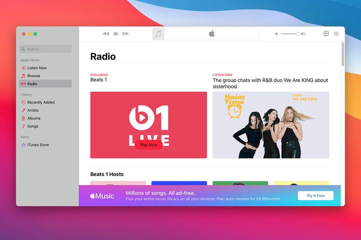
The Music app is especially egregious. In the Radio section, previously informative tiles advertising currently airing shows have been stripped back, with most of the useful info removed. For instance, in Catalina, a prominent advertisement for Apple’s Beats 1 station indicated what show was playing on the station and when it would finish. These details have been removed in the Big Sur edition of Music, leaving users to guess who is on the airwaves.
This underwhelming situation might be forgivable if it was a tiny app studio’s first attempt at the format. But it is not — it is the third attempt from one of the largest tech companies in the world. Apple really has its work cut out if it wants to turn around its Mac Catalyst apps any time soon.
Mapping out Apple’s progress
Not every Mac Catalyst app is struggling, though. News, for example, is a beacon of hope in a stormy sea of disappointing Mac Catalyst apps. Section titles are now much more prominent, making it always clear where you are in the app. There is much less wasted space, and navigation icons and tools have been rethought and, in some cases, relocated. Using it is now a far more pleasant experience than it was previously.
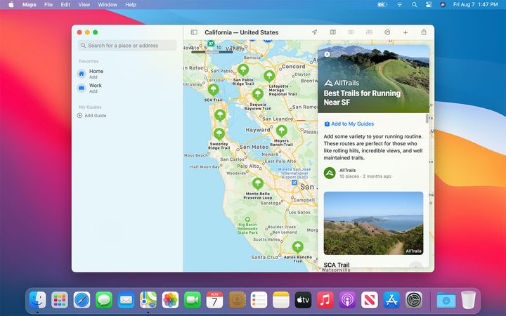
As for Apple Maps, certain locations have been outfitted with detailed location guides from third-party publications, such as the “Best Trails for Running Near San Francisco” from AllTrails. These are collections of locations grouped under a central theme that form a handy way to learn more about a travel destination (or your own hometown). You can create your own guides, although we would like to see a few more official third-party guides than the handful that currently exist.
Maps has also introduced Look Around (Apple’s Google Street View equivalent), more detailed indoor maps for several airports and shopping centers, and improved routing for bicycles and electric vehicles. These are all welcome changes, although nothing particularly revolutionary.
Messages finally has feature parity with its iOS sibling. Search results are grouped by type — perfect for quickly finding that pesky attachment — and favorite conversations can be pinned to the top of the screen. Effects and animations are greatly expanded, with balloons and confetti among the additions, and you can now create Memoji on the Mac for the first time. You can also set a group photo and send inline replies.
In most cases, these Mac Catalyst apps shine because of their new features. In many cases, Apple’s cross-platform apps struggle because of design and layout decisions that do not quite chime on the Mac. Still, the improvements to News, Maps, and Messages show that Apple knows how to create good Mac Catalyst apps — it just needs to go back to the drawing board on some of its more lackluster attempts.
Safari leads the way
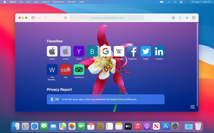
If you are looking for an example of a superb Mac app, look no further than Safari. Apple’s web browser has a few welcome changes, such as a customizable Start Page that lets you set your own background image and add or remove elements like your favorite websites and Siri suggestions. Tab navigation is improved, especially when you have a lot of them open — tabs offer a website preview when you hover over them, and expand in size when active to make it clearer which tab you are currently browsing.
One of the most notable changes is the introduction of the Privacy Report. Visit any website and click the shield icon next to the URL bar to see how many trackers Safari has blocked from that site that were trying to harvest your data. Click the “i” icon for a more detailed breakdown of all the trackers Safari has detected and blocked over the past 30 days. This is great for keeping you informed, and it is reassuring that Safari does all this automatically without you having to configure any security settings. What’s more, it will even notify you of passwords that have been leaked in data breaches and help you improve them.
Elsewhere, Safari extensions finally have their own section in the Mac App Store. This is an area where Safari has long lagged behind rivals Chrome and Firefox, so making extensions more prominent should help expand the options for Mac users. What you will not need an extension for is translation, as Safari now does this on the page automatically — and it works almost flawlessly.
Safari is already one of the most secure web browsers out there, but what about speed? Apple claims to have increased Safari’s performance, boasting of up to 50% faster loading times on frequently visited websites compared to Chrome. In our testing, Safari scored an average of 104.18 in the JetStream 2 benchmark suite, putting clear daylight between itself and Chrome’s 89.75, with Firefox way behind at 63.63. In Speedometer 2.0, Safari hit an average score of 51.01, compared to Chrome’s 71.63 and Firefox’s 53.08. While the JetStream average was very impressive, Safari’s Speedometer score could not keep up. Apple told me they were investigating, and we will update this storywhen we hear back. Still, it is clear from the JetStream average that Safari is no slouch.
Getting the Mac back on track
MacOS Big Sur is the biggest revamp the Mac operating system has seen in years, and Apple has managed to get most of it right. The modern redesign is not only gorgeous but well-considered, with a succession of shrewd adjustments coming together to form a Mac experience that is greater than the sum of its parts.
The new additions improve the Mac experience in meaningful ways, from the superb, customizable Control Center to Safari’s Privacy Report that acts as your personal browsing watchdog. Nothing feels thrown in.
The Mac Catalyst apps are the only real disappointment, and it is a shame Apple still has not brought them up to the level we would expect. Still, in every other way, Big Sur is an impressive renovation of the Mac operating system, one that bodes well for the future of MacOS.