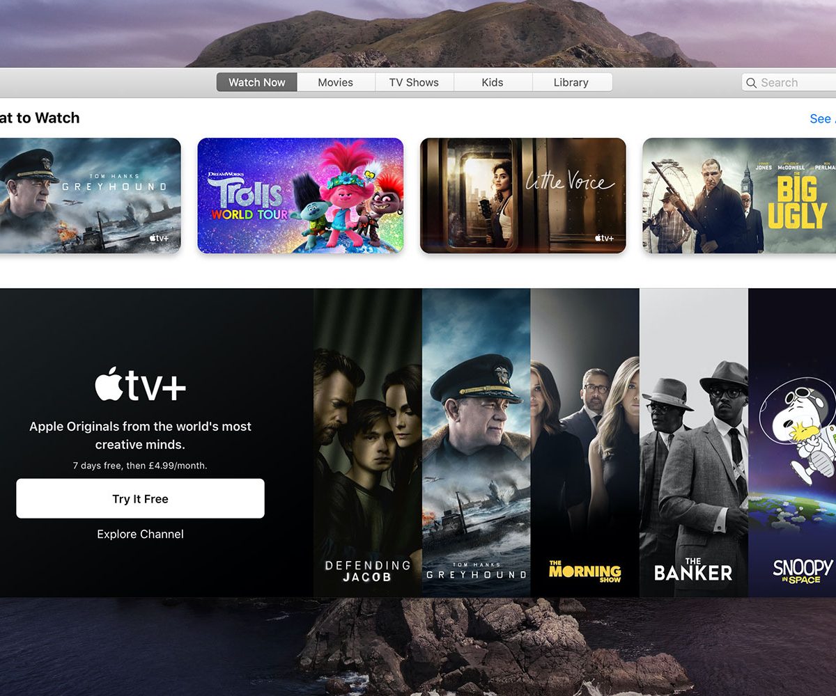
The Apple Silicon transition is incoming, and with it, a wealth of mobile apps that should automatically run on new Macs. That doesn’t mean these apps will offer great experiences on day one, though.
One of the solutions is a project called Mac Catalyst, which is Apple’s way of helping developers port iPad apps over to the Mac. But even Apple’s own Mac Catalyst apps have had a rocky start since the first ones launched in 2018 with MacOS Mojave. They improved in MacOS Catalina, but still left me unconvinced about the future of the platform.
With the official launch of Big Sur on the horizon, Apple has taken its third stab at making these first-party apps feel a bit more at home on the Mac. They’re still far from perfect, but a few of the apps show signs of progress for Catalyst.
Time for some good news
I’ll start with the good news — literally — as Apple’s News app has definitely improved over its predecessor in MacOS Catalina.
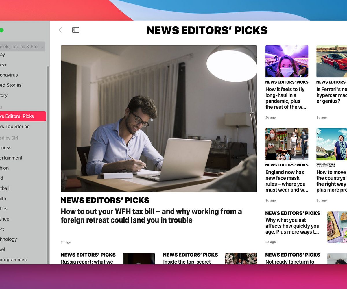
As with many apps in the Big Sur redesign, News now has a full-height sidebar on the left-hand side. In Catalina, the sidebar is cut off by a gray title bar that runs along the top of the app, which feels like wasted space. The redesign now means that the search bar has been relocated from the far right-hand corner to the top of the sidebar, making it much simpler to find.
The removal of the gray bar makes it easier to know what section of the app you are in. Previously, section titles (such as “News Editor’s Picks”) were squeezed between the gray bar and the lead story photo. Now, they have much more space, allowing for larger titles that more clearly demarcate each section. When you read a story, the section title remains at the top, giving you a clear indication of where each story is located. That makes finding your way around the app more straightforward, improving the user experience.
So far, so good.
Mapping out more positive change
There are improvements elsewhere, too. Messages finally gains most of the same features as its iOS cousin, and it is so much better for it. Many of the improvements come in group messages. You can tag people directly and send inline replies; the latter blurs the background when you view a reply, which is a really nice touch. Neither feature is particularly ground-breaking in 2020, but nonetheless each one vastly improves the experience on the Mac.
Messages is also one of the few Mac Catalyst apps in Big Sur where the layout choices really work. Its full-height sidebar and minimalist buttons put the focus firmly on your conversation threads where it should be, without distracting your attention. The app feels more spacious, with each element getting more room to breathe.
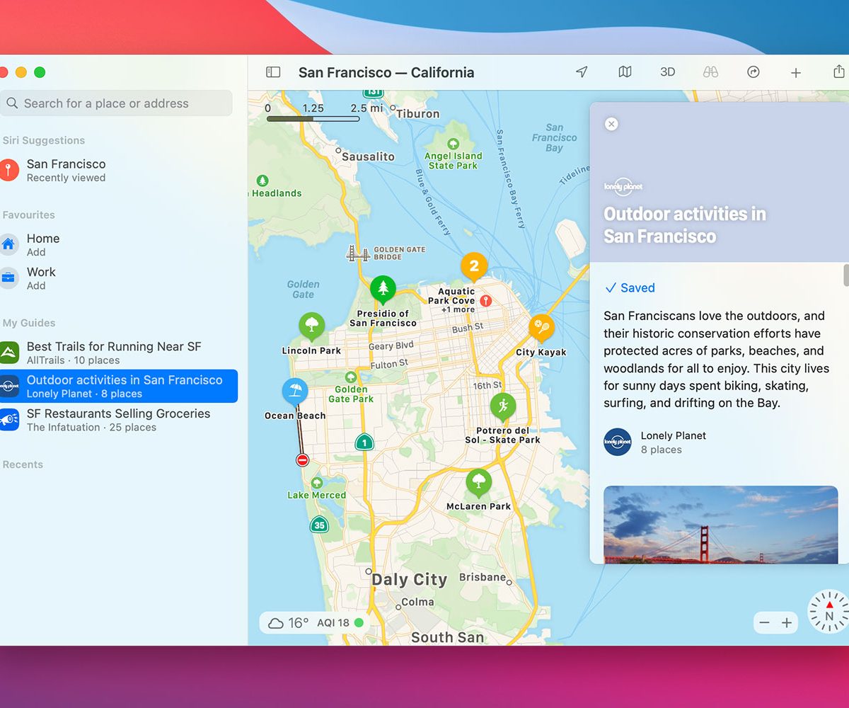
I was also impressed with the changes coming to Apple Maps. One of the most notable additions is the Guides feature, which groups together interesting destinations in themed packages (such as outdoor activities in your area). These are a little tricky to find — they only seem to appear on a city’s pop-up information window, and a tab or button allowing you to browse popular guides would be helpful – but they are a great way to acquaint yourself with a new town.
As with Messages, the layout changes in Maps make sense and work well. Toolbar buttons have been made more subtle, getting out of your way and letting you concentrate on your locations. The full-height sidebar means less wasted space, too, and makes it far more straightforward to find your recent places and Siri suggestions. Overall, Big Sur is good news for Maps.
Undoing Apple’s good work
Unfortunately, not all of Apple’s Mac Catalyst apps are quite so impressive. Some are roughly as good as their Catalina equivalents, while others have stumbled backward.
When the new round of Mac Catalyst apps launched with MacOS Catalina, TV was by far the worst example. It was a total mess, with nonsensical design decisions, confusing layouts, and even sections that seemed completely unfinished.
In some ways, TV has improved. The gray title bar along the top of the app is a little larger, making the navigation buttons a little less squashed, and it is less distracting thanks to its lighter hue. But problems remain: There is still no general sidebar, meaning browsing for categories or favorites is a tiresome exercise in unnecessary scrolling.
The sidebar only appears when you are in the Library tab, but even here it disappoints. Unlike the other Mac Catalyst apps, it is not full-height, while section icons in the sidebar have become duller and harder to tell apart thanks to their uniform colors and thinner font weights.
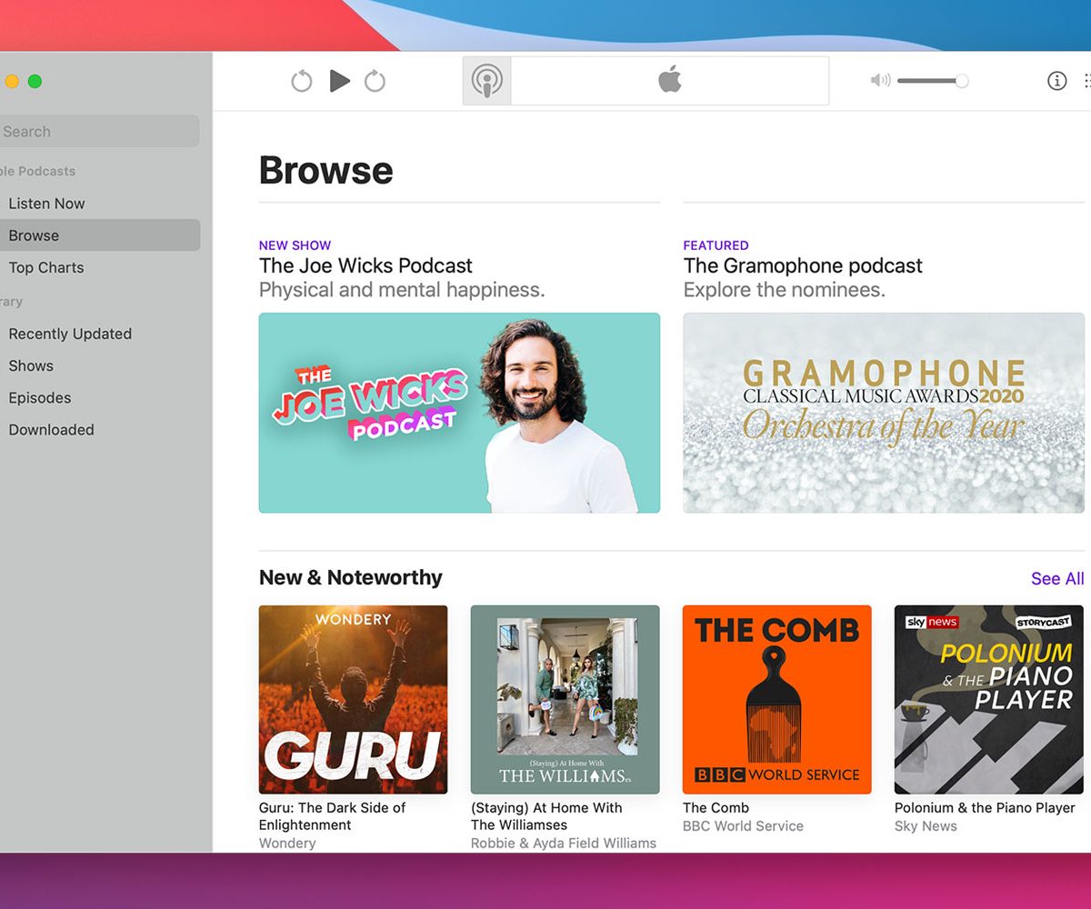
This penchant for dull icons continues in the Podcasts app. Whereas in Catalina the sidebar icons in this app were differentiated by color as well as design, in Big Sur every sidebar icon is the same shade. As well as that, they have been made smaller and thinner, and the text next to them has shrunk too. Combined with a sidebar background that is darker than that in Catalina, the result is it is now harder to navigate the Podcasts app in a glance.
Not music to our ears
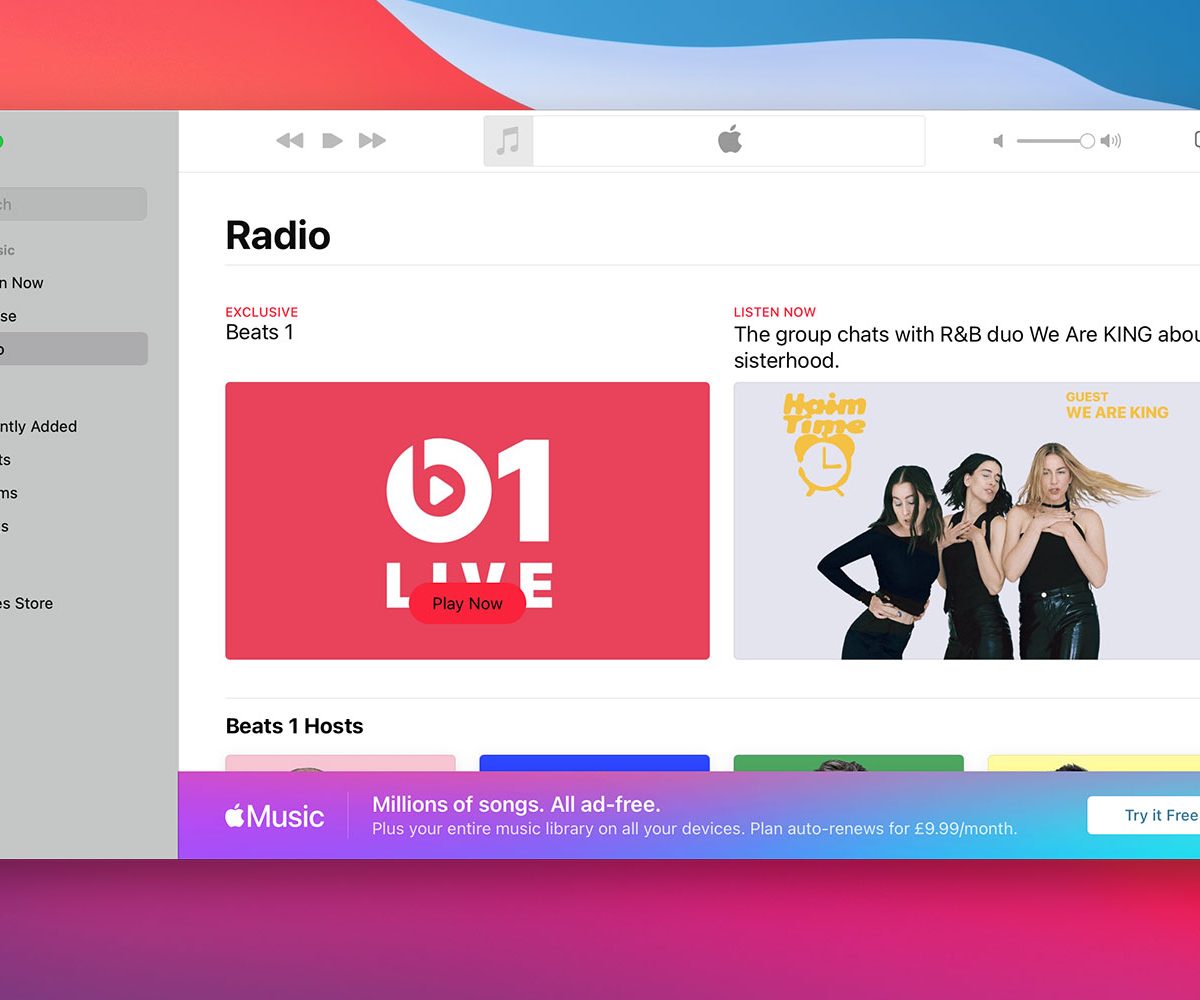
All of those setbacks pale in comparison to the worst of the bunch: Music. As far as Mac Catalyst apps go, this was actually fairly serviceable in Catalina. Clearly Apple thought otherwise, though, as it has somehow contrived to make Music far more unpleasant to use than it was previously.
The app is now less informative, and even more unlikable than before. For example, the Radio tab previously featured a prominent link to listen to Apple’s Beats 1 station. Above a large thumbnail was the name of the current show playing on the station, along with the times it was broadcasting. The thumbnail itself was overlaid with a short description of the currently playing show.
Now, all that is gone, replaced simply by the name of the station and the word “Exclusive.” The show description has been removed from the thumbnail, replaced by a large “Play Now” button that actually obscures the text on the thumbnail. There is no information on what show is currently playing, nor when it will finish. The changes manage to make the app worse, not better.
There are other problems. The same dull icons and thin text that afflict other Mac Catalyst apps are present in Music. Only the iTunes Store icon comes in a different color — purple as opposed to red — but it is still harder to read than it was in Catalina.
Finally, for some reason, the large Play button in the top-left has had its top and bottom corners trimmed off, making it less recognizable as a Play button and smaller than the buttons either side of it. Why Apple chose to do this is anyone’s guess.
One step forward, one step back
As far as Mac Catalyst apps go, MacOS Big Sur seems to present some light at the end of the tunnel. For the first time since the inception of the Mac Catalyst project, Apple is giving Mac fans some genuinely excellent cross-platform apps. It suggests the company is starting to get a grip on what exactly it wants from these apps and where it sees Mac Catalyst heading in the future.
Yet for all the good work, there are still apps that feel utterly lost on the Mac, out of place, and full of baffling design decisions. While the MacOS Big Sur redesign looks magnificent (here’s how you can download it), the Mac Catalyst apps are its obvious weak spot.
I would really expect a company of Apple’s size to have fixed its own Mac apps by now, especially with the transition Apple Silicon lingering over the end of 2020. The positive signs emanating from News, Maps, and Messages show there is hope for the future, but there is still work to do. Who knows? Maybe Apple will add some refinements before Big Sur is ready for prime time later this fall.