If you’ve been a long time user, you could been in for a shock when you open up the new Zite. Calling the new update 2.0, Zite is ushering in a new generation for the platform with a complete redesign and new search functions to discover content. As a long time Zite user who enjoyed its simplicity, the new design was hair raising at first. It’s scary to think that everything about the app that I loved could be gone. But after spending some time with the new app, I found this to be far from the truth.
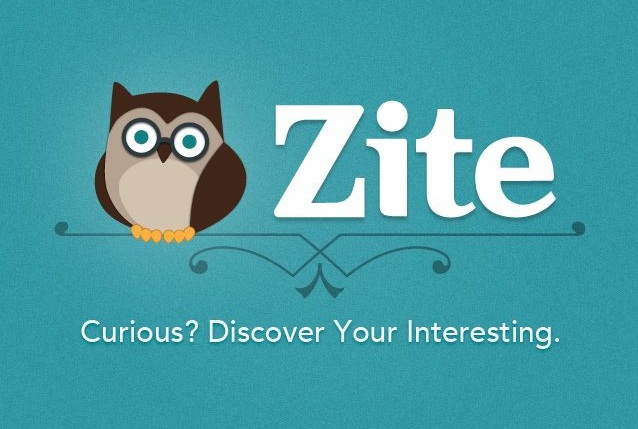
In lieu of Zite’s text-based logo, an owl greets you on the fleeting splash page. Why an owl? Zite says that it’s “curious, intelligent, and approachable” – all the attributes that Zite claims to embody, but we’ll be the judge of that.
First impressions
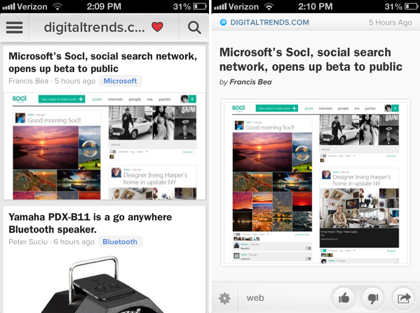
On the front end, Zite’s redesigned app has put a heavy emphasis on images. The images that accompany stories take up more retail space than they used to take. On one hand, you might be more inclined to select or engage with a larger picture, but it also means that fewer stories can be packed into the screen. Stepping back and looking at the redesign as a whole, the new design looks a lot like Feedly’s user interface.
The article pages themselves have few changes and improvements. Among the changes is a topic tagged to each story. Topic tags, which you’ll find added to each article, provide a secondary channel for users to explore deeper into a topic related to the story. You can click through tag and open up a new topic page and its relevant stories.
When you open up an article, the sharing and up/down vote icons are still there. But at the bottom left is a gear icon that pops open the option to increase or decrease text sizes or to block the publication from surfacing again in the future.
A new way to navigate Zite
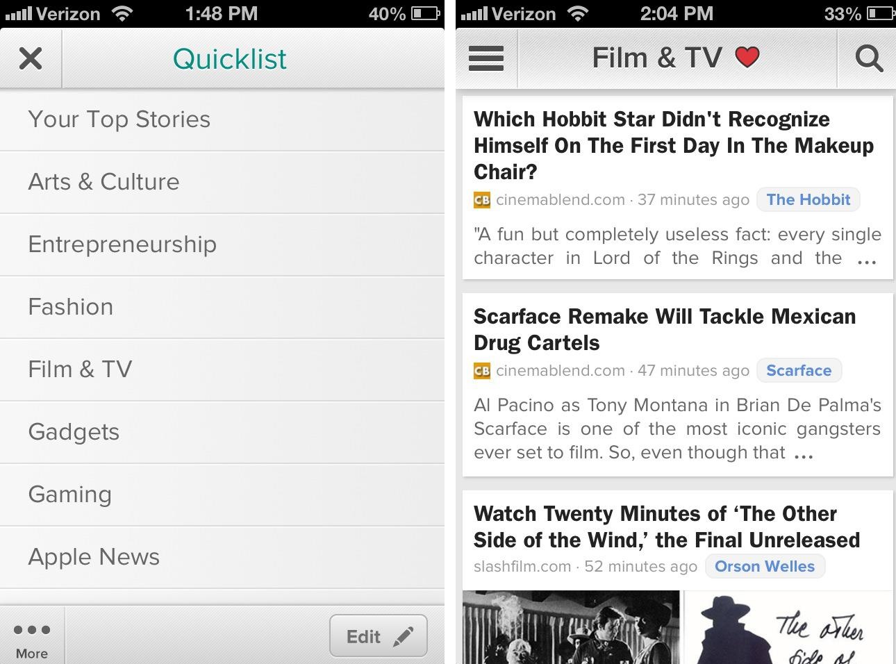
There are a few dramatic changes to the way users navigate the app, and here is where the redesign could be divisive among existing users. To browse through stories you can swipe vertically, which is the same motion that we familiarized ourselves with in version 1.0, but the horizontal motion for browsing topics has been removed altogether (unless you’re returning to the previous page). Normally, you’d swipe left and right to scroll through your choice topics. I may have had to swipe through five different topics before I could find the technology section, but it forced me to at the least catch a glimpse of the latest news happening not only in tech. So should a story pique my interest I would end up clicking on it. The new design opts to list topics in a “Quicklist.” So now you can navigate to the top left button and open up your favorite topics. This move, Zite CEO Mark Johnson tells me, is to satisfy two types of users – user that might have a couple dozen categories and users with just a few categories. The list was the best way to keep all users happy.
Search and ‘Explore’
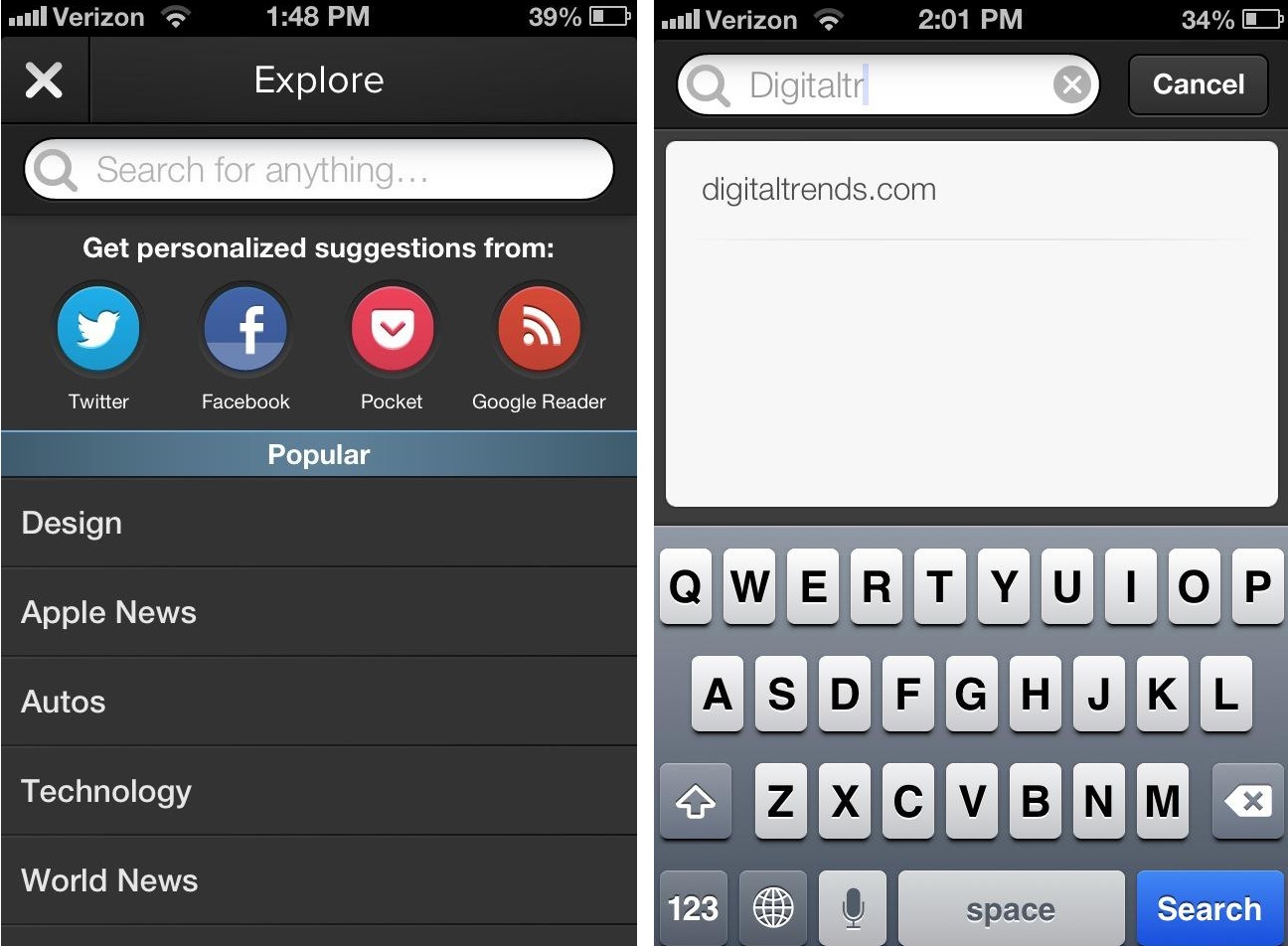
A new search section, which Zite calls “Explore” encourages the discovery of new topics in the app, which wasn’t supported in Zite 1.0. Now with 40,000 different topics, users can find something that fits their interests thanks to a new search bar. If you select the magnifying glass icon on the upper right corner of the home screen, it opens up the “Explorer” page. Here, there’s four social buttons, and below that there are recommendations for new topics that you might want to select.
Johnson says that the discovery of new categories was really what motivated the company to redesign the app. With 40,000 categories, Zite had the challenge of convincing users that these categories exist, which was impossible on Zite 1.0, but now a reality on Zite 2.0.
Profile page
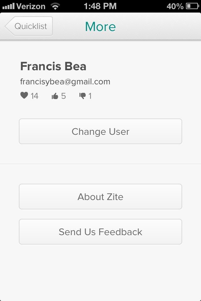
One major but non-assuming feature on Zite that’s hidden away is personal profile pages. If you access your Quicklist, there’s a button in the bottom left corner of the page labeled “More.” If you click on this, you’ll see your name, email address, the number of topics on your Quicklist, and the number of times you’ve liked and disliked stories. There’s also a button to change users. You don’t have to think much of this right now, but it’s a clear indication of Zite’s interest in developing personal profiles users. Johnson confirmed with me that this was in fact the direction Zite was taking.
“Another good reason for the changes is that we wanted a base on which we could build a lot of cool features,” said Johnson. “A common request from users is a history page. In terms of users and personalization, there’s a lot of ways users can give us a lot more data to make Zite smarter, so we’re also thinking about that.”
Behind the scenes
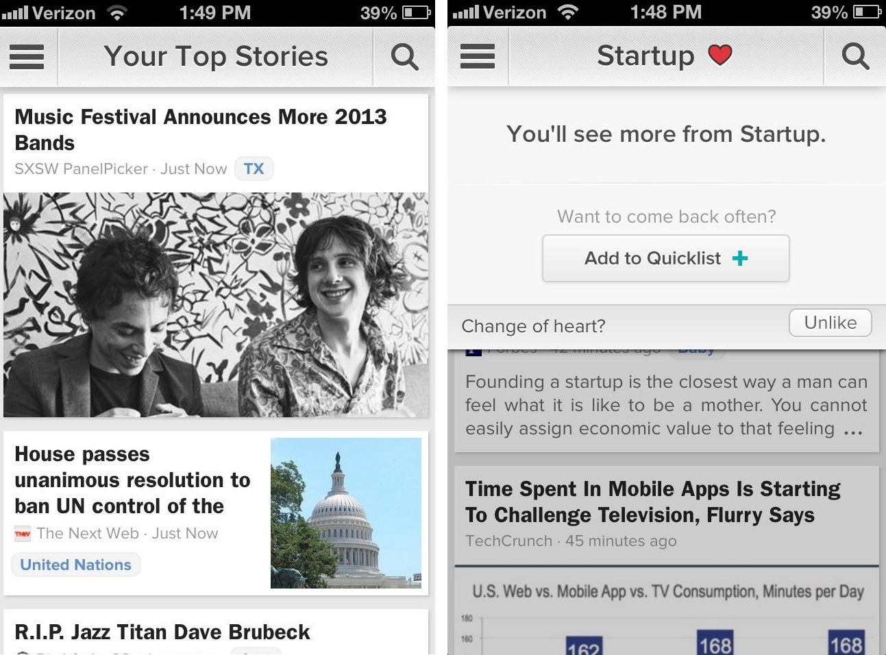
User interface changes are nice, but Zite 2.0 is also packing a superior recommendation engine. These changes are most obvious if you you’re on the topic, “Your Top Stories.” This topic recommends you a veritable cornucopia of stories depending on your engagement and other variables on Zite including social, views, and likes.
If you connected your Twitter and Facebook accounts (through the “Explore” tab), Zite is also able to surface articles based on the stories you’ve shared in the past on each network. Johnson encourages users to upvote and downvote each story they read to better improve their recommendation services. You’ll also recognize a heart icon next to each category, which fuels the recommendations. By pressing this icon you can add that topic directly into your Quicklist and, at the same time, tell Zite that it’s a topic that you’re interested in. Finally, the articles that you read in Zite contribute to surfacing the articles that Zite thinks matters to you the most.
Why the changes
As discussed above, the changes revolve around the discovery of new topics and categories. This design just happened to best fit Zite’s needs. But also Johnson says that Zite always wanted to go native on the iPhone and make the user experience feel “snappier.” “It was always our intention to rebuild Zite from the ground up once it became popular.”
Editors' Recommendations
- Oppo Find X2 Pro hands-on review: A leather-clad stunner
- New leak shows off Samsung’s One UI 2.0 — and it’s built on Android 10
- Google Assistant 2.0 isn’t just a minor evolution. It’s a game-changing upgrade