
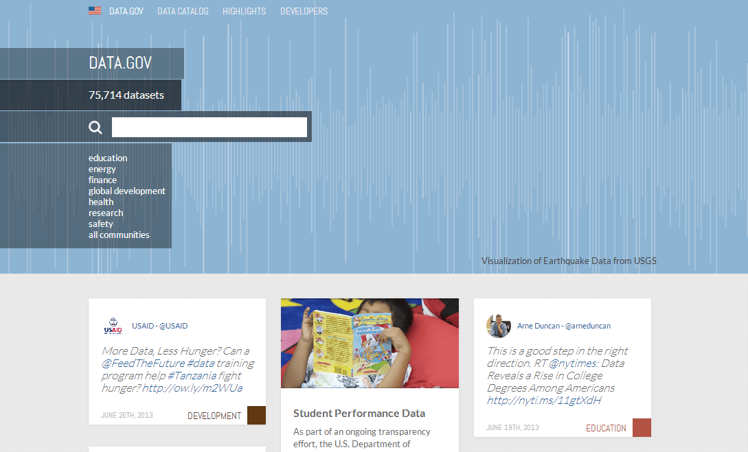
Despite the media outcry in the wake of the recent NSA revelations, negative publicity hasn’t phased the government’s effort to improve the transparency and technological uses of its public data sets. As promised by President Obama, the White House unveiled a sneak peek of Data.gov’s overhaul. Compare the new site, temporarily found on next.data.gov, with the former and you can’t help by notice a few things Data.gov is borrowing from social sites.
Before we start comparisons, let’s take a look at what’s happening under the hood. The new Data.gov site is something of a search engine for public data sets, but with a few extra bells and whistles (which we’ll get to later). Agencies like the Department of Health and Human Services, explains Nick Sinai and Ryan Panchadsaram of The White House, are among the first under the President’s Open Data Executive Order to publish its publicly available data in a machine-readable format.
What this means for users is that while the data itself might not live on Data.gov, every agency participating in the revamp of Data.gov will eventually be required to allow the site to index these agency’s reports. It’s why you can browse next.data.gov for public data – like the Census Bureau or the U.S. Energy Information Administration – but if you want to dig into the data, you’ll be directed to the relevant agency’s website.

Admittedly it would be far more convenient to be able to view all the data from these government agencies within the Data.gov site, with visualizations of the data generated by algorithm. So this is where third-party developers come in at the behest of Obama’s Executive Order, which notes “Entrepreneurs and innovators have continued to develop a vast range of useful new products and businesses using these public information resources, creating good jobs in the process.” With this in mind, the new Data.gov introduces easy-to-access tools and data sets that developers can use to hack together meaningful apps. In other words, Data.gov is developer-friendly with multiple file types and one-click downloads.

Data.gov’s search engine is powered by the open-source tech, Solr, and its search engine suggests auto-completed recommended queries. Notice its trend-hugging characteristics? Open-source is a hot topic, and the suggested search term functionality is something we’ve seen and come to use plenty of times before. The feature is mainstay in Google.com, and also a core feature within Facebook, Twitter, Quora, and the other social platforms.
But what about the front end? Well it would appear that Data.gov is doing a little social media copycatting.
The Pinterest-ification of the Web has been much-discussed, and the White House isn’t missing out. The pin board style and infinite scroll has been adopted.

And the search bar in the upper left-hand corner, in addition to the pin board scheme, is a nice page taken out of Google+’s book.

Naturally, Data.gov is also pulling in relevant tweets.

Really, this is all what we’d expect from an administrative that has been tearing up Tumblr. What do you think of the new design: Is it a cheap pull for attention, all social and no substance – or a revolutionary design that will engage more users than the old version?


