“Why you can trust Digital Trends – We have a 20-year history of testing, reviewing, and rating products, services and apps to help you make a sound buying decision. Find out more about how we test and score products.“
You’ll find no shortage of software that will turn an ordinary PC into a TV-friendly media center. From MythTV and Freevo for chronic TV recorders, to Boxee and XMBC for Hulu and YouTube fanatics, any machine can morph into a set-top box with the right software aboard.
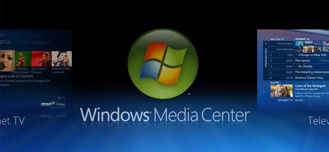
But for total integration with an OS, Windows Media Center has been hard to beat. The large-print, remote-friendly interface for Windows started off as an offshoot from Windows XP, grew into its own with Windows Vista, and has taken on an even more impressive suite of features with Windows 7. While we ran the new OS through a slew of benchmarks, testing and performance comparisons for our Windows 7 Road Test, we didn’t have a chance to fully poke and prod all the new Media Center features Microsoft has slid in along with its other updates. So without further ado, here’s what Windows 7 brings to the scene, and some of our own impressions from toying with the impressive new tool.
Internet Video, Take Two
Or as Microsoft calls it, “Internet Video, Beta 2.” Microsoft technically introduced the feature as Beta 1.1 with Vista, but it has revamped access to this content with Windows 7. While the categories (News, sports, movies, etc.) will look familiar, the menu system has changed to deliver a fuller overview of all options. Main categories, for instance, no longer spread across the top of the screen in an outrageously large type size that pushes non-selected items to the very periphery of the screen, and the side-scrolling effect has been done away with. The result may be less artistic and striking, but seeing all options right from the start makes finding what you want significantly easier.
Unfortunately, the selection of content (culled from MSDN) remains as it always has been – rather weak. Although we found full episodes of Arrested Development and a few other gems, the majority of the content remains in clips, putting it far behind providers like Hulu. Microsoft also conveniently continues to snub Google-owned YouTube as a rich source for content.

Turbo Scroll
Nothing’s more annoying than sorting through a list of 2,458 titles when all you have to work with is a back and forth button, which is why Microsoft has developed Turbo Scroll. Hold that scroll button down and titles start flying by – until they turn into a quite literal blur. Fortunately, it’s an intentional visual effect, and Microsoft layers over a couple letters from each entry on the whizzing list going by to clue you in as to when it might be time to stop. It works with both media loaded on the server, and other obtuse lists, like days’ worth of TV listings.

The Fade
Windows Media Center (and even most cheapo cable boxes with guides) have always allowed you to browse while you watch TV with picture-in-picture style video playing beside menus. Windows Media Center takes it a step further with a classier technique, which lays whatever you’re watching over the menu system in a semi-transparent gradient as you perform other tasks. Besides scoring some definite style points, the new way of cutting away from active video leaves it much larger, making it much easier to watch when you actually divert your eyes from the menu. Unfortunately, Media Center still reverts to picture-in-picture for some crowded menus that just weren’t built to have a additional video layered over them (like the Internet TV browser).


Don’t want to open a gigantic Windows Media Center window just to see if there’s anything new worth watching? No worries. Microsoft’s new Windows Media Center desktop gadget feeds a constant stream of content to a discreet corner of your desktop, including Internet TV content you’ve already shown an interest in, and freshly recorded shows picked up from a tuner. When something catches your eye, just click, view more details in an expanded gadget tab, click again, and it’s playing.
Holy Album Covers, Batman!
If you have a 42-inch display connected to your stereo, chances are you don’t just want it to sit there and look lame while you’re pumping music. Windows 7 Media Center ups the ante a bit by scrolling a massive grid of cover art around in the background as you play music or browse your collection. Missing some cover art? Most peoples’ collections are, which is why the new Media Center now does a better job covering it up by mixing up the background colors on the automated covers it generates in place of a real one. A small fix, but it looks far more subtle than a patchwork of mostly blue squares.

Play Favorites
Don’t have time to pick a specific artist or slideshow to stick up on the TV? Both the music and pictures categories now have a “Play Favorites” option that instantly retrieves your past favorites (as the name implies) and puts them up on the screen. While the music version displays the same graphics you could typically expect, the photo version uses a new effect called Ambient Slideshow. OK, it’s a glorified screensaver, but it looks great. Your photos show up as a busy patchwork of desaturated, white-rimmed prints, then slowly come to life in color as the screen pans over them.

Tweaked Interface
Media center software is all about ease of access – after all, if you wanted to click through 10 different menus just to play a movie, you could just use the standard desktop. Fortunately, Windows 7 makes a range of improvements to the overall ebb and flow of the system, not to mention cleaning up and improving graphics. Pressing to the right or left while video is playing brings up a synopsis of a television program, not to mention commonly used features (like zoom) that used to require additional hunting. Mouse-and-keyboard users can even click and drag on video progress bars to skip forward or back in the programming, and a tiny thumbnail will appear above to preview where the drag will bring you in the footage. It’s a small feature, but one that’s been long missing until now.

Wrapping Up
Windows Media Center 7 has us itching to build a home theater PC worse than ever – and with the improved performance of the new OS, the hardware requirements for what we can get by with have dropped, as well. Though its DVR capabilities remain robust, it continues to lag behind in the rapidly expanding realm of Internet TV, where competitors like Boxee still deliver a far superior selection of content. However, additions from Microsoft itself as well as third-party plugins (like SecondRun.tv) could easily bring it up to speed, and we suspect it will remain a strong contender for future HTPCs when Windows 7 officially rolls out in October.
For more on Windows 7 check out our articles: Experts Review Windows 7, Recommend You Upgrade and Windows 7 Upgrade Guide: Everything You Need to Know.