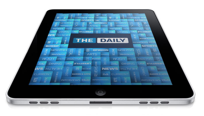
The old-timey concept of a paperboy peddling his way through your neighborhood at the crack of dawn pitching newspapers onto welcome mats is dead. If it didn’t die with child labor laws, the guy who now delivers your paper in an El Camino, or Internet, you can rest assured it died today with the launch of The Daily. Newspaper magnate Rupert Murdoch presented the world’s first iPad-exclusive digital newspaper at New York City’s Guggenheim Museum, where he pushed the glossy app as a revolution in journalism that would push the print industry forward into a fast-paced new age of Web media.
But is The Daily truly a breakthrough, or the last, $30-million gasp of a dying behemoth?
We put on our reading glasses, poured a cup of coffee and settled down with the inaugural issue to see for ourselves.
Why is The Daily any different from all the other media apps on the iPad?
If you own an iPad, it’s the first question you may ask. And a valid one. The answer is more about what’s going on behind the scenes than on your screen.
The Daily is the first newspaper presumptuous enough to charge consumers for content that only exists in bits and bytes. With the exception of Richard Branson’s iPad-only magazine Project, all the outlets hawking subscriptions on the iPad before (The New York Times, Wired, GQ, Popular Science) had roots in real paper, making it easy to pitch consumers the idea of paying for a digital alternative. Other media apps, like Slate’s, were free to download, merely offering cleaner versions of the same stuff consumers could get for free through a browser.
You can subscribe to The Daily for 99 cents a week, or $40 annually. Not exactly a wallet buster, but what is unique is the way you pay. The Daily is the first magazine to leverage a new feature of iTunes that allows you to pay for subscription apps through your iTunes account – no need to enter another credit card number. Besides making it easier for consumers to buy in, iTunes subscription billing will pass vital consumer information (like where you live) on to the magazines and newspapers, allowing them to build more accurate demographic information for advertisers, the same way they once did in print. The end result: More revenue for the media company, and hopefully better content for you.
 Welcome back to pages

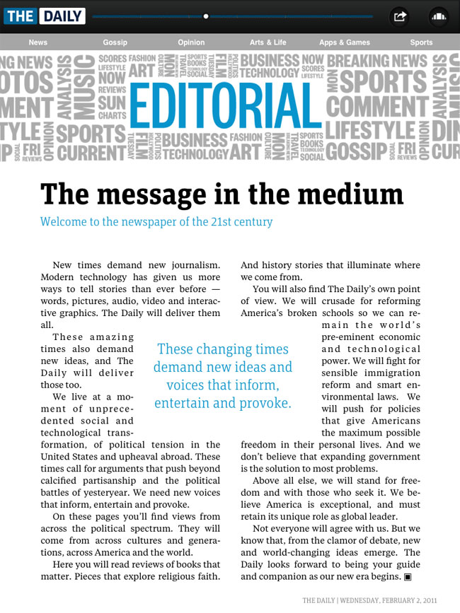
After firing up The Daily, the app greets you with an iTunes-style carousel of pages that could almost pass for album art: page after colorful page in an ever-rotating lineup. Each comes from one of six sections: News, Gossip, Opinion, Arts & Life, Apps & Games, and Sports, which lie strung out across a bottom navigator, and tabbed at the top of each page in red for convenience.
Though you can give the carousel a whirl, it actually stumbles along with a bit of a stutter, and thumbing from front to back is a no-no here. You’re better off selecting an article and using the top scroll bar, which lets you jump to any point in the magazine with a finger wag, even if does suffer from the same latency.
In practice, every page layout looks exactly like what you might have expected from a magazine, but with a twist. Some pages begin with subtle animations. Others have videos embedded at the top, or panoramas you can click on to explore, say, a 360-degree view of Venice. In a fashion article, you can click “Buy Me” next to any item of clothing and indulge your most impulsive consumer desires on a whim (no accident we assure you). All the bells and whistles we’ve been promised from the next generation of digital media are present and accounted for. But not perfect.
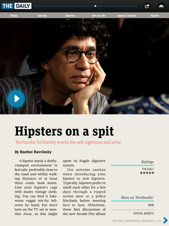
With such an assortment of content lurking more than page-deep, some of it seems to get lost. For instance, an article on the new IFC series Portlandia included an embedded video clip of the show, photos embedded within the text, and – if you turn the iPad sideways – a separate gallery of full-screen shots with captions. Trouble is, there’s nothing to clue you in to the extra photos when you’re reading vertically, which left us with the uneasy feeling we had to tilt every interesting article sideways to see if there was “any more” lurking underneath.
The Daily also seems unsure of how to split up long articles. On half of them, you can scroll down off the first page as if you’re in a Web browser. It’s familiar, it keeps the format going, and it works. On others, you’ll need to leaf to the side for the next page, as if you’re reading a traditional magazine. It works too, but the inconsistency will have you hunting for arrows to see which way you need to drag for more. Designers should have just picked one style and committed.
Other options just aren’t easy enough to use. For instance, while you can listen to any article read out loud in a natural voice – a brilliant feature for car-bound commuters – you need to counter-intuitively jump out of an article back to the carousel to find a triangle button, which drops down another menu, which lets you hear it read out loud. How about an audio button in the top right?
Reading between the lines

The Daily’s approach to content looks something like Newsweek or TIME diced up into day-sized chunks. Breezier than The New York Times but more authoritative and less sensational than The Huffington Post, The Daily’s voice fits its hybrid medium.
Heather Havrilesky’s review of Portlandia, “Hipsters on a spit,” weaves the snark and everyman perspective of a blogger with the impeccable wordsmithing of an author allowed to tap out a review in more than the 23 minutes it takes to watch the show.
Steven Leckart actually found time to interview the CEO of WikiAnswers for his article on crowd-sourcing Q&A.
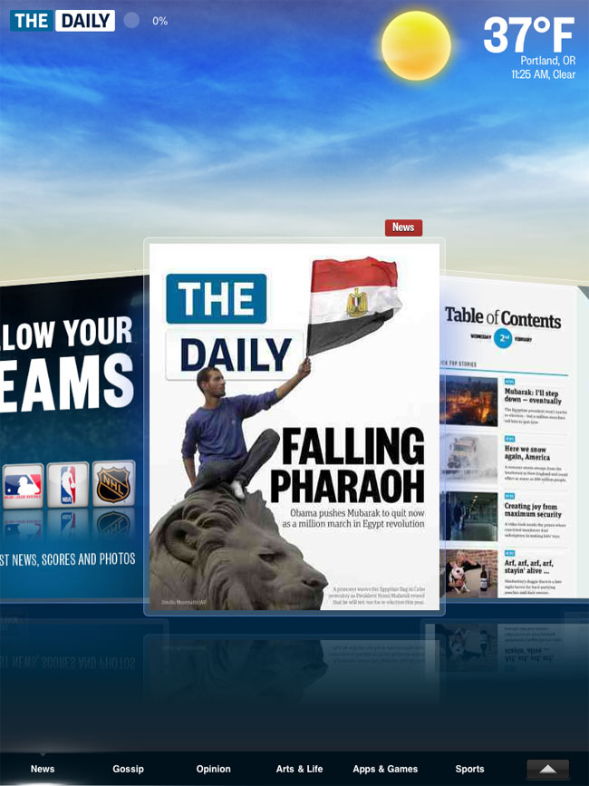
None of the splashy, colorful headlines (“FALLING PHARAOH”) are trying to game search engines with keywords.
This is the kind of writing, and design, Murdoch hopes to maintain with a pool of millions of readers paying a buck a week, and animated Pepsi ads floating between pages. And we like it.
Bringing back the good ‘ol days
Whether or not the 79-year-old newspaper titan can remains to be seen. Aside from its thoughtful content and slick (if initially flawed) interface, The Daily’s $40 annual price point may be its biggest selling point. A year of Newsweek costs $39 and only lands you one issue a week. A year of The New York Times hits the doorstep at a stiff $384.80. Heck, a single digital issue of GQ on the iPad costs $2.99. If you want to talk about the kind of writing worth paying for, The Daily actually makes good on the magic of digital distribution by offering a solid value. If you don’t consider opening Safari a competitor, that is.
The wealth of free content on the Web will remain The Daily’s biggest barrier. It may not come in an iPad-friendly rectangle, but you’ll still know which celebrity is dating which, the top 10 ways to everything, and find all the scathing rants you want on the next crooked politician.
Our advice for would-be buyers?
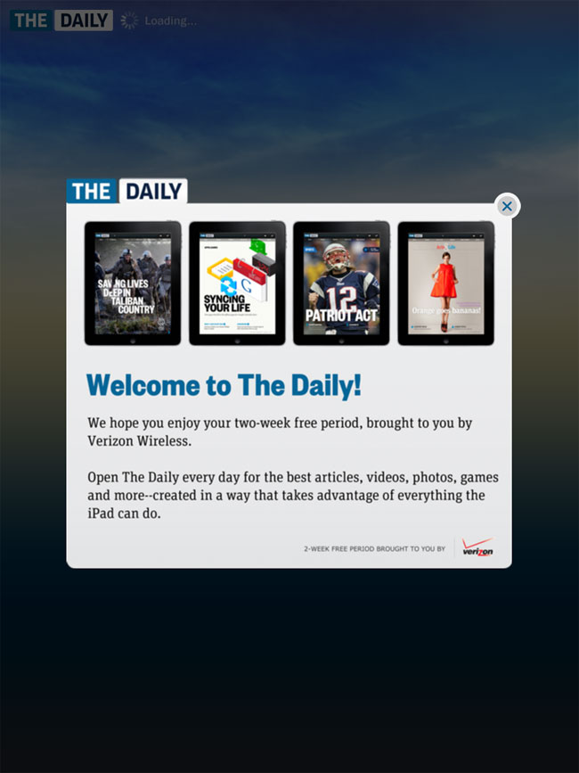
Try it. Murdoch wisely kicked off The Daily with a two-week free trial, so you can open it up with your morning coffee every day and see whether pay walls really are the wave of the future.
More screenshots of The Daily app


Editors' Recommendations
- Apple is about to do the unthinkable to its iPads
- We finally know when Apple will announce its 2024 iPads
- This iPad just got a rare discount — save $100 at Best Buy
- Apple accidentally revealed a big iPad Pro display upgrade
- Two popular iPad models just got pretty steep price cuts — from $250