
Want to know everything about your town or job? This site will show you

Welcome to Data USA! MIT Media Lab has released Data USA, an open source data visualization engine loaded with all publicly available U.S. data. The promise is that we can find what we want fast instead of laboring through tons of data with different interfaces on thousands of government sites. If you’ve tried accessing government databases to get commercially unbiased data, as I have, the experience is often cumbersome. But that may change.

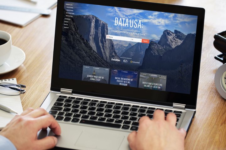
For example, if you’ve considered moving for a job transfer, your experiences likely have been like mine as you try to figure out what different towns and cities are really like to live in. With typical online government databases you first have to figure out if what you want is really there, learn how to navigate the interface, and finally search for data that’s often in tables and lists that aren’t very clear. This is where Data USA to the rescue.

Recommended Videos

The data visualization project was sponsored and supported by consulting and auditing firm Deloitte, according to The New York Times. Deloitte not only provided the funding, but also “expertise on how people use government data sets in business and for research.”

So if you decide to search on a city or town, you just type the name in the center screen query box and click “Search.” I looked at Boulder, Colorado and learned that the population is 102,002, it’s the 295th of 29,509 census designated places, median household income is $58,062, and the media age is 28.3. That’s nice, but it’s not all. First off, the background image shows the Rocky Mountains, which border the hip little city. At the bottom of the screen there are menu icons for About, Economy, Demographics, Education, Housing & Living, and Health & Safety.

See also: MIT biologists have developed a programming language for bacteria

It’s easy to find the data on public health, traffic patterns, energy consumption, family incomes, and many other topics, but Data USA isn’t just about data, it’s about visualization. When you click on a location’s sub-menus the data comes back fast but it may take a couple of seconds for the graphs to appear. The category is typically summarized or described in a short sentence or two but the data is converted to simple-to-understand graphs. Most of the graphs I saw were horizontal or vertical bar charts. The graphics are not over done or glitzy, in my opinion, but very easy to understand.

Research always has been about finding accurate information. Thanks to Data USA, it appears that info is going to be even easier to understand.

Bruce Brown
Bruce Brown Contributing Editor   As a Contributing Editor to the Auto teams at Digital Trends and TheManual.com, Bruce…
How to change margins in Google Docs
Laptop Working from Home

When you create a document in Google Docs, you may need to adjust the space between the edge of the page and the content -- the margins. For instance, many professors have requirements for the margin sizes you must use for college papers.

You can easily change the left, right, top, and bottom margins in Google Docs and have a few different ways to do it.

Read more
What is Microsoft Teams? How to use the collaboration app
A close-up of someone using Microsoft Teams on a laptop for a videoconference.

Online team collaboration is the new norm as companies spread their workforce across the globe. Gone are the days of primarily relying on group emails, as teams can now work together in real time using an instant chat-style interface, no matter where they are.

Using Microsoft Teams affords video conferencing, real-time discussions, document sharing and editing, and more for companies and corporations. It's one of many collaboration tools designed to bring company workers together in an online space. It’s not designed for communicating with family and friends, but for colleagues and clients.

Read more
Microsoft Word vs. Google Docs
A person using a laptop that displays various Microsoft Office apps.

For the last few decades, Microsoft Word has been the de facto standard for word processors across the working world. That's finally starting to shift, and it looks like one of Google's productivity apps is the heir apparent. The company's Google Docs solution (or to be specific, the integrated word processor) is cross-platform and interoperable, automatically syncs, is easily shareable, and perhaps best of all, is free.

However, using Google Docs proves it still has a long way to go before it can match all of Word's features -- Microsoft has been developing its word processor for over 30 years, after all, and millions still use Microsoft Word. Will Google Docs' low barrier to entry and cross-platform functionality win out? Let's break down each word processor in terms of features and capabilities to help you determine which is best for your needs.
How does each word processing program compare?
To put it lightly, Microsoft Word has an incredible advantage over Google Docs in terms of raw technical capability. From relatively humble beginnings in the 1980s, Microsoft has added new tools and options in each successive version. Most of the essential editing tools are available in Google Docs, but users who are used to Word will find it limited.

Read more