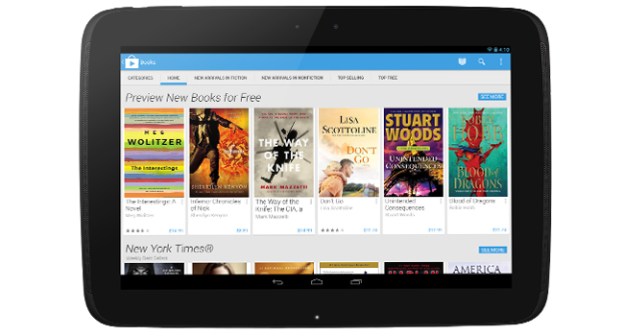
Michael Silisk, a product manager over at Google Play, has given us a sneak peek of what the next generation of Google Play is going to look like before its release in the coming weeks, and both Apple and Microsoft better take note.
While nobody is up at arms over how Google Play is organized, that isn’t stopping Google from looking for new ways to be innovative and convince you to fork over money for new books and apps. The sneak peek suggests a design that, according to Silisk, “focuses on bigger images that jump off the page.” The design certainly gives that feeling, focusing on bigger cover art for movies, books, and apps, so they’re easier to select whether you’re on a small smartphone, a big phablet, or even bigger tablet. The experience is also expected to be streamlined for payment processing, which Google is claiming will make the entire buying process all the more easy for people to rent movies, books, and more. While the Play Store didn’t seem like it needed a major update, it appears to be a step forward.
Along with the media mock-up, Google promises to start rolling out the update ASAP to all devices running Android 2.2 and above, which is just about every Android device out there, save for an extreme few still using Android versions 2.2 Eclair or Donut. Most Americans should expect to get the update in the next day or so, while the rest of the world will see it within a few weeks.