You can try NothingOS, the software installed on the new Nothing Phone 1 today, right now, without buying the phone itself. Go to the Google Play Store and download the Nothing Launcher app, and provided your phone is compatible, you’ll get most of the NothingOS experience on your current device.
But it’s not quite the full experience, and it’s worthwhile understanding where the differences are between the app and the phone’s software. Still, it’s a great way to get the Nothing Phone 1 experience on your device before actually buying it for yourself.
Nothing Launcher compatibility
When the Nothing Launcher app was released it was only compatible with certain Google Pixel and Samsung Galaxy smartphones, but in early May this list was dramatically expanded to include almost any Android phone with Android 11 or later. That means if your Android phone is less than a couple of years old, there’s a very strong chance it’s capable of running the Nothing Launcher.
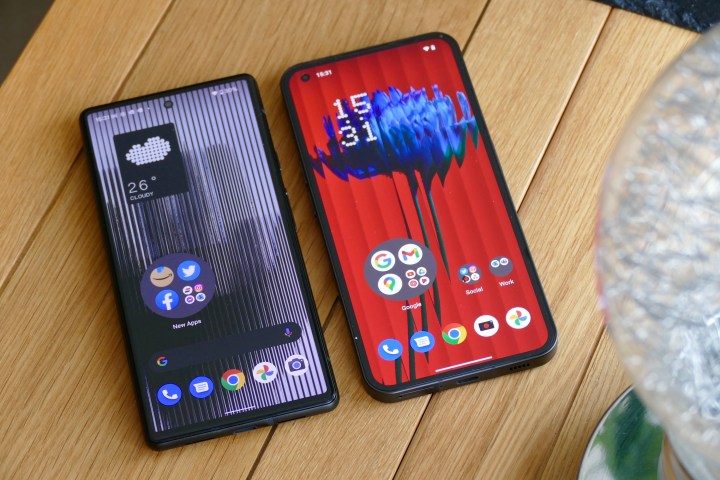
The launcher is still listed as a beta app though, meaning it may have bugs and other performance problems, so just be aware that if you use it on your everyday phone it may introduce some issues. Although the Nothing Phone 1 has been released, there is no sign of Nothing updating the Launcher to a final version, so we have tested version 1.0.2.
What you get with the Nothing Launcher
We have been using the Nothing Launcher on the Google Pixel 6, and are comparing it here with NothingOS 1.1.0 on the Nothing Phone 1. The launcher isn’t hugely customized, and it doesn’t introduce any dramatically different apps or methods of control, regardless of which phone you use. It’s simple and follows Android 12’s Material You design closely, so don’t expect a revolution.
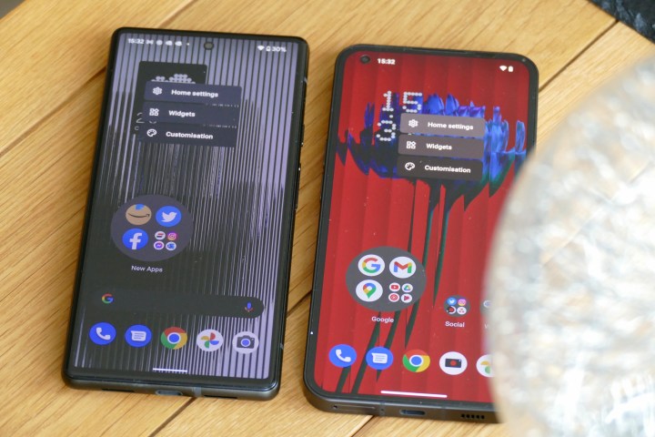
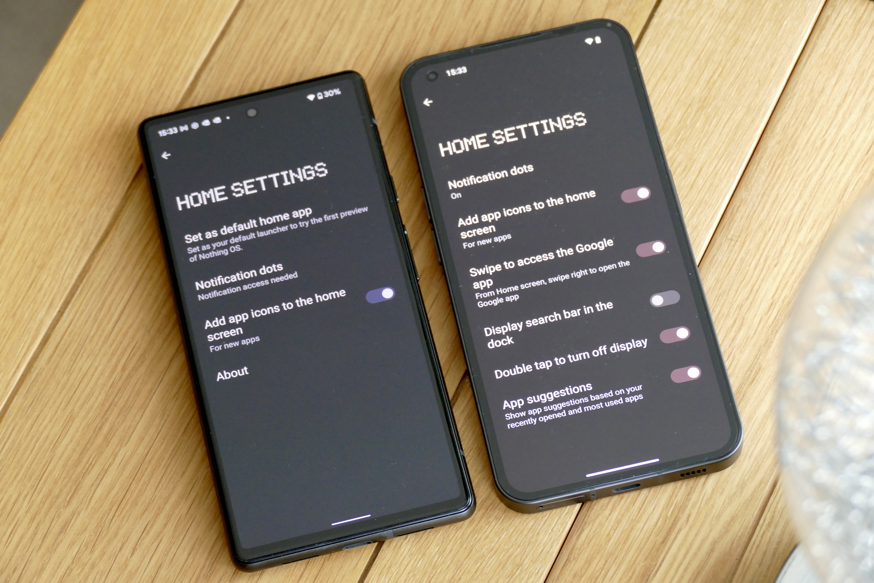
Once Nothing Launcher is installed on your phone, tap and hold the Home Screen to get three options: Home Settings, Customizations, and Widgets. We’ll start with Home Settings, which is where you can set the Nothing Launcher as the default on your phone. In NothingOS you can activate the unusual double tap to turn off the screen feature, and there’s the option to remove the Google Search bar from the Home Screen, too. The Search bar is permanently on the Home Screen in the Launcher app.
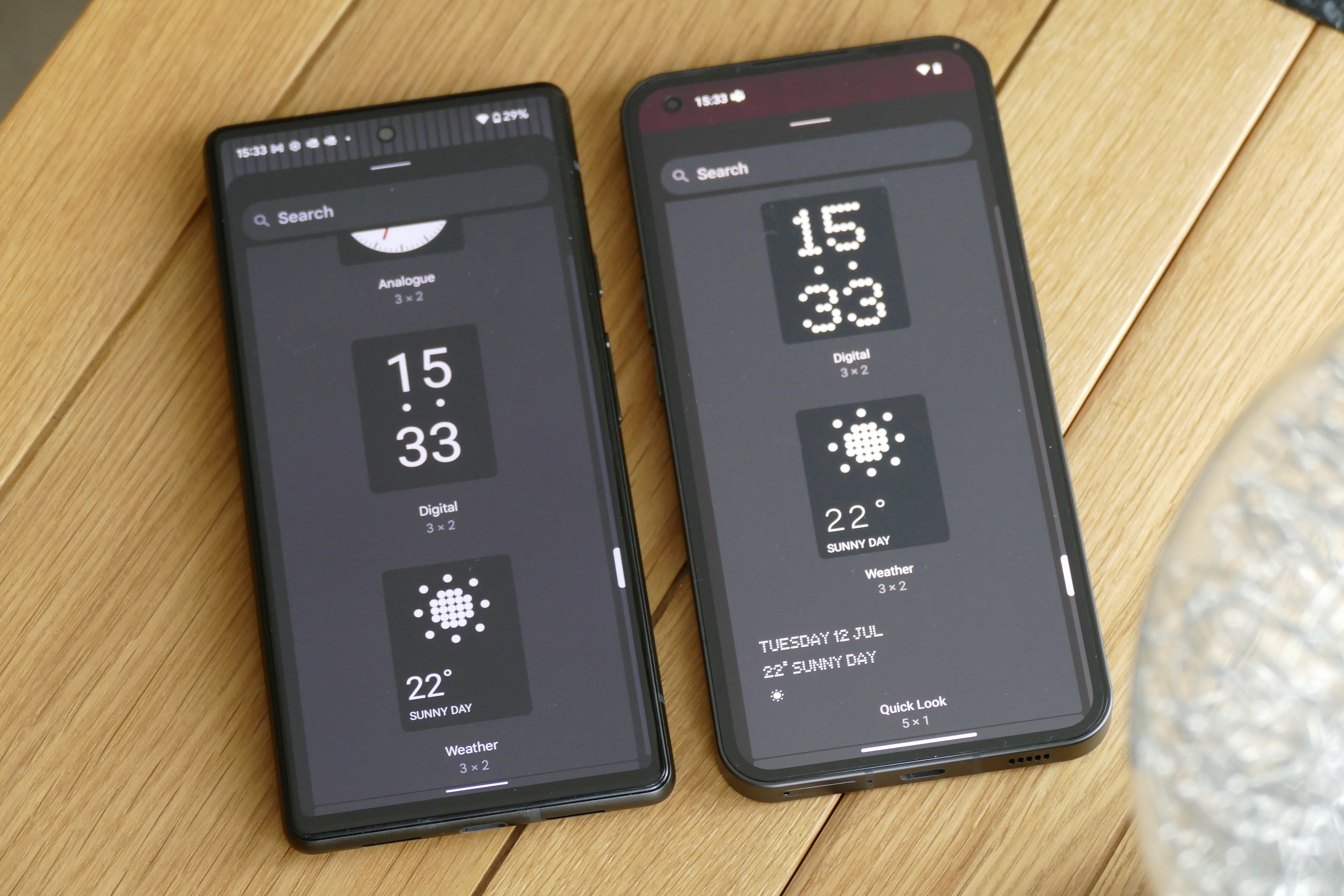
Moving on to the Widgets menu, if you scroll through the list that appears, you’ll spot an option called Nothing Launcher. Expand it and you have a choice of three different styles of clock. In NothingOS on the Phone 1, however, there are four different choices, including a further pixel-art style version seen in a lot of Nothing’s promotional material. Nothing’s NFT widget is also missing from the Launcher.
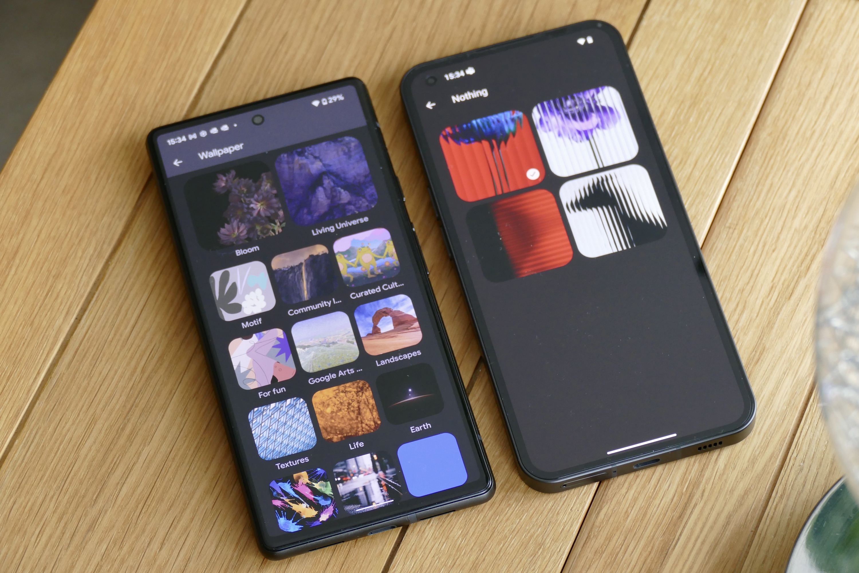
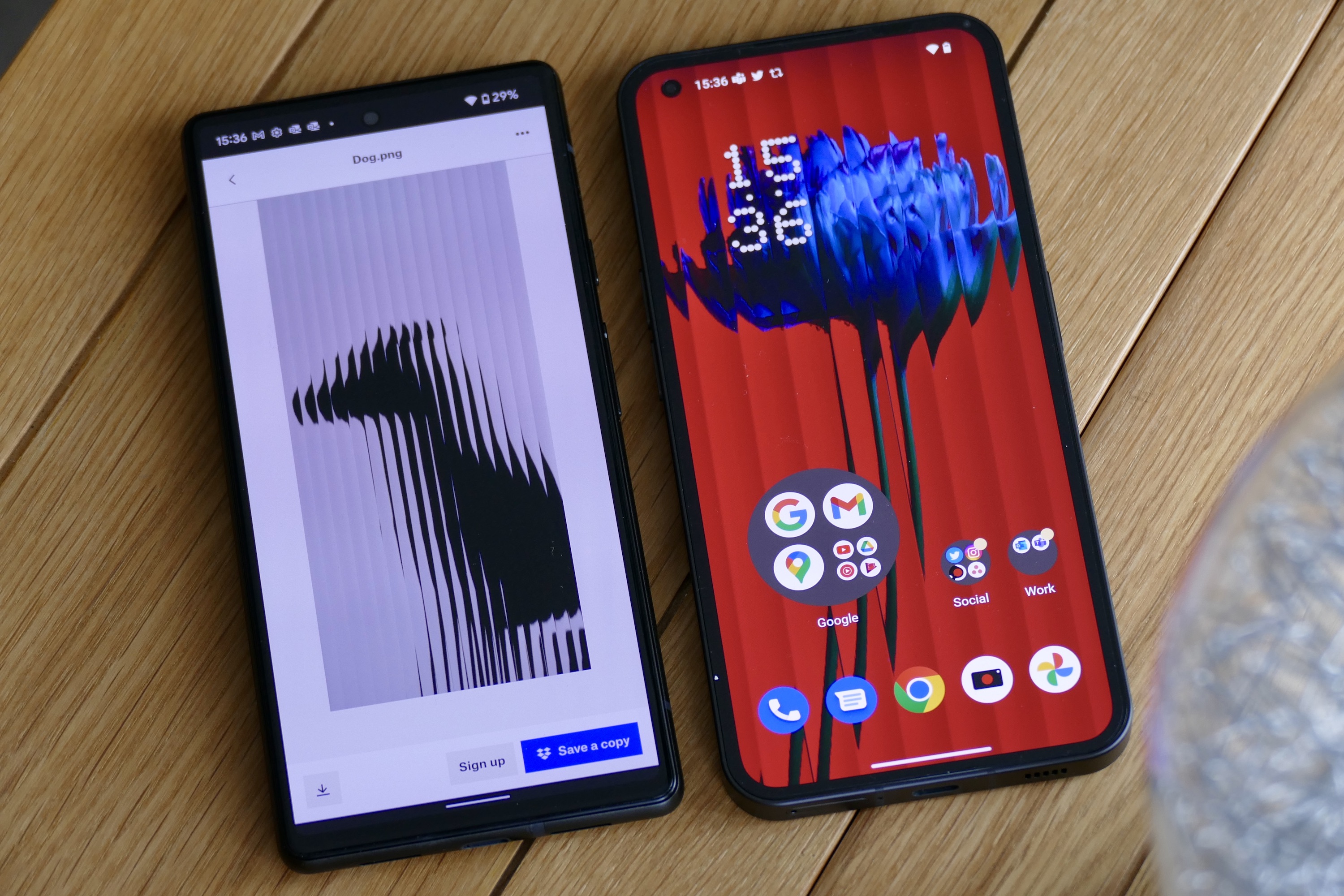
Next, return to the Home Screen and open Customization. Here you can select the Nothing Icon Pack, which is activated by default in the launcher and NothingOS. You can also change the app grid layout and turn on Wallpaper Scrolling. It’s essentially the same across both devices, apart from a link to download more wallpaper and ringtones in the Launcher. It’s worth doing, as there are some wallpapers in the folder that aren’t included with the Phone 1. If you don’t download the additional wallpapers, the Launcher app only has one wallpaper option, (the weird pixelated hand) while there are four different wallpapers in NothingOS.
Staying on the Home Screen, put some apps in a folder together and long press on it. You’ll spot an option named Enlarge. Tap this and the small, single-icon folder becomes a large, circular folder where you can see at-a-glance three larger icons and four smaller icons all at the same time. Long press the folder again and tap the Minimize option for it to return to its old, small size. This works exactly the same on the Nothing Launcher and NothingOS on the Nothing Phone 1.
What the launcher is missing
Aside from what’s mentioned above, there’s not much more to the Nothing Launcher. What’s different on the Nothing Phone 1? Open the Settings menu on the Phone 1 and you’ll find the Glyph Interface menu, the Connect to Tesla experimental feature, plus widespread use of Nothing’s dot matrix font. Slide down the notification shade to the Quick Settings view on the Nothing Phone 1, and there are two circular icons at the top of the screen, where the phone’s connectivity status is shown and can be quickly altered. This is not part of the Launcher. The only extra app found on the Nothing Phone 1, the visually unusual Recorder app, is not installed alongside the Nothing Launcher.

For obvious reasons, you don’t get any of the Glyph Interface options in the Nothing 54567rtLauncher, as your phone won’t have the required hardware to make it work. It also doesn’t come with any of the ringtones or vibration patterns that add so much to the Nothing Phone 1’s light show, although a selection of the ringtones can be found in the folder linked to under the Customization menu in the Launcher.
Because NothingOS is closely aligned with Android 12’s design, it’s not a huge departure for anyone using a Pixel phone, but it’ll be quite different for anyone on a Xiaomi, Oppo, or other phone with a heavily customized interface. It certainly gives a good impression of what NothingOS on the Nothing Phone 1 is like to use, including its enviable turn of speed and clean, bloat-free design.
A good (and limited) preview of the Nothing Phone 1
If you’re curious about the Nothing Phone 1 and its software, the Nothing Launcher gives you a good, if basic, introduction to what it’s like. And while there’s definitely more to NothingOS than you see in the Launcher, you won’t find masses of additional features, apps, or design elements on the Nothing Phone 1. NothingOS isn’t like that. It is a pleasingly simple Android interface, and that’s what makes it worth trying.
