Bespoke as a concept is alien when it comes to smartphones. Unlike other strains of consumer technology, there is so little that a phone’s hardware can be tailored to. Therefore, software customization remains an inclusive and integral part of personalizing smartphones.
Android has traditionally symbolized the freedom to customize. But with so many brands running wild with the sole aim to increase their market share, practical use of handheld technology is getting eclipsed by features such as superfast charging speeds and fanciful photography skills.

Nothing, an infant smartphone brand, aims to change that by emphasizing the meaningful use of smartphones — and giving users the power to control their phones instead of being controlled by them. But how well does it fare with its first attempt? Not as impressively as it would like, I fear.
Here’s why the Nothing OS feels suitable for nothing upon the first look.
How Nothing labels minimalism
Nothing was founded in 2021 by OnePlus co-founder Carl Pei. Since the beginning, it has sought to serve consumers a tasteful experience with technology while minimizing distractions and making these experiences less boring than what is already available. Therefore, its philosophy — as trumpeted by its name — thrives on the lines of minimalism, even though its first product, the Ear (1) earbuds that launched in August 2021, only follows that approach in an aesthetic sense.
In March 2022, Nothing held a special event to announce its plans to launch a new phone. Although prolific leakers gave us a glimpse of the phone, Nothing emphasized the experience is what sets the Phone (1) apart. The keynote featured symbolic references to Star Trek and was narrated by a Carl Sagan look-alike.
At the short — and quite ironically, unenlightening — event, Nothing promised to build an iconic product ecosystem dedicated to seamless connectivity. The company also gave us a preview of its customized Android skin — called “Nothing OS” — hailing it as a solution that allows its phone to connect seamlessly with products from Nothing, as well as other leading tech brands in the world.
According to Pei, Nothing OS will capture the best of Android in an unadulterated form by “distilling the operating system to just the essentials” for a purposeful, unrelenting, and personalized experience with the smartphone. The company aims to forge an experience with a blissful harmony of UI elements, colors, and sounds in its custom skin.
As promised at the event, Nothing has opened up a new beta preview of Nothing OS in the form of a custom Android launcher, currently available only for the Samsung Galaxy S21, Galaxy S22, and Google Pixel devices (Pixel 5 and newer). I tried the launcher to assess how it lends a sense of minimalism that Nothing endorses.
What the Nothing OS beta preview offers
The Nothing OS launcher is available on the Google Play Store on the devices mentioned above. In awful contrast to what the company is aiming for, the Nothing Launcher feels quite drab and uninspiring. These are the features spotted in the Nothing Launcher.
A bare-bones launcher
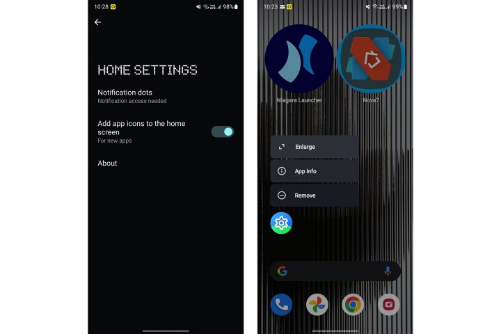
The Nothing Launcher replicates the simple menu options on the Pixel launcher, which is limited to Google’s smartphones. The options in the home screen menu are conventional (read boilerplate). At the same time, the launcher settings have just two rudimentary options — to show notification dots on app icons and add newly installed apps to the home screen.
The Nothing launcher allows users to resize app icons. But unlike a host of other Android launchers that enable you to fine-tune the size of the icons, Nothing offers the option to enlarge icons to a ginormous footprint. I fail to see the value behind an abnormally protracted icon.
The unusual icon size becomes even more bothersome when you realize the padding between two enlarged icons is the only thing that adheres to minimalism. The closely wedged icons rob the home screen of empty space in a way that can only be classified as a soulless massacre of minimalism.
The app drawer with its fixed icon grid and the lack of any options to change that, once again, feels like a trifle.
One wallpaper
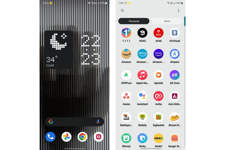
The Nothing Launcher offers only one wallpaper — even though the company claims it has three. This is the same wallpaper with jagged lines that was first shown as part of the operating system’s preview in March 2022. Contrary to the vision that Nothing wishes to sell, the wallpaper feels quite distracting and reduces the visibility of text and widgets. Speaking of widgets, there are some interesting additions here but, once again, nothing unusual.

I spotted another wallpaper in one of the settings menus, but could not apply it as the system background.
Some widgets
The only compelling aspect of the Nothing Launcher is the assortment of custom widgets it brings. There are only three widgets — a digital clock, an analog clock, and a weather widget. The digital clock and the weather widget boast of Nothing’s hallmark dotted-line font.

I fail to understand how Nothing associates this font with minimalism. Instead, its retro aesthetics allude to classic imagery associated with futuristic technology. To me, it is reminiscent of digital billboards and, thus, visual noise.
Special ringtones
Nothing says it has added three special ringtones designed by audiophiles, but I could not find them while running the Nothing launcher on my Samsung Galaxy S22 Ultra.
What I wish it had
While Nothing favors stripping down the standard Android interface in favor of its less intrusive Android skin, I feel a few features could have helped the company deliver the message better while also making it stand apart.
Smarter integration
Unlike what Nothing insists, its launcher does not look like a step toward an ecosystem for seamless interconnection between devices. What could have made more sense is a widget or a subsection of the app to manage everything in one place. This could include options to manage wireless connections and Bluetooth devices, toggle sound profiles, and control smart home devices through Google Home integration.
Nothing not only misses the mark with its unconvincing “minimal” design, but also forgoes — at least at the initial impression — the opportunity to set an example for other brands while assuring users it is doing something meaningful.

To Nothing’s credit, it teased an inclusive quick settings interface at the March event. But that wouldn’t be possible unless it releases the complete firmware for devices to test this on.
A minimalism mode to-go
Google and Apple have floated the idea of digital wellness for some years now. While Android offers the ability to hide notifications while you are working, iOS allows you to set multiple intervals, after which it delivers compact summaries of notifications. OnePlus — and its sister companies such as Realme and Oppo — also bet big on the work-life balance mode that allows users to classify aspects from the personal and professional fronts of their life. Meanwhile, Xiaomi offers a Lite mode that automatically increases the size of the icons (within bearable limits) to make usage easier for inexperienced users.

Nothing offers no such solution to allow users to withdraw from unwanted noise. Easy gestures or shortcuts to enter a less-distractive mode would have made much sense.
Brands must promote minimalism, not dullness
While Nothing poses as a brand to help users dodge the relentless stream of digital distractions, it does not take a step in that direction. Instead, Nothing’s approach of stripping down options in Android feels unwelcoming and lackluster. If there’s one aspect in which Nothing succeeds, it is qualifying as unique; the first preview of Nothing OS is uniquely arid. The first draft lacks skill, maturity, and most importantly, enthusiasm for technology — and that is unquestionably dismal for a technology company.
For now, I will be driven by Austrian psychologist Victor Frankl’s famous and highly relatable quote — with some modifications for it to be gender-neutral and bette- suited for the modern times. “Everything can be taken from a [human] but one thing: The last of the human freedoms — to choose one’s attitude in any given set of circumstances, to choose one’s own way.” Nothing has chosen its way, and that’s what worries me.
Editors' Recommendations
- I can’t wait for Nothing to launch this stunning phone
- The Google Pixel 8a leaked again, and now I’m nervous
- Want to design your own smartphone? Thanks to Nothing, now you can
- I saw the Samsung Galaxy Ring. Here’s what I love (and what I’m worried about)
- I just ordered my first folding phone, and I’m worried