You’d be forgiven for thinking there was only one way to fold a smartphone — after all, the Samsung Galaxy Z Fold 4 is really the only game in town if you want a big-screen foldable today, and other phone makers are following in its design footsteps.
Except, it’s not the only choice, as Huawei proved with the recently released Mate Xs 2, which folds up differently. The folding smartphone is still very new, but are we already at the point where we’ve settled on a single design as being the “right” one? Or is the (Hua) way a route worth following?
In, out, fold it all about
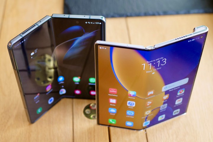
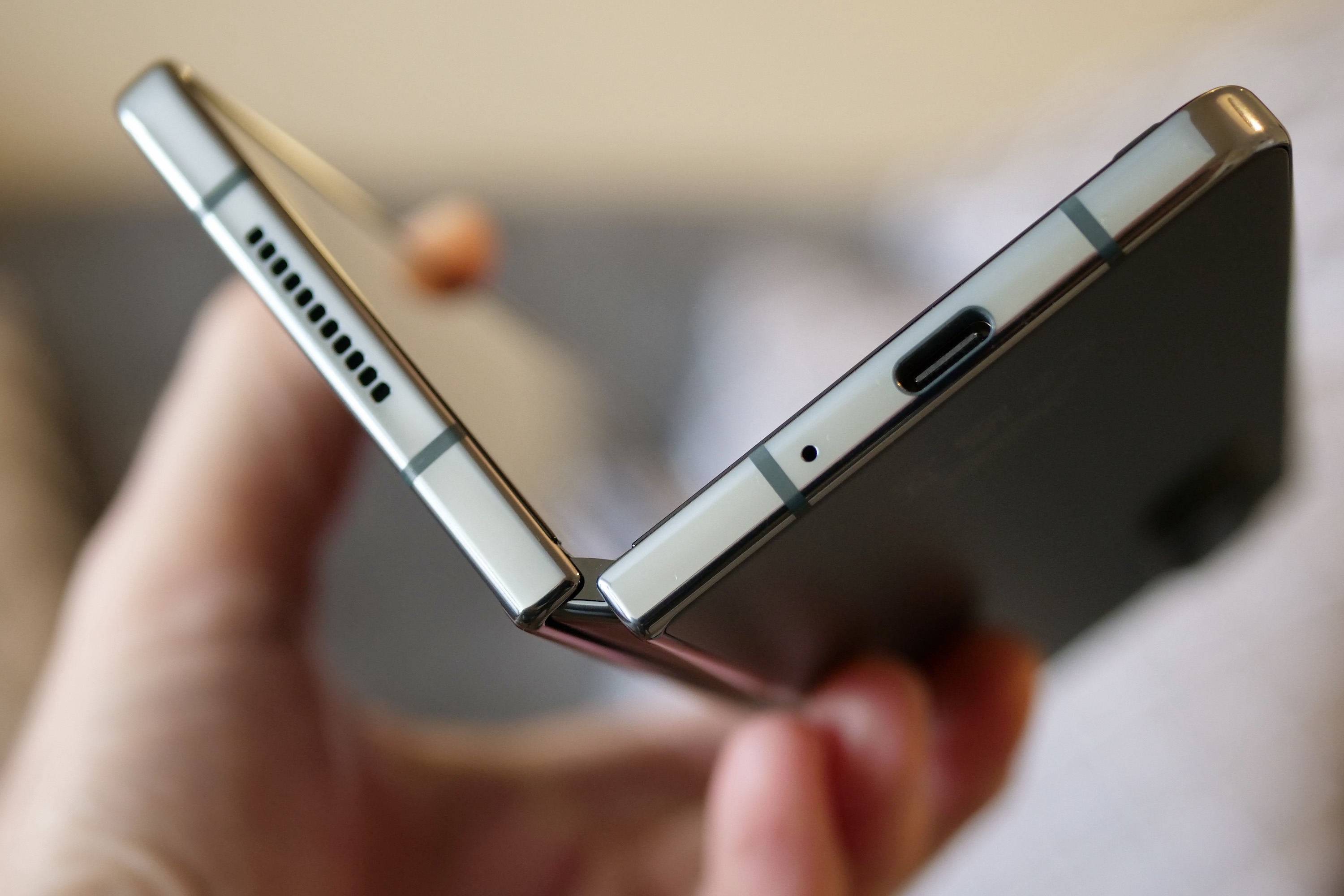
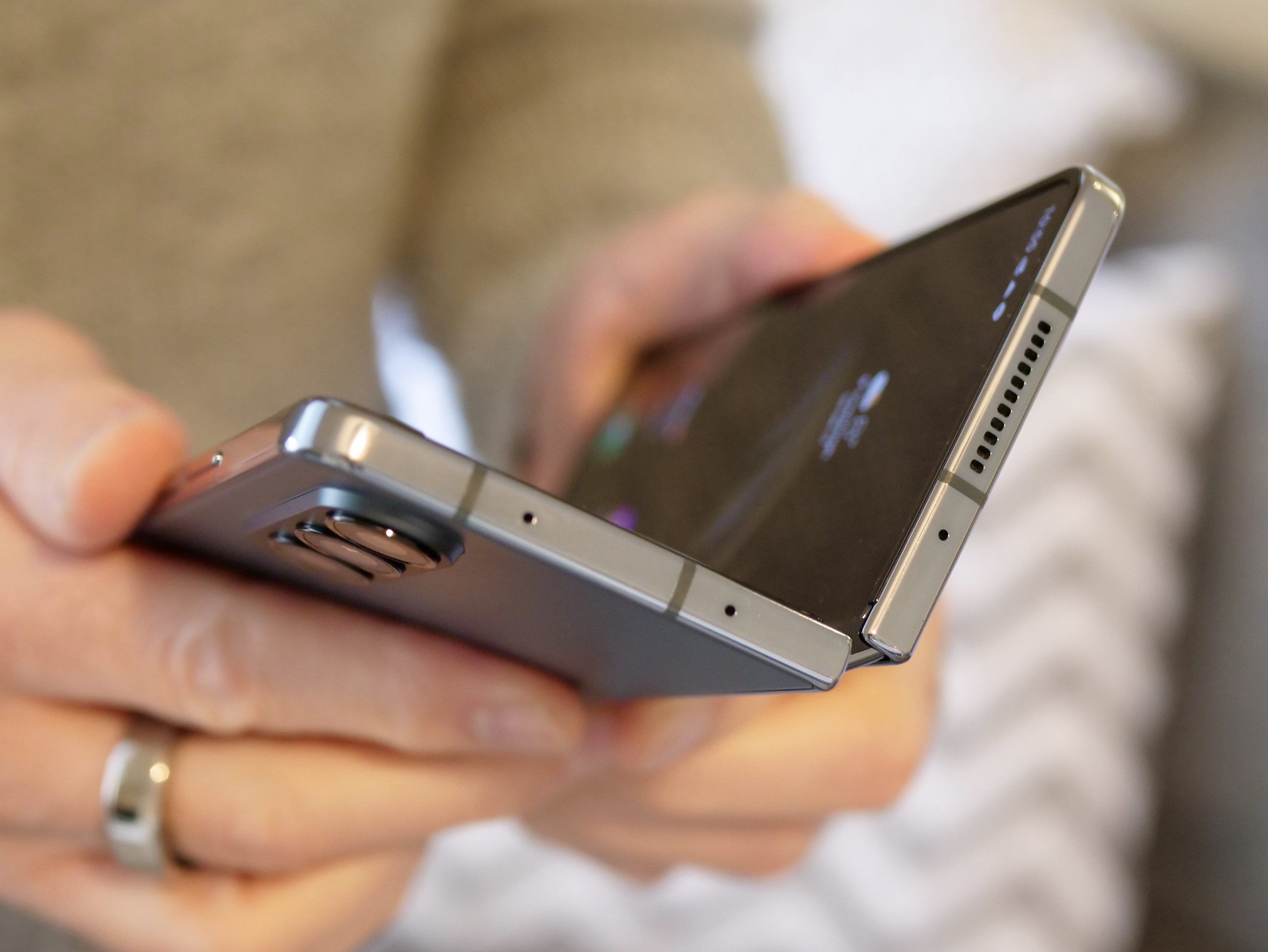
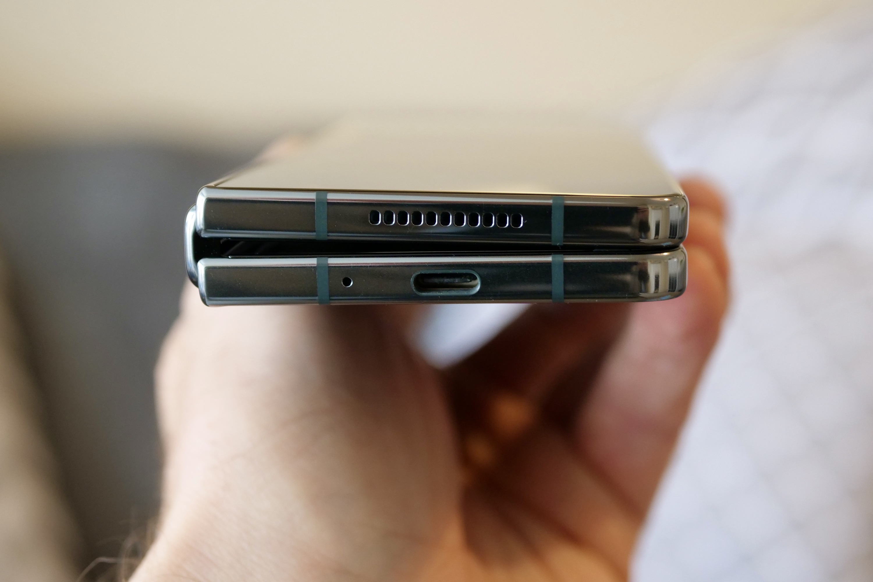
First, we need to look at how the two phones fold. When folded up, the Galaxy Z Fold 4 has a 6.2-inch cover screen, which is noticeably less wide than traditional non-folding phones. Pick the phone up, and you unfold it like a book, grasping the top and bottom sections to pull them apart, revealing the big 7.6-inch screen hidden inside. It’s how Samsung has approached folding smartphones since the very beginning, and it’s the same format used by Oppo and Xiaomi; plus, it’s the same as the rumored Pixel Fold.
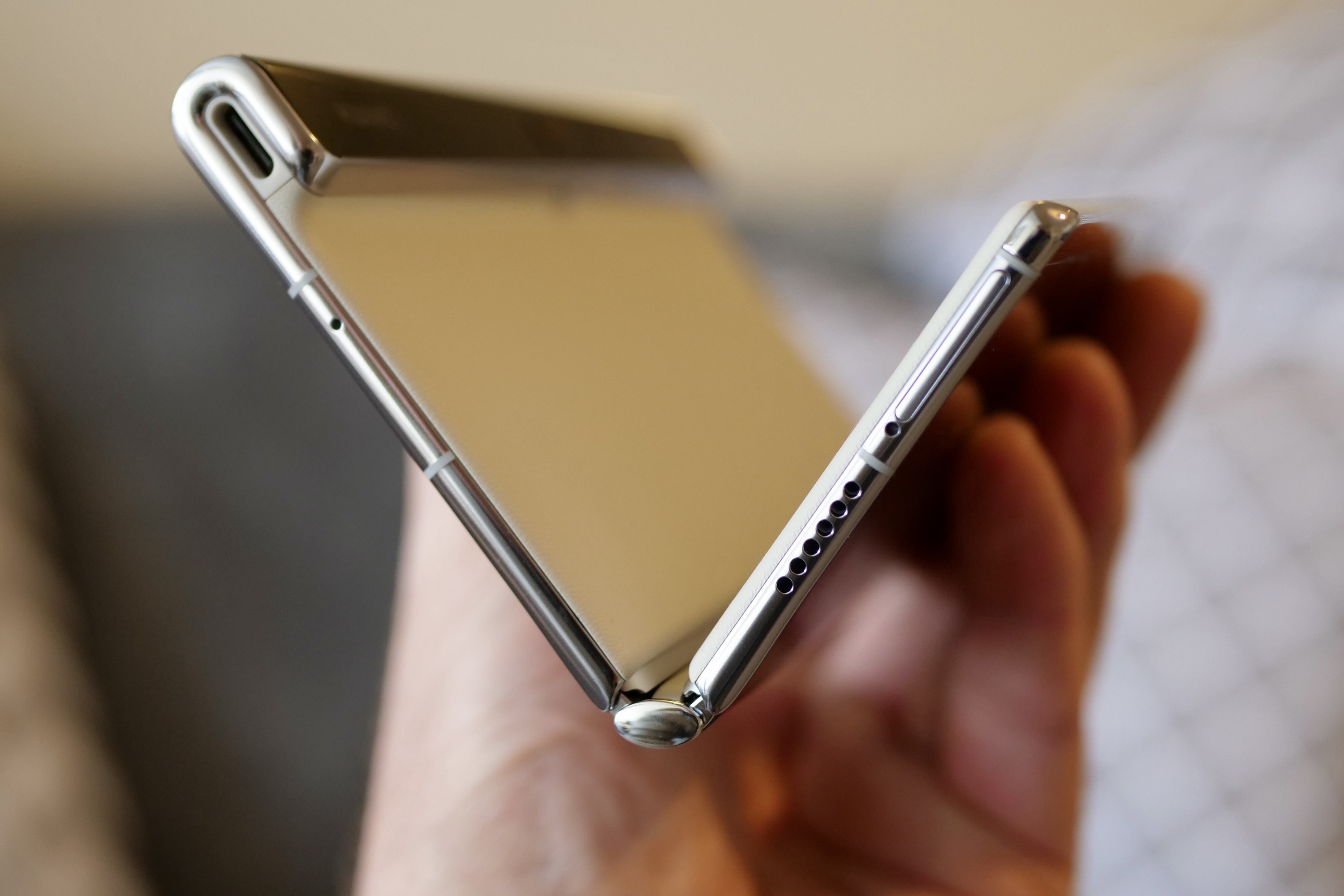
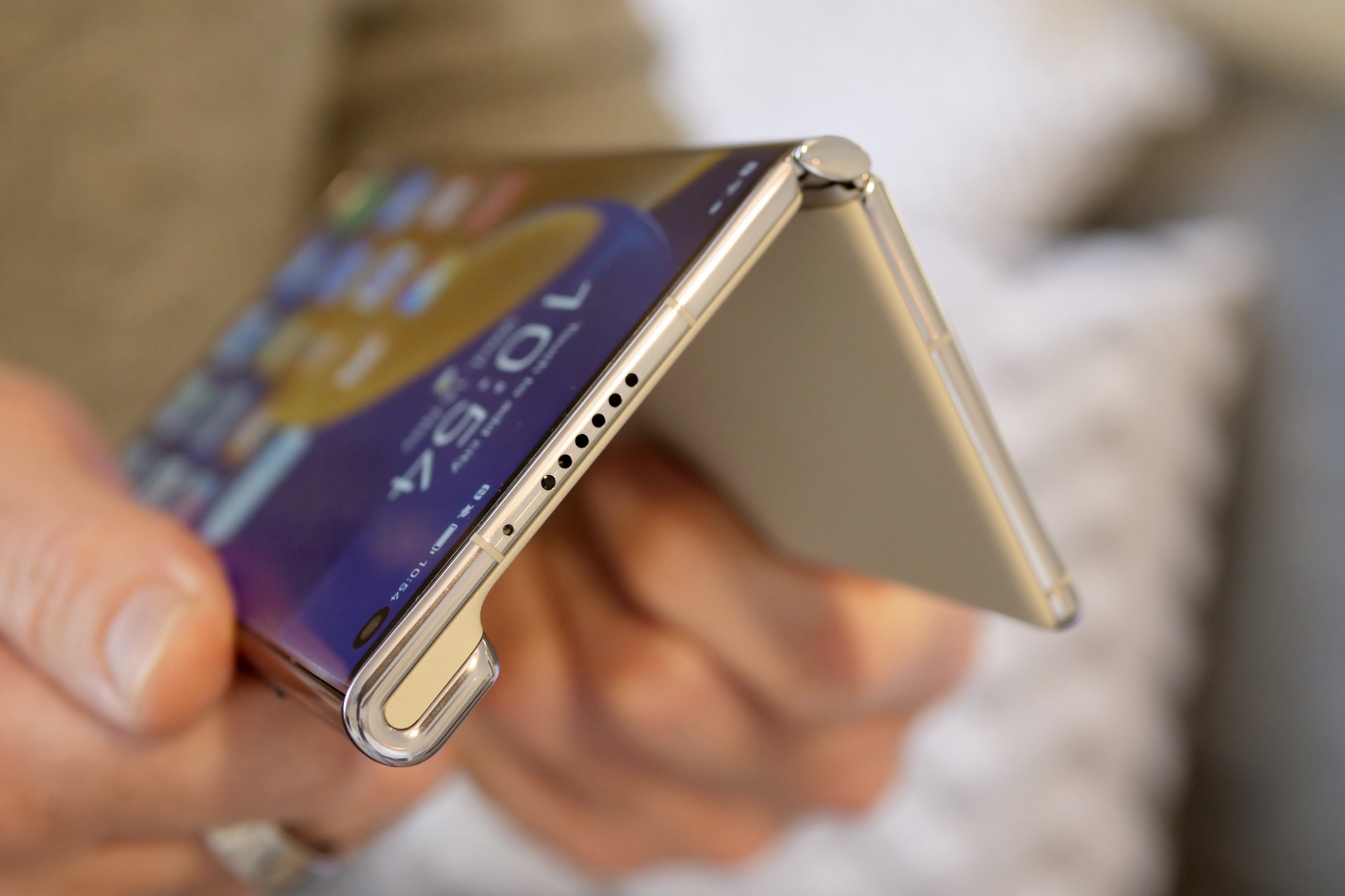
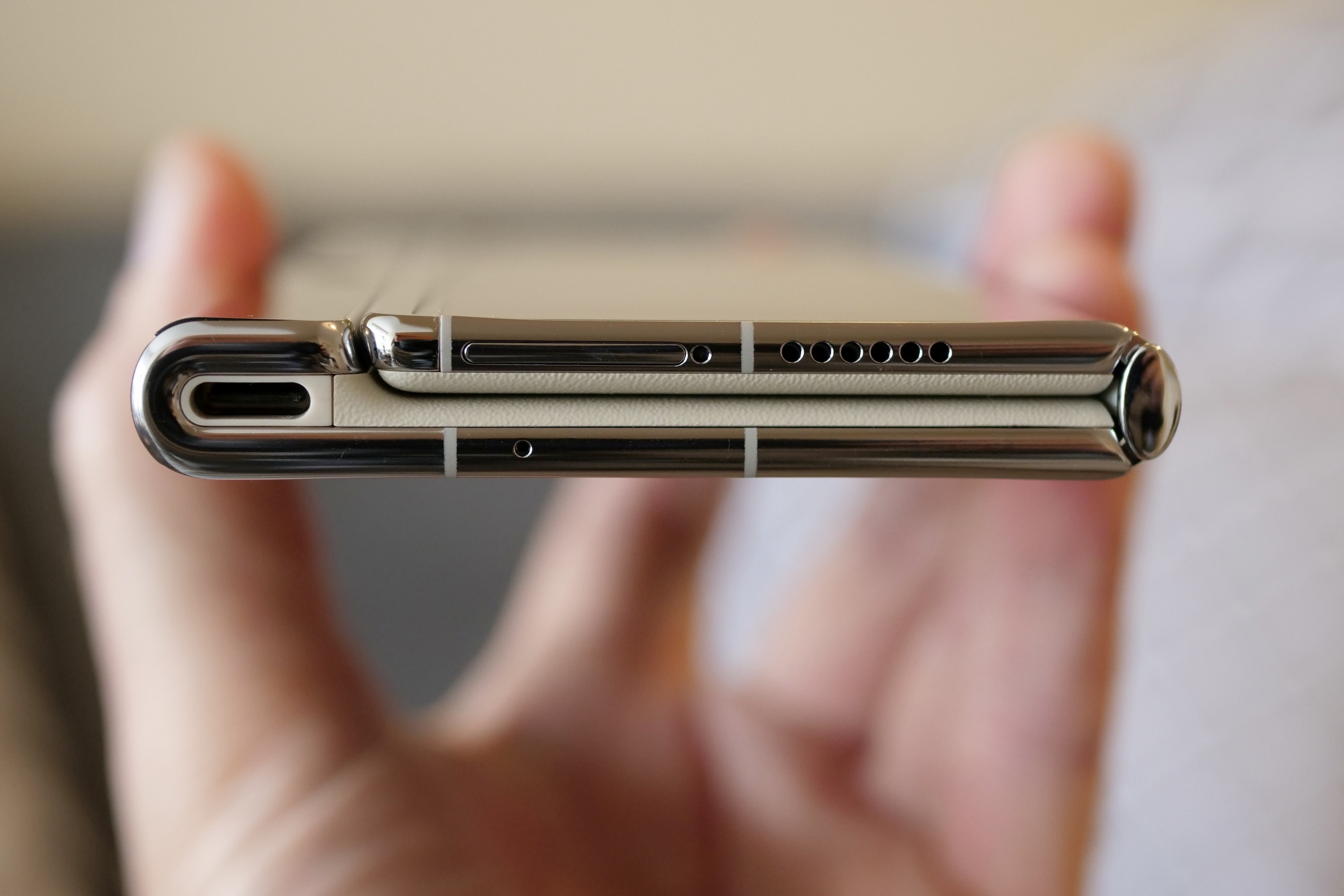
The Huawei Mate Xs 2 does things differently. The phone’s outer screen is 6.5 inches and as wide as any other non-folding phone. In fact, when it’s closed, the Mate Xs 2 looks like any other phone — just on the thick side.
Hold it, and it feels different, as the curved sides are smooth and warm to the touch, quite unlike the flat, cool metal on the Z Fold 4. It’s because you’re gripping the screen, not the chassis. Press a button on the back, and the Mate Xs 2 springs apart, and you unfold the device into its full 7.8-inch glory.
These are two different takes on the same concept, and it’s quite rare to find such considerable alterations in smartphone design. A curved or flat screen, an in-display fingerprint sensor or side-mounted sensor, or a notch or hole-punch don’t fundamentally change the way you use the phone. The inward and outward folding smartphone design does, and you’ll notice and experience the difference every time you interact with the device.
The ins and outs of design
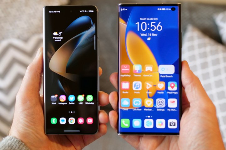
Because we use our smartphones every day, and often for many hours, it needs to have a simple, friendly design. The Z Fold 4 has almost cured one of the least friendly aspects of the inwardly folding design, as the cover screen is wider than previous models, the bezel thinner, and the amount of screen you use is slightly more generously sized. But it’s still not “normal.” The Mate Xs 2 is normal, at least to look at.
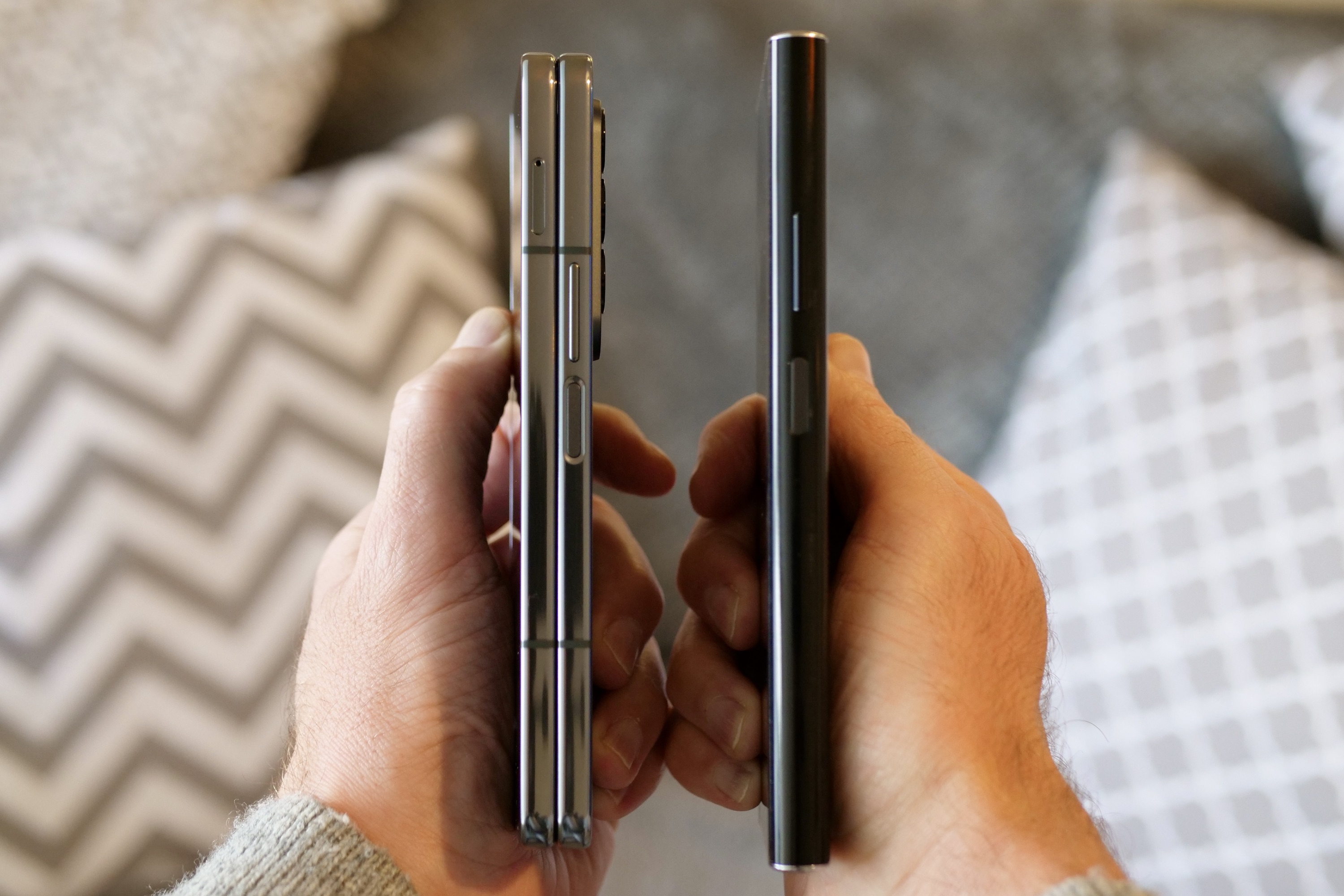
The Mate Xs 2’s software adapts the screen around the fold, so you only interact with the front when the phone is closed. Unfortunately, it’s all very sensitive, and I’m forever opening apps, removing icons, or attempting to change the wallpaper without intending to do any of it. This does not happen on the closed Z Fold 4, but the Mate Xs 2 is much easier to use with one hand due to the more standard dimensions. When it’s closed, the Huawei phone is 11mm thick compared to the Z Fold 4’s substantial 15.8mm thickness at its thickest point.

This ease of use changes when you decide to open the phone. Pressing a button to unlock the screen on the Mate Xs 2 is annoying. Yes, I know how this makes me sound, but after using the Z Fold 3 and Z Fold 4 for many months — and enjoying the convenience of simply opening the phone up like a book — there’s something almost archaic about pushing a physical button first.
You also have to press the center of the screen when you unfold the Mate Xs 2 to lock it into place, and this never feels good to do. Additionally, while the Mate Xs 2’s screen eventually lays flat, there are a couple of “steps” in the hinge to get it to that point. You have to make sure it’s locked into place, otherwise, it doesn’t quite lay flat. None of it feels as fluid as the Z Fold 4’s hinge and folding mechanism.
Folding it closed also takes more effort, and due to the way it’s designed, there’s no capacity to have the same satisfying thunk you get when the Z Fold 4 snaps closed. You may wonder why these things matter. It’s because the physical interaction with a folding smartphone is a large part of its appeal. It’s what makes it different, and getting it right is very important.
The inward folding motion of the Z Fold 4 is my preference. The Mate Xs 2’s more regular folded shape is welcome, but it comes at the expense of convenience when opening the phone; the screen attracts more fingerprints, and crucially, the hinge’s motion doesn’t feel as refined as the Z Fold 4’s hinge. Samsung has really improved its hinge technology since the original Galaxy Fold, while the Mate Xs 2’s hinge doesn’t feel that different from the Mate Xs.
It’s an open book
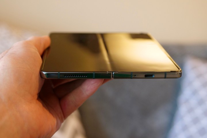
Does Huawei’s slightly more labor-intensive unfolding motion result in a better big-screen experience? One thing a lot of people dislike about a folding smartphone is the crease down the center of the unfolded screen. The Mate Xs 2 doesn’t eliminate it, but it certainly looks and feels different than the Galaxy Z Fold 4’s crease.
It’s less noticeable visually, and although you can still feel it when swiping across the screen, it’s very slight. On old folding Mate phones, the crease was more of a ripple and disconcerting visually and to touch, but that has been engineered out here. The only thing you have to deal with on the Mate Xs 2 are smudges down the part of the screen that forms the side of the phone when it’s folded when it’s in constant contact with your palm.
The Galaxy Z Fold 4 has a crease. It’s not as noticeable as the Z Fold 3, and a dramatic improvement over the original Galaxy Fold, but it’s still there. You can see it when the screen is off and feel it under your finger, but when the screen is lit up you can’t tell there’s a crease when you’re watching video unless you make an effort to get it in the right light. However, I’d still rather it wasn’t there, and the Mate Xs 2’s folding design means it’s truly minimized.

There’s a difference in the way both screens feel to touch. Samsung has put ultra-thin glass on the Z Fold 4’s inner screen. It’s pleasurable to swipe and tap, and very close to how the Gorilla Glass Victus covering the outer screen feels.
The Mate Xs 2 has plastic over the screen, and you notice. It’s warmer and less pleasing to the touch, and your fingertip doesn’t flow over it the same way as it does on the Z Fold 4. Like the folding motion, touching the screen is an important part of the overall experience, and glass wins over plastic every time, crease or no crease.
Do we need two folding styles?
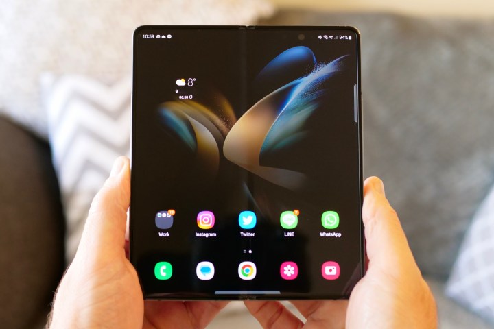
Huawei is the only company seriously investing in the outwardly folding smartphone design with the Mate Xs 2, while almost all others are adopting the Z Fold 4 or Z Flip 4’s design. After spending time with both, the Z Fold 4’s design makes better sense from an everyday, user-friendly perspective. Samsung has worked hard to improve its durability, and there is a sense of security about the big screen being folded away safely, which you don’t get with the Mate Xs 2.
However, the Mate Xs 2’s lack of crease, somewhat slimmer body, and larger outer screen are considerable benefits — and they stop me from dismissing the outwardly folding design entirely. But it’s obvious when you use the Mate Xs 2 it hasn’t been refined in the same way the Z Fold 4’s design has over the past few years. The screen doesn’t always lock open on the first try, the button isn’t the most elegant solution to locking the device closed, and there’s an annoyingly noisy springiness to the rear portion of the screen when it’s shut.
The Z Fold 4 is more mature and feels every bit of its high price. For the outwardly folding design to make sense, it would need to reach the same level of maturity as the Z Fold 4, and that’s going to take serious investment. But due to the greater availability of materials, screens, and hardware that make up inwardly folding smartphones, the motivation for companies to invest in an alternative may not be there.

It’s a shame. There are aspects of the outwardly folding screen system that work better than the inwardly folding design, and vice versa. The folding smartphone is still new enough that settling on one design now seems shortsighted, and there are elements of the Mate Xs 2 that prove we haven’t found the perfect solution just yet.
There’s absolutely space for both, but only if Huawei and others invest in enhancing the outwardly folding design now. At least then, it has a chance to reach the same level as the inwardly folding versions before it fades into obscurity.
