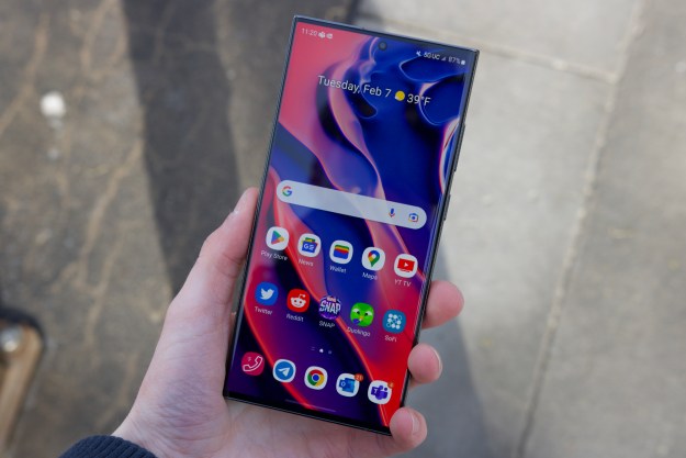
One UI — the interface that runs all phones from the top to the bottom of the price list on Samsung’s catalog — enjoys the reputation of being one of the finest Android skins. The credit for the prestige goes to Samsung’s promptness with software updates, features that build a functional castle upon barebones scaffolding that Google offers in the form of stock Android, and a consistent experience throughout its entire portfolio of phones — irrespective of what a phone costs.
Samsung’s fastidiousness is further complemented by one of the longest software support policies; an average Samsung mid-ranger now gets four Android updates, making it one of the most trustworthy brands for anyone who values longevity as a key virtue of any phone they buy.
Samsung has spent years tweaking One UI to match the real estate of larger phones (and foldables) and adding features that make the user experience far superior to Google’s projected vision of Android. After five years, Samsung is bringing a massive overhaul to the interface with One UI 6 based on Android 14, making it the most significant upgrade to Samsung phones since the introduction of One UI. Besides well-defined visual distinctions, the new update reorganizes the Camera app and modernizes systems like Reminders, Weather, Gallery, etc.
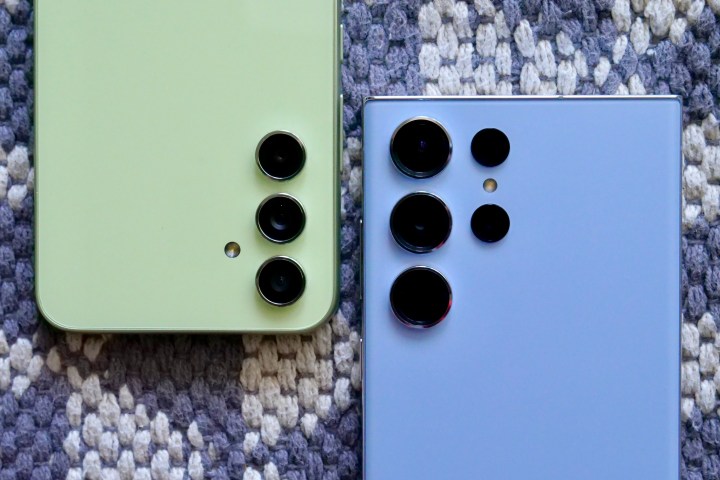
Samsung has started rolling out One UI 6 to select devices in the Galaxy S Series, specifically the Galaxy S23 series, while the beta is available for several other ones to try on. For the lack of a better device, I tried One UI 6 beta on the Galaxy A34, and there are a few observable differences between the beta and the final version. So, here are all the refreshing new features that the One UI 6 update brings.
Better visuals across the board
One UI 6 gets a drastically (in a good way) changed design. Elements that receive special attention from Samsung include the notifications panel and Quick Settings menu, along with improvements to system apps. But there is a common underlying theme in the entire update: Samsung has reorganized the elements in the interface to make it more arranged and systematic.
Designers behind the update appear to have earned the liberty to completely rejig icons from the previous One UI 5 (or 5.1) interfaces to make everything look cleaner, especially by strategically using empty spaces in different areas. Most importantly, a sense of uniformity gives One UI 6 a poetic finesse that I didn’t realize previous versions lacked until I used this one.
Let me dive into each of the elements with detailed overviews.
Notifications panel
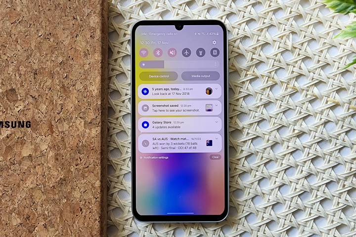
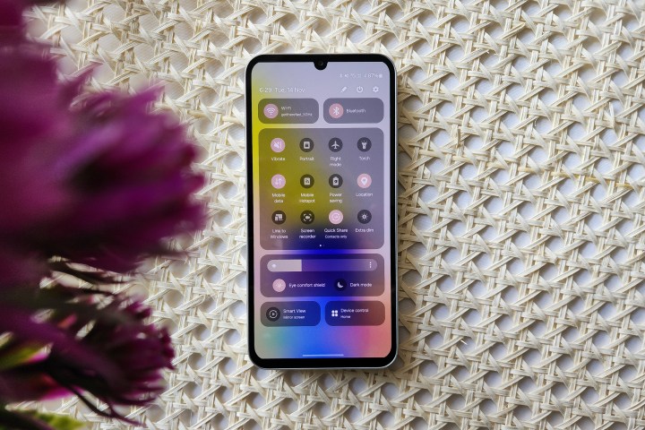
The One UI 6 lock screen or home screen does not immediately give the impression of a significant redesign. But as soon as you lower the notifications panel, the changes glare into your face. The first few things to note are the smaller Quick Settings icons that are now farther apart and leave ample space in between for a cleaner look. Above these icons, the time, day, and date now appear in a single line in the same text size. Below the icons now lies a persistent brightness bar, which would previously be only available by expanding Quick Settings completely (unless set otherwise). The location and functionality of the “Device control” and “Media output” buttons remain the same, but the bubble is now leaner.
Irrespective of whether you choose a light or a dark theme, One UI 6 now leans towards duller whites and less imposing colors. Personally, I like them more because these colors make the buttons quicker to identify and text easier to read.
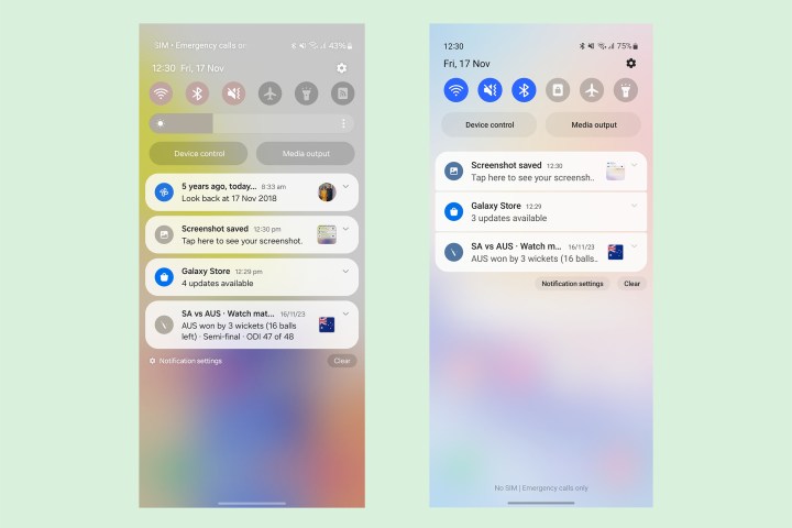
Coming to the notifications, each one now appears as an individual bubble instead of a stack. The spacing between each notification bubble has also been increased, making them look more like the Notification Center on iOS.
The spacing between the notification headline and text has also increased marginally, while the size appears to have been reduced slightly, reducing the clutter. Another minor change is how the button for Notification settings now appears on the left instead of the right previously, presumably to prevent users from accidentally tapping it instead of the “Clear” button.
Quick Settings
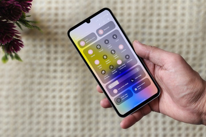
The Quick Settings menu is where you see the most meaningful changes, such that you would easily confuse them for being made by different brands if you weren’t already aware of the update. For the first time since the introduction of One UI, Samsung has wavered from its commitment to one-hand usage in the interface (which was maintained mainly by placing icons in the lower half). Instead, the Quick Settings on One UI 6 extend out to the top and are segmented into four different sections.
Firstly, the Wi-Fi and Bluetooth menus now assume permanent positions at the top of the display, seemingly inspired by the changes Google made to the Quick Settings two years ago with Android 12. This new placement makes sense because we are almost always connected to devices with these services virtually all the time. Additionally, it makes it easier to switch Wi-Fi networks or Bluetooth devices simply by long-pressing the icons, with the gesture now opening a small overlay window for these settings, unlike previously when it would open full-fledged Wi-Fi or Bluetooth settings.
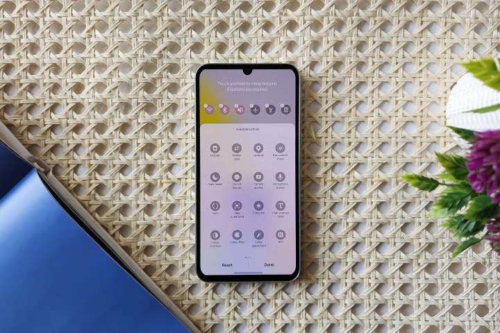
Then, we have the Quick Settings in a square-shaped card-like confinement. You can swipe right on this area to reveal other active Quick Settings tiles. If you need to add new ones, you can now tap the pen-shaped Edit icon on the top of this interface. Interestingly, you can now separately edit the top six buttons on top of notifications or the entire list. Previously, the first six icons would automatically compress onto the top of the page, but you can now add different icons in both views. That is definitely one of the most compelling improvements to this section.
You can also enable a gesture to access Quick Settings directly by swiping on the right of the screen instead of opening the notifications first. Other settings on the Edit page allow you to change the placement of the brightness slider and buttons for Device control and Media output. One UI 6 also takes out unnecessary buttons, including the Global Search one and another to contact Samsung from the main Quick Settings page and places the latter here instead.

Underneath the brightness slider, we now see persistent buttons for “Eye comfort shield” — which, like the iPhone’s True Tone feature, adjusts the warmth of the color in response to the ambient lighting and the time of the day — along with a toggle for Dark mode. At the bottom, there are two more buttons for screen mirroring and smart home controls, which, again, are persistent and cannot be customized. It appears the choice of these buttons is based on how frequently users engage with them — based on data sent back to Samsung as part of device diagnostics. It would be better to get customization options for these buttons, not just the Quick Settings ones.
Media player
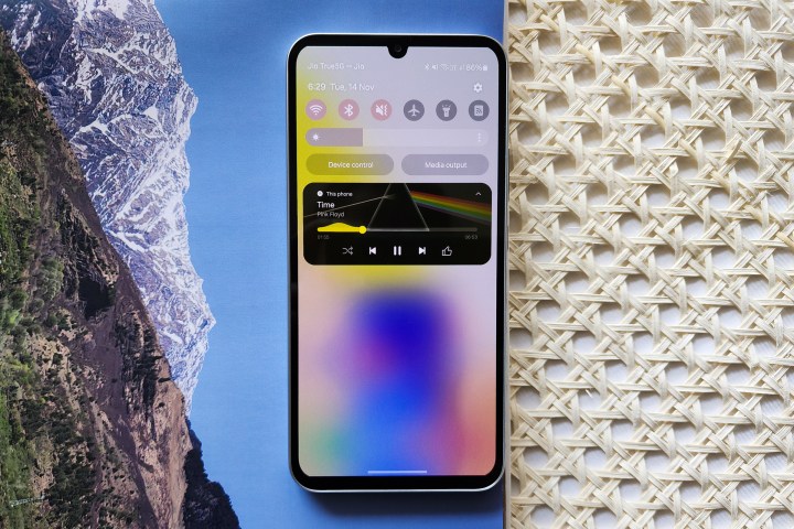
Another significant change we see under notifications is the new media player. Whether you’re listening to music, audiobook, podcast, or a video running in the background, the album cover now spans across the entire card in the notifications panel. But that’s the easily ignorable part. What instantly grabs your attention about this new player is a new wave-like animation along the seek bar, which now ripples its way to the end of the track instead of moving in the regular linear fashion.
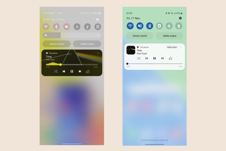
That’s quite fascinating, especially since the same animation also appears on the lock screen (although it will not if you have a widget for the specific media app). I would be a wee bit more excited if the animation were equalizer-based rather than an arbitrary wave. Perhaps it’s a secret homage to Samsung’s eponymous phone from over a decade ago, but the animation is better than a bland seek bar and is definitely impressive to see brands put the extra effort and add features for pure joy’s sake.
A new font makes things more lively

The next big change after the notifications and the Quick Settings on One UI changes every facet of the interface visually. A new font family called One UI Sans replaces the older “SamsungOne” typeface. The new font resembles the Google Sans font, which can be spotted across Google apps such as Home or Messages, online services, and logos.
The new Samsung One UI Sans typeface is rounder and broader (the same words occupy more space horizontally than earlier). As a result, the text appears shorter in height despite actually being of comparable size, making the surrounding area seem wider and more open. It adds a sense of airiness throughout the interface, which, to me, feels visually much more relaxing than Samsung’s previous Roboto-esque font.
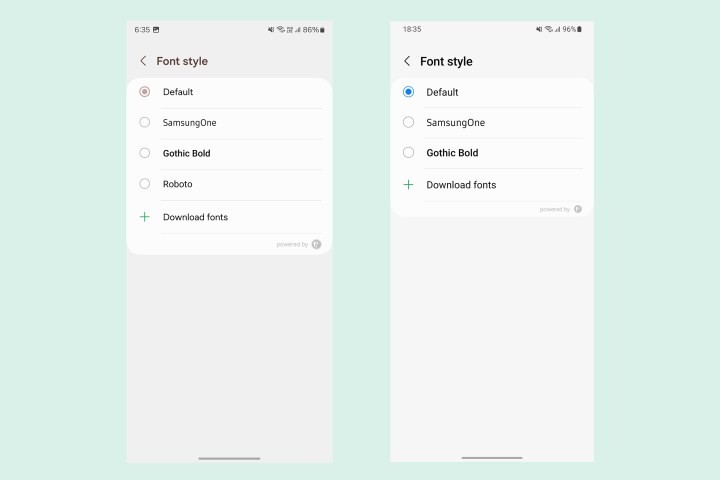
If you aren’t a fan of the new font, you can change it in the settings. While Samsung has removed the previous default font entirely, you can use Roboto for a similar experience. And again, the option to download additional fonts from the Galaxy Theme Store remains, too.
Sleeker Settings and system apps
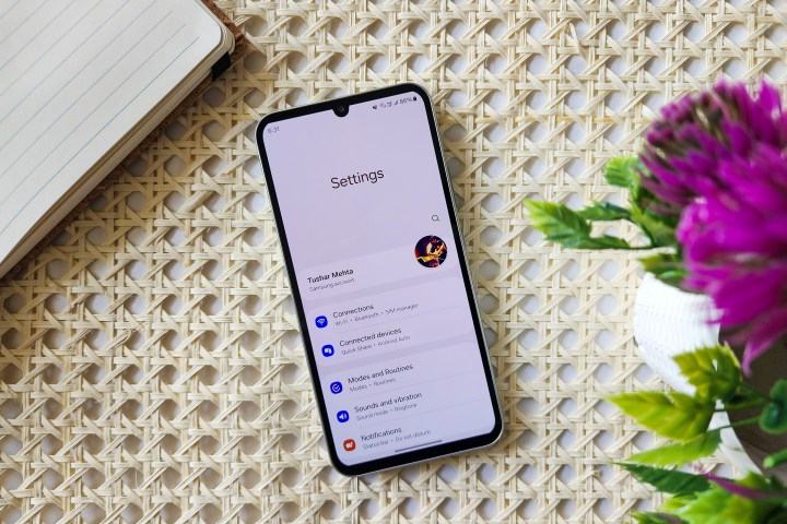
Like notifications on One UI 6, the Settings app also gets a visual upgrade with more space between items and sub-menus. Samsung also spends some time refining the categories and menus. For instance, Battery now gets a dedicated menu instead of being stacked within “Device Care,” while Display settings have been separated from other customization settings for Wallpapers, Homescreen, etc. In addition, the sliders throughout Settings are now thicker and fit well with the overall interface.

Furthermore, the update also refines various Settings menus. For instance, Digital Wellbeing gets an entirely new dashboard, while Battery now shows a more comprehensive chart for usage.
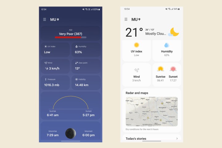
Similarly, Samsung has also redesigned several system apps, including Samsung Reminders, Calendar, Weather, and Samsung Health. One that instantly comes across as a significant upgrade is the new Weather app, which now uses new animations and more appealing visual aids to show details, including wind speeds, sunrise and sunset times, and humidity, and also adds an Air Quality Index (AQI) value.
Presumably, for brevity, the words Samsung or Galaxy, which were earlier used as prefixes, have also been dropped from the names of most first-party apps such as Members, Notes, Wearable, etc.
Better image suggestions in Gallery
The Gallery app in One UI 6 doesn’t appear much different initially. But the fundamental changes show up when you open each photo or video. With the updated Gallery app, you now get more contextual recommendations as you swipe up to reveal the EXIF data. For instance, every photo, whether it has been taken with a Samsung phone or not, will now get instant suggestions for remastering the picture using features from Samsung’s Enhance-X app and the option to activate the object eraser. On images taken in portrait mode, you also get a quick action to change the intensity of the background blur. While these controls are also available on One UI 5, the new update makes them immediately accessible.

In the future, we can expect these recommendations to get more refined. One of the easiest predictions is that the Gallery app might soon start using AI to determine the context of the images, lighting, mood, etc., and make more semantic suggestions than simply those based on the state in which the image was taken.
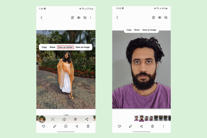
Another nifty feature in the Gallery app is that you can now instantly save clippings from photos as stickers. Although the ability to clip subjects from images was already available on One UI 5, the saved stickers can be sent directly in chats (if you’re using Samsung Keyboard) or accessed instantly when editing images and videos.
Emojis that look more awkward
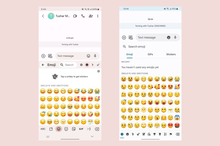
You will also notice another change if you’re using the Samsung Keyboard. The emojis available as part of the Samsung Keyboard received a fresh coat of paint — or an entire remodeling (based on however you wish to see it). The newer emojis are brighter, rounder, and look more 3D.
I’m not entirely a fan of these new emojis because they still appear very gaudy, especially in front of Apple’s more serene emojis. Moreover, I generally prefer Gboard over the Samsung Keyboard, but it’s a matter of preference.
One UI 6 is a refreshing new update
Samsung has successfully overturned the narrative in its favor with prompt and solid software updates over the last few years. One UI can easily be called one of the most refined Android-based interfaces. More importantly, it is the most stable Android interface with fewer bugs than any other skin.
One UI 6 takes the next step towards a more cohesive software experience. The update, based on Andriod 14, is undoubtedly its most extensive in the last five years — and arguably the best, too. Not just that, it also sets the foundation for variable interfaces on Samsung’s foldables, tablets, and even smartwatches.
Lastly, something cannot be visually described, but One UI 6 significantly speeds up animations throughout the interface, and we hope these changes are not just cosmetic but generally refined on a code level. This will ensure that lower-end phones also run the new interface with the same fluidity as higher-end devices.
Overall, this new interface seems to be a step in the right direction, and we wait to see how applications of onboard AI with more advanced chipsets like the Snapdragon 8 Gen 3 on devices like the Galaxy S24 series and next-gen foldables improve the experience even further.
Editors' Recommendations
- 5 phones you should buy instead of the iPhone 15
- Samsung’s newest Android tablet is a perfect iPad alternative
- The Galaxy S24 just got a big camera update. Here’s what’s new
- When is my phone getting Android 14? Here’s everything we know
- I used a gaming smartphone for a week. Here’s how it surprised me


