With users posting beautiful photos from around the world on social media, it’s a given that you’ll imagine visiting these other countries and cities. This week, we have an app that makes scrolling through travel content even more enjoyable, and could even be helpful towards planning your next vacation. For travel junkies out there, it’ll also make sharing your trips even more aesthetically pleasing.
Trips by Lonely Planet — available for iOS, with an Android version coming soon — is an app that allows you to share your travel experiences in magazine-like form. On the homepage, the feed strongly resembles Instagram. There are photos lined up one after the other with the ability to “like” a post via a heart icon, or share it through social media and text messages. Once you click on a specific post, you can then see the entire trip through both photos and descriptive blurbs. You can also choose to follow other users on the app.
The app has several different tabs to scroll through: Trips, Discover, and Activity, in addition to your profile. On the Trips tab, you’re able to see all the different travel content someone has recently posted. Also included throughout the feed are Staff Picks, which showcase breathtaking trips with photos we couldn’t believe were real. While you most likely won’t want to, you can turn this feature off by going to your profile settings and toggling “Show all staff picks in your feed.”

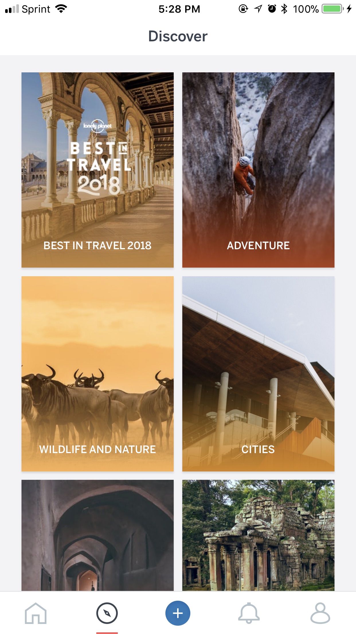
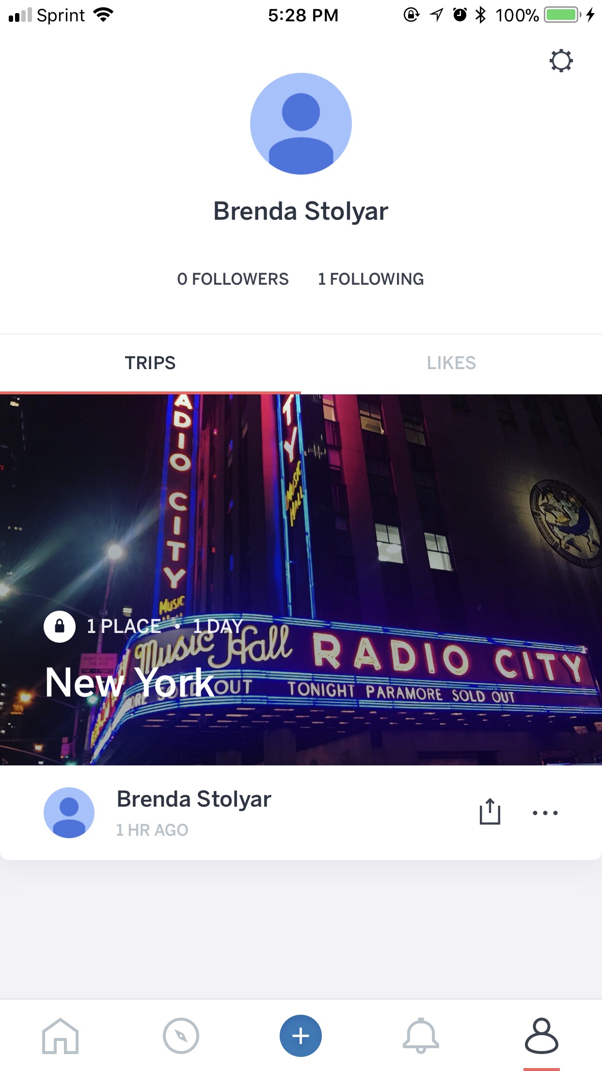
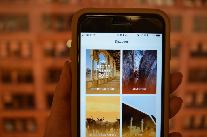
Under Discover, you can choose a specific category you want to look through, ranging from wildlife and nature to road trips hiking. Tapping on any category brings you to a filtered feed that you can also “like” and share with others. As for Activity, this is where you can keep track of all the people who have liked your posts. When you tap on your profile, you can see your profile photo at the top, a bio, and the history of trips you’ve posted yourself, along with ones you’ve liked.
Fair warning — you might start aimlessly scrolling through this app more than you do with your other apps. I found myself jumping from one post to another, only to be more impressed by the second, and then more so with another one, and then another, etc. The high-quality photos are not only immersive, but they make you realize how much more exciting it is to spend time on a feed that solely focuses on nature and architecture, rather than other people’s lives (sorry, Instagram).
Creating my own post was a very simple process, and I found the overall interface to be seamless. While in Trips, you can add a post by tapping the plus sign in the center of the various tabs. After permitting access to your phone’s photos and videos, you can select either a multitude of photos, or just one. In terms of security, you can also choose to make individual posts private or public which can be changed at any time.
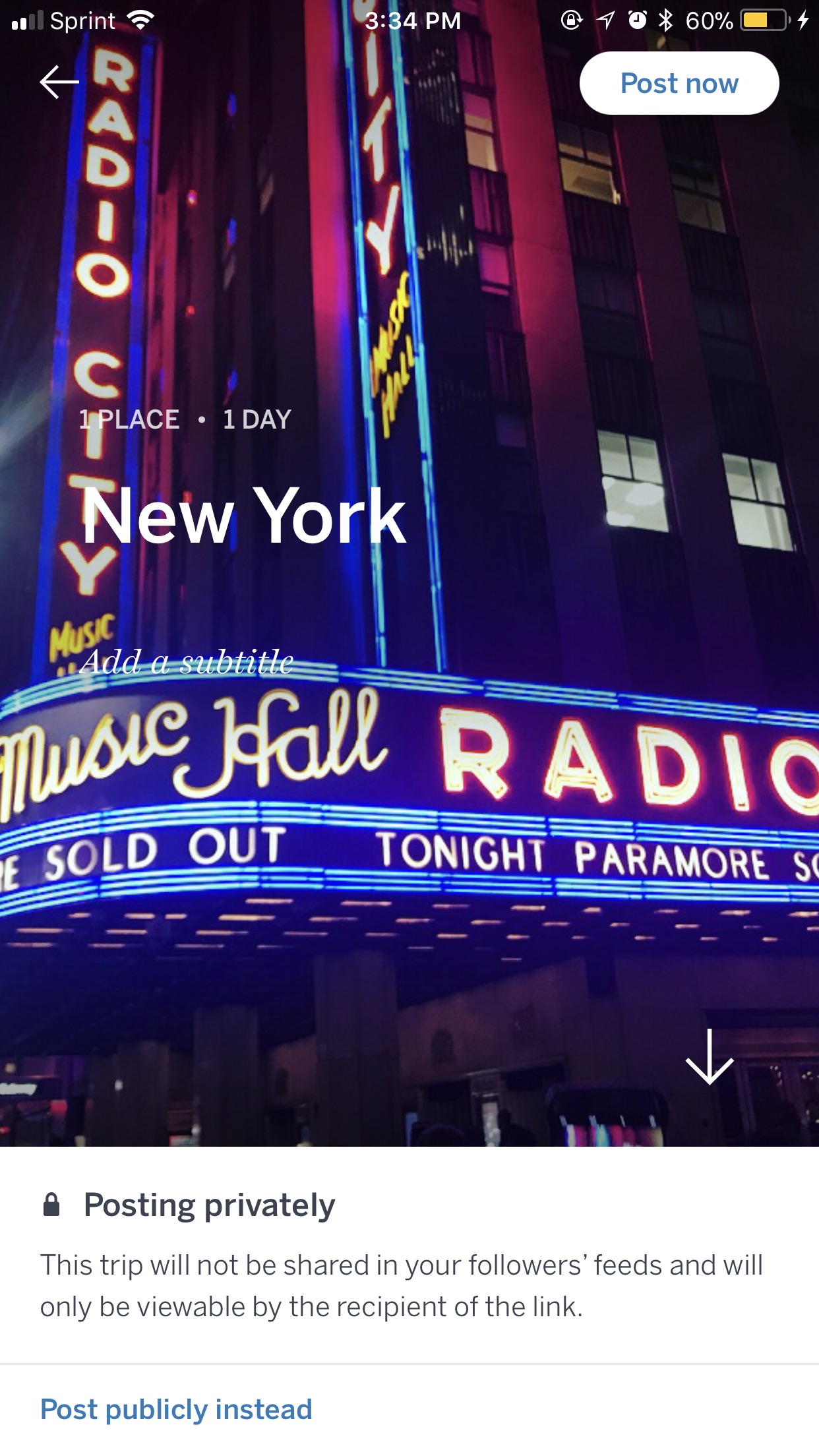
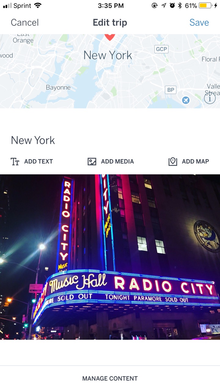
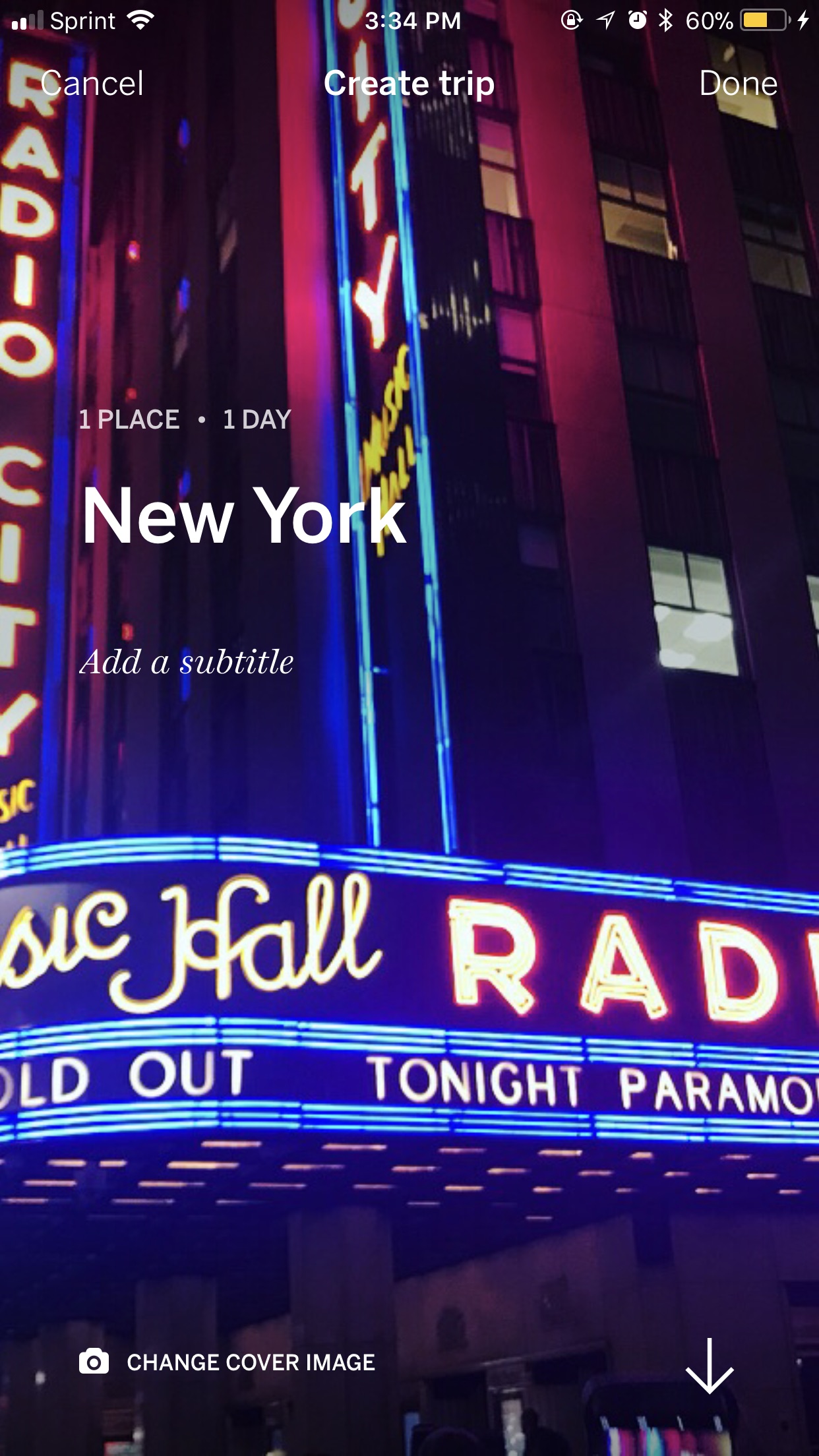
My favorite part of the app is the ability to add context to the photos. Once you choose your content, it will then give you the options to add a title and a brief intro. You can add text and additional media underneath each photo, or pinpoint a specific location. Text is also customizable — you can choose whether you want it as a heading or in the body of the text. I specifically enjoyed this feature because it allows users to tell a story to accompany their photos. Another customization option is the ability to change the cover photo, which is what users first see when the trip is posted.
Users normally post brief, single-sentence captions on social media apps, but Trips encourages you to take your viewers on a ride through photos as well as words. It’s also what kept me on the app for that much longer. While users on the app aren’t posting thousands of words, it’s still interesting to be able to read various captions from one trip, or even short paragraphs. But the text is also what adds to the beautiful layout of each user’s post. I felt like I was reading through a travel magazine, rather than scrolling through a mobile app.
Even if you don’t travel to the most aesthetically pleasing places, there’s a category to post under for every type of trip. It’s also a great way to plan future vacations, since it gives you a sneak peek of what you might except. For those who don’t travel often — such as myself — it’s probably the second-best way to explore. That is, once you get past the jealousy and rage when you realize how many stunning places there in the world that you have yet to visit.
Editors' Recommendations
- Are you having iPhone alarm problems? A fix is coming soon
- Everything you need to know about the massive Apple App Store outage
- I found 16 new widgets for iOS 17 that you have to try
- 8 iPhone browser apps you should use instead of Safari
- No, the Journal app on your iPhone isn’t spying on you