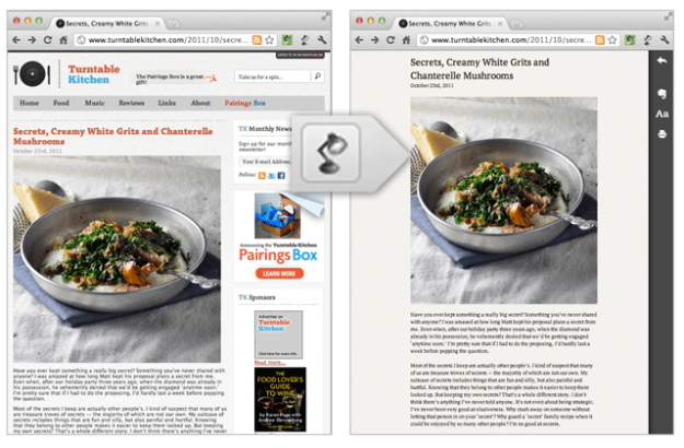
 Evernote has taken a cue from Safari Reader, Instapaper and Readability and released a product named Clearly. The company’s new browser extension cleans up the clutter surrounding blog posts and articles on the web—simplifying your reading experience.
The browser extension is currently available in the Chrome Web Store. With a click of the button in the right-hand corner of your browser an alternate page quickly overlays, and everything unnecessary to the article or post you’re reading gets shoved aside. That includes irrelevant images, links, navigation and of course advertisements. All that’s left is a block of text and the story’s image.
Clearly packs three themes in the side menu: Newsprint, Notable and Nightowl. Text can be easily enlarged from the same menu, and you can further customize themes with different colors and fonts. Also, it seems that Evernote’s extension has the ability to turn those multi-page articles into a single page, keeping your reading experience flowing.
Evernote’s software specializing in notetaking on the web; easily allowing you to stash those gems you come across while browsing. Before Clearly, the company released the Peek iPad 2 Smart Cover learning app which allowed users to create flashcards. Those that use Clearly will have the ability to save stripped-down articles to their Evernote accounts.
The Clearly extension is only available for Chrome at the moment, but Evernote is working on bringing it to more browsers. The idea of a minimalist inducing product for web reading isn’t exactly new and may seem familiar to those of you that use Instapaper, Safari Reader, Read It Later, Readability or any of the others. Hopefully, all this ad ignoring doesn’t put web writers out of business. On whether Clearly will find an audience, Evernote Chief Executive Phil Libin said, “The opportunity is in the 99 percent of people who haven’t already tried anything similar.”


