Apple’s fall event is just around the corner, and we’re expecting a slate of new products — including the iPhone 15 lineup, the Apple Watch Series 9, and possibly the Apple Watch Ultra 2.
With the iPhone 15, we’re expecting some big changes this year with the Pro models, in particular, including a new titanium frame replacing the stainless steel from previous generations, plus a new Action button instead of a mute toggle. But the overall design of the iPhone 15 and iPhone 15 Pro looks to be the same as that of the iPhone 14 series, which itself looks like the previous two generations before it. In other words, an already aging design isn’t going to be changing all that much.
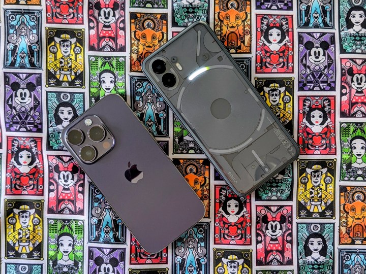
Meanwhile, on the Android side of things, designs are kept fresh and interesting, especially when there are devices like the Nothing Phone 2. After spending some time with the phone, it’s become crystal clear that Apple needs to take a page out of Nothing’s book and come up with an innovative new design for the iPhone.
The iPhone has been playing it too safe
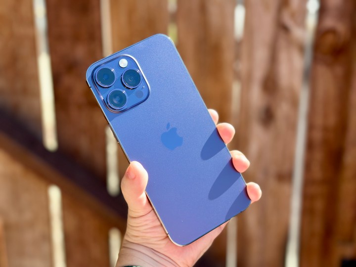
Taking the latest rumors at face value, the iPhone 15 lineup will look pretty much the same as its predecessors, with only a few minor differences. We’re still going to have the same flat edges, camera modules, and volume buttons for the most part. This would be four years of the same overall design for the iPhone.
I’m not sure about everyone else, but I’m finding the current iPhone design a little stale at this point. When the iPhone 12 brought back the flat edges, I was excited because it made me reminisce over the old iPhone 4 and iPhone 5 designs, which were incredible.
But as I’ve now used the iPhone 12 Pro, iPhone 13 Pro, and iPhone 14 Pro, I’m not sure I like the flat edges with the current 6.1-inch display size. I tend to use my phone with one hand primarily, and with my smaller hands, I need to support the bottom edge with my pinky. After extended use, the sharp corners of the edges feel a little uncomfortable. Perhaps the flat edge design worked well with the iPhone 4 and iPhone 5 series because those were physically smaller, but it just doesn’t feel ergonomic with the current size of phones today .
Another trend I’ve noticed is that Apple has been going with much more muted colors across the iPhone lineup, especially on the Pro models. While we’ve had a few pretty good Pro colors — like Pacific Blue, Alpine Green, and the most recent, Deep Purple — Apple could do better. I like my Deep Purple iPhone 14 Pro, but in most lighting, it tends to appear more gray with a tinge of purple in it rather than actual purple.
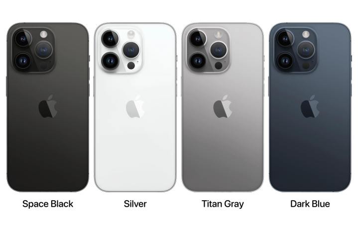
The iPhone 15 Pro color lineup that is rumored this year looks to be exceptionally disappointing. The rumored colors are shaping up to be Space Black, Silver, Titan Gray, and Dark Blue — since Apple may also be removing the gold option this year. The reason is due to the switch from stainless steel to titanium, which is harder to add color to. But if you look at the colors all together, they’re pretty much just different shades of gray — and absolutely boring.
There was originally a report of a possible crimson red color, but that hasn’t popped up recently, which is worrisome. I would take that over these very dull colors, even if I didn’t originally care for it. It feels like Apple’s in a design rut with the iPhone right now, and that’s not a great feeling.
The Nothing Phone 2 shows how it’s done
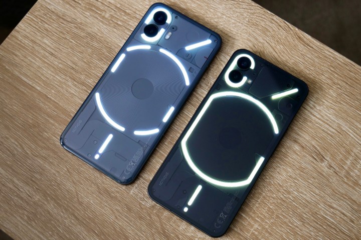
I brought up the Nothing Phone 2 earlier because it’s quickly become one of my favorite Android phone designs. It is completely different from the standard, and it stands out. It brings excitement back to the world of smartphones.
The Nothing Phone 2 is the successor to the original Nothing Phone 1, which was only released in the U.K. and Germany. But the recently released Nothing Phone 2 is the first Nothing Phone to be released in North America, which was a big deal.
The Nothing Phone 2 has a transparent glass back that shows off some of the inner components of the phone, such as the wireless charging coil in the middle. The Nothing Phone also has the unique Glyph Interface, which is the LED lighting array underneath the transparent pillowed glass back. The Glyph Interface on the Nothing Phone 2 offers expanded functionality by letting you use it as a visual timer, customize priority notification, show charging progress, and assign different lighting sequences and sounds for individual contacts.
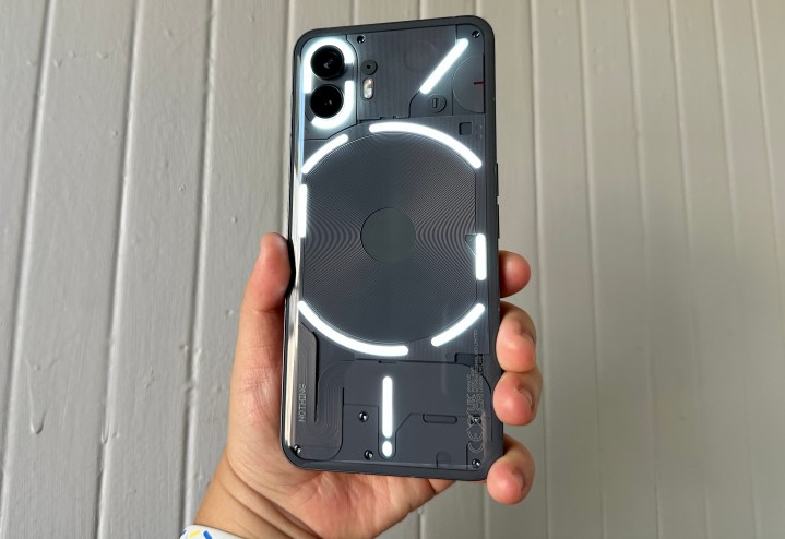
Though some may think of the Glyph Interface as a cool-looking gimmick, and it very well could be, there’s a lot of functionality to it as well. When I’m out, I like to keep my phone readily available on the table when I’m eating, but I keep it facedown so that I’m not constantly distracted by notifications. I appreciate that you can “Flip to Glyph,” which silences the phone and only uses the Glyph lights to notify you of notifications and calls. There are also Essential Glyph notifications, which will have a persistent light displayed until you read or dismiss the essential app notification.
Another useful feature of the Glyph interface is being able to use the entire light array for photos. I often find that the single LED flash on most smartphones just isn’t enough, but the Nothing Phone 2 allows you to use the entire Glyph interface as a fill light, illuminating the scene much more than a single little LED. I like to think of it as a built-in ring light on the phone — no additional accessories needed!
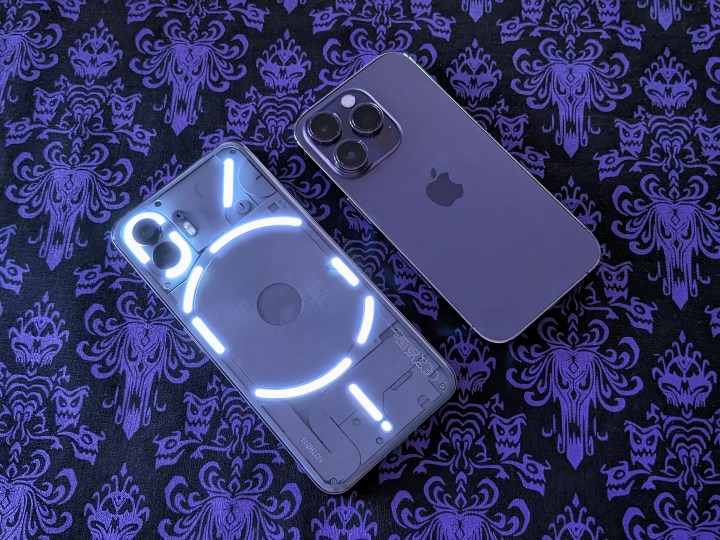
And though the LED flash makes for a good flashlight, you can also use the Glyph interface instead, though it’s not as strong as the LED for that purpose. And if you want to show off that your phone can light up, using the Glyph Flashlight from the Flashlight quick settings panel lets you do just that. Battery life may be affected, of course, but hey — you can keep those cool lights on all the time if you want.
Even though a lot of Android phones are also glass slabs, with the exception of foldables like the Motorola Razr Plus, Samsung Galaxy Z Fold 5, and Google Pixel Fold, the Nothing Phone 2 stands out from the crowd. It’s the only widely available phone that is transparent, and it even has pretty lights. Sure, some may call it gimmicky, but it’s unique and different.
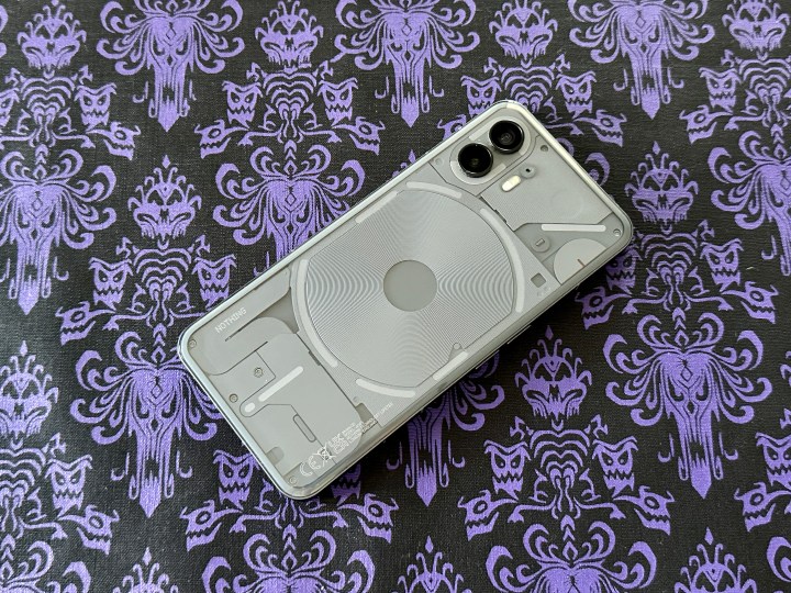
Apple really needs to innovate with the design of the iPhone once again. Beats, which has been Apple-owned since 2014, recently released the Beats Studio Buds+ in a transparent color, which is arguably one of the most impressive (and most nostalgic) color options yet. How cool would it be if Apple were to release a transparent iPhone one day? I mean, it did have colorful, transparent iMacs back in the day, remember? It’s not out of the question — Apple just needs to embrace its fun side once more.
Apple can learn something from Nothing
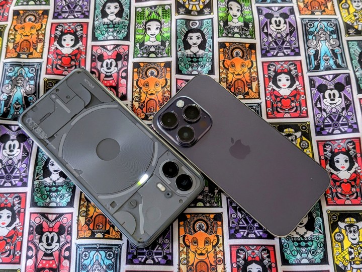
With the iPhone 15 launch just a few weeks away, I’m not expecting any big change with the overall look and design of the phone, of course. I am excited about the first-of-its-kind titanium frame, but that it may be a reason for making the color lineup dull is disappointing if it’s true.
I hope that we can get a different iPhone aesthetic when the iPhone 16 or iPhone 17 comes around, however. I mean, after around five years or so, isn’t it time for a change in design? And maybe some actual colors that people want?
Maybe one day, Apple can make the iPhone design fun and interesting again. I don’t suspect we’ll ever see an iPhone that looks like the Nothing Phone, but it is an encouraging reminder that smartphones can still be fun and exciting — even if Apple doesn’t seem intent on making that happen right now.


