Apple’s WWDC 2024 is just a couple of months away. As with every WWDC, we’ll see what Apple has in store for the next generation of software across its hardware portfolio, including the iPhone with iOS 18.
Rumors have been swirling about iOS 18 and how it will be “one of the biggest updates yet.” We know some features like RCS support in Messages are definitely coming, with other whispers of big home screen customization changes and more.
All of that sounds great, but there’s one other change I’m hoping for more than anything else.
iOS has grown stale

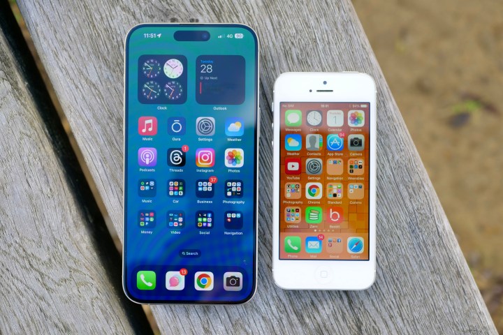
When the first iPhone was revealed in 2007, the skeuomorphic interface of iPhone OS was iconic. It was clear that Apple put a lot of thought into the designs of each individual app icon, from the textured notepad paper of the Notes icon to the camera lens for the Camera app. Each one was carefully designed to mimic its real-life counterpart.
Then iOS 7 came along and flattened everything. The beautiful detail, textures, and life-like icons were replaced with bland and boring gradient-filled squares with basic icons inside. Even buttons disappeared, and typography became thinner than ever.
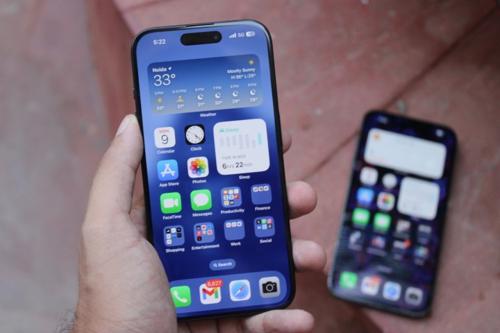
And this flat, lifeless interface has become standard for the past decade. Even Android’s Material You design is flat and unimaginative to my eyes. It took seven iterations of iOS before we had a huge shift in how it looked. And now, we’ve been living with that same overall aesthetic for 10 years.
The one iOS 18 change I’m hoping for

A recent report suggests iOS 18 could be inspired by visionOS design elements. This stems from a leaked image of what looks like the iOS 18 Camera app, originally reported by MacRumors. However, it has since been revealed that the image is possibly fake.
The image shows the Camera app with transparent, glass-like gray bars on the top and bottom instead of the usual black ones in iOS 17. Even if the original “leak” is fake, I would love to see iOS get a visionOS-inspired design. I tried out the Apple Vision Pro at a nearby Apple Store, and while I did not buy one, I did enjoy the short experience with it — especially Apple’s software design.
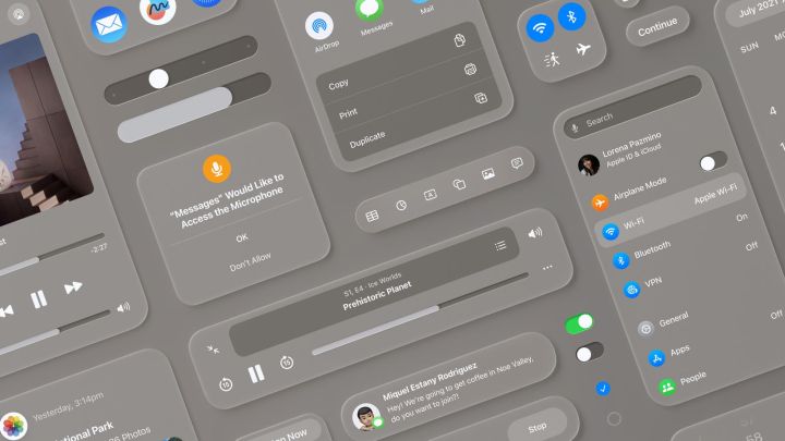
Since visionOS floats in front of you, the icons and menus have depth as your eyes hover on them. I personally like the transparent glass aesthetic, as it reminds me a bit of the old OS X Aqua interface.

Take a look at this image of various visionOS design elements. I love the rounded corners of the pop-up boxes and notifications, and it has a slight bit of depth to it, at least more than what currently exists in iOS. It’s more visually interesting than what iOS looks like now. I could see some accessibility issues with the transparent design, but if handled correctly, this could be a huge step forward for iOS design.
Apple has already tweaked some design elements in tvOS 17.2, like adding a transparent navigation bar similar to what you find in visionOS. It wouldn’t be surprising to see iOS 18 have some similar visual tweaks, if not a complete overhaul, once it launches alongside the iPhone 16 this fall.
Please let this happen, Apple

There’s a lot to look forward to with iOS 18. I’m looking forward to possibly being able to put my app icons anywhere I damn well please on my home screen in iOS 18. RCS support is long overdue, and the rumored AI features could be really interesting.
But more than that, I can’t stop thinking about the prospect of a visual overhaul. iOS is in dire need of a facelift, and considering the other big changes Apple has planned for this year’s update, iOS 18 seems like the perfect time to finally make that happen.


