Windows 11 launched late in 2021 with plenty of fanfare and controversy. I reviewed it, and said that it was an exciting new era of Windows. Nearly half a year later, there are still some reasons to be just as excited about Windows 11.
With help from Windows Insiders, who beta tested upcoming and new Windows 11 features in the Dev Channel, there’s a lot of new things that are coming soon to the new Microsoft operating system. Some of these were requested by long-time Windows users familiar with Windows 10, and some are entirely new. From folders on the Start Menu to tweaks for tablets and even Live Captions, here are six of those upcoming Windows 11 features you really need to try.
Folders in the Start Menu
The first feature is one that many people have requested — the ability to create folders in the Windows 11 Start Menu. With the Start Menu having limited space compared to Windows 10, this lets you organize your apps in a more efficient way. It works as you’d expect. Just drag one app icon over another, and then you get both apps together in a folder.
Unfortunately, though, at the moment, it’s not possible to name the folders, or change colors. Microsoft says that it’s working to improve on the feature in future Windows Insider builds. Still, it’s plenty useful, I have folders on my Start Menu for work and personal apps, to keep myself organized.
Live captions
Second on the list is live captions. If you’re an Android user, you might be familiar with the feature. On Android phones, when live captions are turned on, autogenerated captions show up over your video, or whatever you’re watching, letting you read what’s being spoken on the screen. Well, it’s the same thing on Windows 11, too, but with some cool tweaks.
On Windows 11’s Dev Channel, you can also enjoy this feature. Just hit the Windows Key > Control Key > L on your keyboard. After being prompted to set up and download the feature, you’ll get a bar at the top of your screen that will have captions. It’s a bar that matches Windows 11’s mica effects, cleanly fitting in its own space on top of your existing content. I’ve found it useful for when my speakers are muted, so I can read what’s happening in a Teams meeting or what’s being said in a video.
Changes that make Windows tablets more useful
I’ve written before about the need for changes to tablet mode in Windows. The public non-beta version of Windows 11 delivers a lot of tweaks in that regard. It’s mainly thanks to a newer touch keyboard and increased spacing between icons. Yet in the Dev Channel versions of Windows 11, Microsoft is testing a ton of new features that make Windows tablets even more useful.
The first of those are new touch gestures. Like in Chrome OS or iPad OS, you can now swipe up on the Taskbar to bring up the Start Menu. You also can swipe up on Quick Settings to summon controls for Wi-Fi and Bluetooth. This just feels so natural, rather than having to tap your finger over an icon.
Also included in this is a new Taskbar state designed just for tablets. There are now “collapsed” and “expanded” modes. In collapsed, the taskbar is more out of the way, so you get more screen space and won’t accidentally summon it when holding a tablet in your hand. In expanded mode, the taskbar is more optimized for touch. You can easily switch between the two states by swiping up and down from the bottom of a device.
The setting option is available in Settings>Personalization>Taskbar>Taskbar behaviors. You can then check if automatically hide the taskbar when using your device as tablet is available.
“Microsoft is finally matching hardware with software, and it feels awesome.”
One more thing in this area has to do with Snap Layouts, Windows 11’s signature feature. Previously, it wasn’t catered for tablets, but rather keyboard and mouse. You’d hover over the maximize button to see ways to “stack” your open windows. Well, in the Dev Channel version of Windows 11, you can now hover over the window with your fingers to the middle of the screen, and you’ll get the Snap Layouts UI. Just drag the window on top of one of the layouts in the UI, and you’re in on the multitasking fun!
Some smaller changes for tablet mode in the Dev Channel version of Windows 11 include new audio controls on the lock screen and cleaner volume sliders. As I said nearly two years ago, Microsoft is finally matching hardware with software, and it feels awesome.
Easier ways to manage your Microsoft Account

One thing that is great about iPads, iPhones, and Macs is the ability to manage your Apple ID and subscriptions directly from the operating system’s settings app. Well, this is now possible in the Windows 11 Dev Channel, too. Instead of having to go online to check on your Microsoft Account, you can now do it directly from the Settings page.
There’s a new Your Microsoft Account option for all this. You can peek at your Microsoft 365 subscription status and OneDrive storage plans, manage payment options, and even view benefits. Microsoft says even more experiences may come to this Microsoft Account settings page, as it’ll be using Online Service Experience Packs to add more features here.
Improved Task Manager

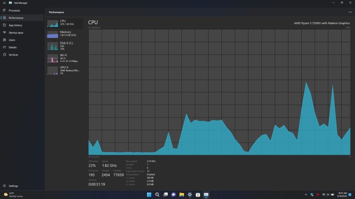
The Task Manager is an area where many Windows 11 power users spend a lot of time. It is used to kill unresponsive tasks, peek at system performance, and more. However, the design has not changed much since Windows 8.1. Windows 11’s Dev Channel, though, finally tweaks the design a bit — and it never looked better.
Unlike before, Task Manager now has a dark mode, supporting your system’s theme. It also has a new sidebar, matching Windows 11’s thematics. The Sidebar has a tabbed interface for Processes Performance, App History, Startup apps, users, details, and services. There’s even a new dedicated settings menu, too. It all looks so clean and modern, and after 10 years of the old design, it’s a sight for sore eyes used to Windows 10 and Windows 8.1.
Improved Search experience

Last, but not least, on the list is an improved search experience. Microsoft is calling this “Search Highlights,” and it adds some cool improvements for the search box in Windows 11. Though it hasn’t rolled out at the time of writing, Microsoft promises that this makes the Search box a little more timely and periodical. You’ll see fun illustrations that help you discover more, be connected, and stay productive. You’ll also see notable and interesting moments — like holidays, anniversaries, and other educational moments in time both globally and in your region.
Each day will bring more things to see. And, if you’re signed into Windows with a work or school account, the Search Box will even showcase your organization’s people chart, documents you collaborated on, and things going on at your company. And don’t worry your recent apps, as the actual search bar is still there. Recently opened apps now show to the left of the box instead.
Sign up today to try these features out
All of these features are being tested in the Dev Channel branch of the Windows Insider program, and you can check them out, too. Though this is where you’ll get new Windows 11 features first, it’s also the most unstable version of Windows 11, with a lot of bugs and risks of experiencing PC crashes. Features in the Dev Channel aren’t guaranteed to make it to final Windows 11 releases, but they are the latest and greatest. Sign up today by heading to Windows Settings, choosing Windows Update, then going to Windows Insider Program. Sign in with a Microsoft Account, and choose the Dev Channel. Your PC will restart a couple of times, and you’ll be in on the action.


